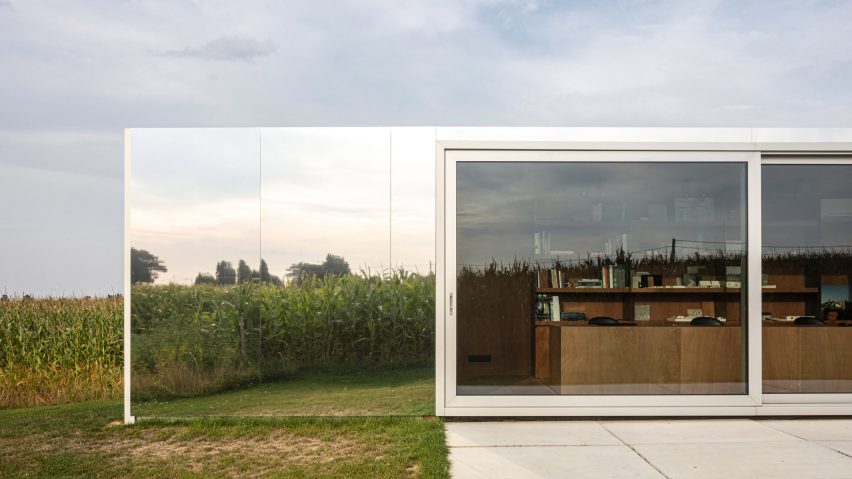
Belgian practice TOOP Architectuur has designed two mobile architects' studios for its staff made of repurposed shipping containers clad in mirrors and timber.
One studio, called Cowes, is set within the rural landscape of Westouter, close to the French border.
The other, called Colok, sits at the end of an inner-city garden in Lokeren in East Flanders. Together the project is called Diptych.
"The starting point of the concept for our two offices is a low-budget shipping container," said TOOP Architectuur.
"These movable structures can easily be placed everywhere, have a strong formal identity and exist in varied sizes."
Cowes, surrounded by a green, hilly landscape has been covered almost entirely with mirrors.
A large, sliding opening at its centre and a full-height window at one end.
"On this beautiful plot we tried to create an office which is as invisible as possible and always lets the landscape speak at its maximum," said the practice.
"Precisely chosen openings for the interior create a connection to the landscape. One is oriented towards a nearby hill, and the other frames a small forest at the end of the plot."
Colok, which sits in the city centre surrounded by row houses, is clad in wood.
It opens out onto a garden through a glazed wall and sliding door.
The rear of this studio creates a boundary to the street. Its blank wooden elevation is entered through a hidden door.
Within each container, a run of desks is oriented looking out towards the landscape.
Full-height bookshelves sit behind the desks.
At the end of each container is a more informal seating area.
Interior finishes were chosen to create a strong visual identity that would bring consistency to the studios despite their differing sites.
Walls, floors and ceilings have been finished with standardised panels of red plywood, a material usually used for construction rather than as a finish.
Untreated steel ribbons placed between them and used to mount bookshelves.
"By using such a low-budget yet beautiful material we show visitors the possibility to doing interesting things with low-budget materials," TOOP Architectuur said.
Gallery-style lighting illuminates the desk areas.
While only two units have currently been completed, the concept is one that TOOP Architectuur believes could be rolled out across several sites.
"One could imagine another [studio] giving a different answer to another site but forming part of a triptych. Or even more becoming a polyptych," said the firm.
The practice recently completed a project for a home, also in Westouter, built using concrete and wood to frame views of the surrounding landscape.
Photography is by Tim Van de Velde.

