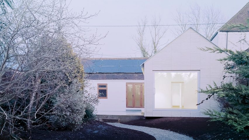
The ground appears to have fallen away beneath this minimal house, designed by architectural designer Jonathan Burlow in Kent.
Over the Edge is the first completed project by Burlow, who recently set up his studio in nearby Folkestone.
It takes its name from a subtle cantilever in one corner of the building. From some angles it's barely noticeable, but from others it creates a dramatic effect, as if that section of the house is hovering above the ground unsupported.
"The landscape falls away beneath the cantilevered edge, giving the impression of being lifted from the ground," said Burlow.
The project began with a small, single-storey bungalow. The client asked Burlow to significantly extend the property, creating a larger kitchen, but also to create space that could function as a studio for painting.
The extension increases the property's size from 62 square metres up to 97, and changes its floor plan from a rectangle to an L-shape.
A polished concrete plinth provides the floor of the extension, and also continues outside to create a simple patio.
The topography of the surrounding garden varies – at some points it's level, at others it's set down below. It is this, as well as a clever step-back detail in the concrete, that create the cantilevered corner.
The design takes its cues from 18th-century grain store buildings that were once common in this part of England. The floor would be raised up from the ground, to protect the contents from rodents and flooding.
"Commonly grain store buildings were built separated from the main house on saddle stones," explained Burlow.
"The extension references the rationale at the time, lifting the kitchen from the ground and placing the space on a concrete pedestal."
Burlow chose a Danish clay brick with unusually long proportions to exaggerate the effect of the cantilever. It is laid in a stack bond, rather than the traditional stretcher bond, in a subtle reference to piled-up grain sacks.
"The extension was really crafted and put together by a human hand," Burlow told Dezeen.
A black kitchen was chosen, in contrast with the pale tones of the exterior and interior walls.
Large glass doors – both sliding and pivoting – ensure the space is filled with natural light, while a mirrored door conceals a utility room.
A glazed wall creates a visual break between the old new sections of the building. Behind the kitchen is an entrance hall and bathroom, while a living room and two bedrooms are located beyond.
"The interior space is basic in finishings and fixtures, allowing the activities and furnishings that will evolve and change through time to become an ever-changing curation of [the owner's] habits and choices," added Burlow.
Photography is by Simone Bossi.
Project credits:
Architect: Jonathan Burlow
Contractor: Sprinks Construction
Structural engineer: Neil Smith Associates
Artist collaboration: Butler Archive
Bricks: Petersen Tegl
Specialist concrete: Lazenby’s
Glazing: Maxlight
Kitchen worktop: Henderstone

