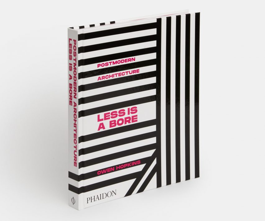
Less is a Bore book celebrates "postmodern architecture in all its forms"
Less is a Bore by Dezeen columnist Owen Hopkins reveals the diversity of postmodern architecture from around the world. Here, he spotlights 10 significant structures from the book that come in all shapes, sizes and colours.
Named after the anti-minimalist maxim coined by American architect Robert Venturi, Less is a Bore is a global survey of over 200 buildings that exhibit "postmodern architecture in all its forms".
It was curated by Hopkins for publisher Phaidon as a celebration of the movement that, despite being one of the 20th century's most controversial styles, is experiencing newfound popularity.
"[Less is a Bore] is about widening the canon and revealing the variety and richness of the movement, and looking beyond architecture to the world in which it operates," Hopkins told Dezeen.
"Its goal is to establish postmodernism not as a style but as a sensibility that can be found in all places and all periods," he continued.
"A sensibility that values complexity over simplicity, decoration over minimalism, colour over the monochrome, fragmentation over singularity, contingency over universality, context over introspection, doubt over certainty, and in which more is always more."
Postmodernist architecture emerged in the 1960s, and thrived from the 1980s through to the 1990s. Alongside Venturi, it was led by architects Denise Scott Brown, Philip Johnson and Michael Graves.
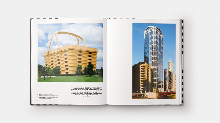
Less is a Bore features photos of buildings ranging from the movement's most famous, through to lesser known 21st century structures and manifestations in Asia and South America.
Weaved in between are a number quotes that reference postmodern culture, made by architects, designers and artists including musician David Bowie and Andy Warhol.
According to Hopkins, the publication coincides with the recent rise of postmodernism's popularity, which has seen the return of ornate designs and expressive forms throughout architecture and design.
However, unlike the recent revival of brutalism, Hopkins argues that this resurgence goes beyond aesthetics and fashion and demonstrates ambition and changing times.
"It's about new generations of architects and designers looking beyond the normative modes of architectural expression embracing a set of previously marginalised design tactics and aesthetic devices in order to create something new, bold and potentially oppositional," he explained.
"Its present revival is something of a vindication of postmodernism and an important reminder that architecture should always be eclectic and should allow a range of styles to co-exist," Hopkins added. "That was the vital lesson of postmodernism in the 1970s and 1980s, and it is one we need reminding of now."
Read on for Hopkins' pick of his top 10 buildings from the movement:
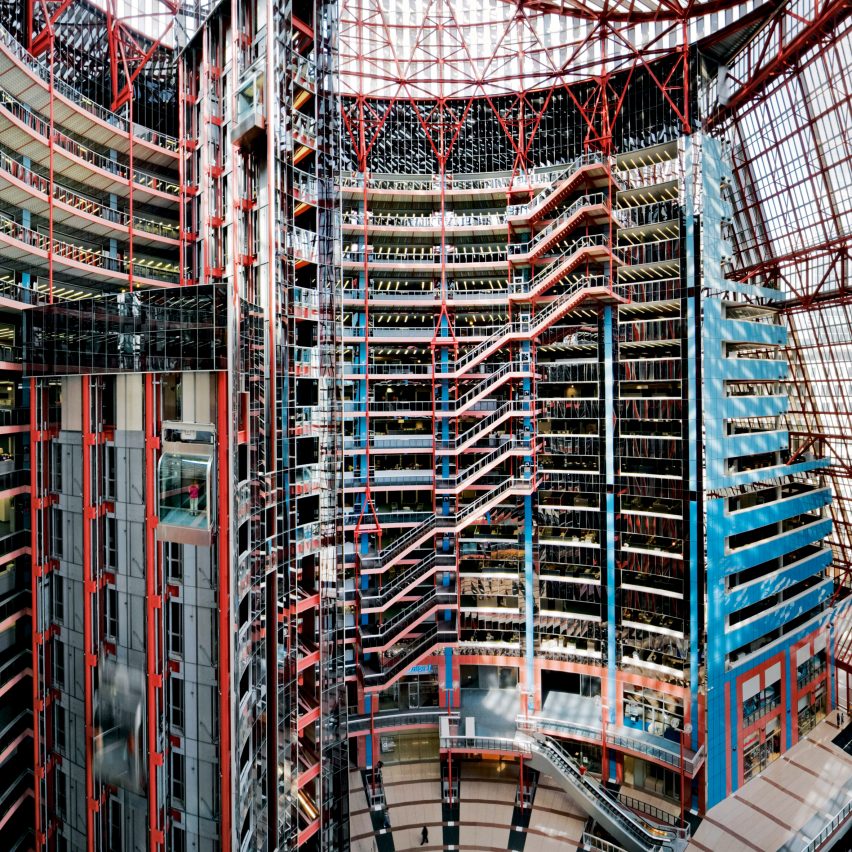
State of Illinois Center, USA, 1985, by Helmut Jahn
"As a style or movement, postmodernism is often seen as being mostly concerned with exteriors and the role a building plays in an urban composition – and this is usually the focus of most of its canonical texts, most notably Learning from Las Vegas.
"However, postmodernism's principles could be applied in incredibly powerful ways to interiors: domestic, commercial and civic. One of the greatest is the sadly under threat State of Illinois Centre by Helmut Jahn, which to my mind exceeds the similarly cavernous and better known hotel lobbies of John C Portman in its bravura blurring of surface and structure, form and void."
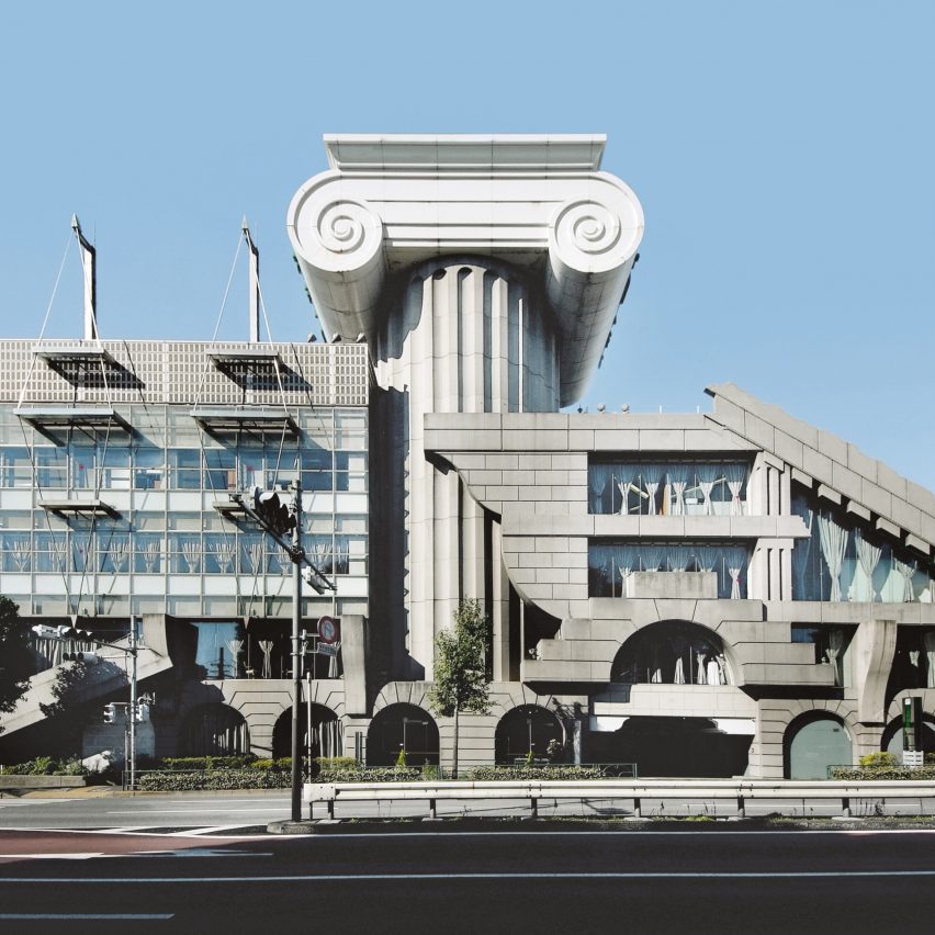
M2 Building, Japan, 1991, by Kengo Kuma
"Anyone familiar with Kengo Kuma's more recent work would struggle to believe that this amazing confection of different styles, forms and scales was by the same architect.
"The architect himself no doubt had this project, one of his first major commissions, in mind when he admitted in an interview for Dezeen that 'to be honest, sometimes I feel a bit embarrassed by some of my buildings'. But I think he should be proud of it.
"It's an extraordinarily powerful statement, pointing to a very different, and rather more meaningful, direction that the 'iconic' building might have taken during the 1990s."
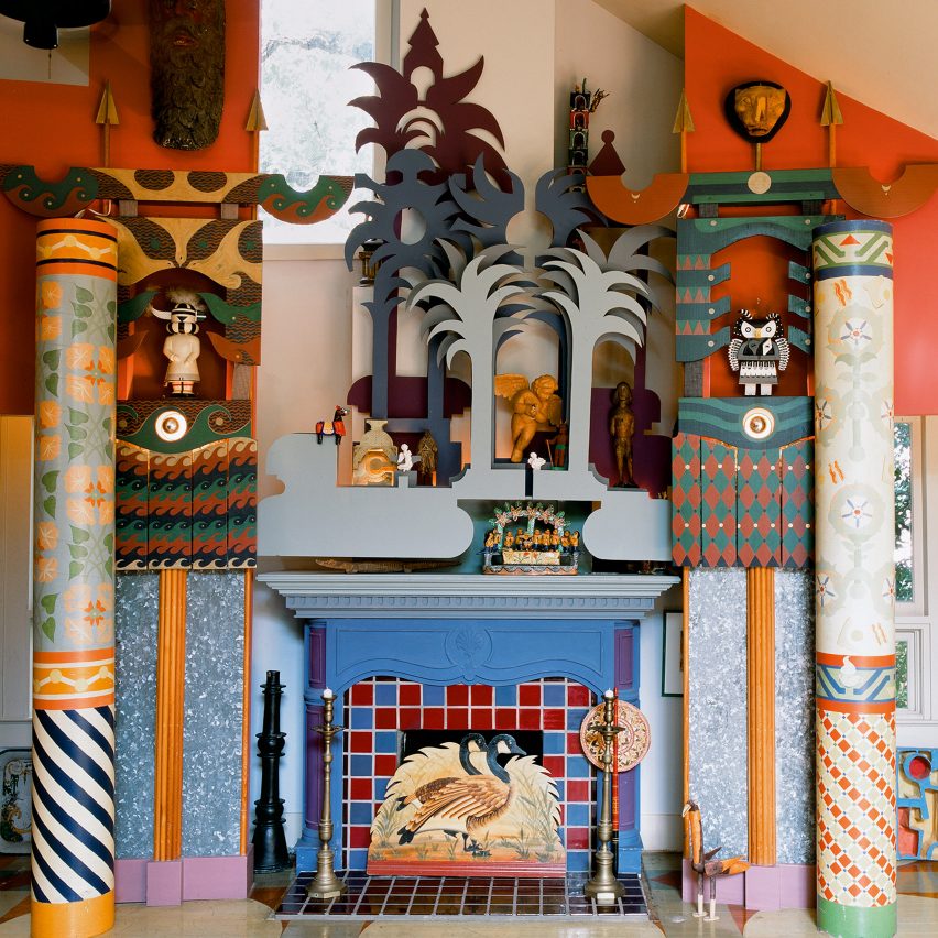
Charles Moore House, USA, 1962, Charles Moore
"Charles Moore is an enigmatic figure in the history of postmodernism. His Piazza d'Italia in New Orleans is now rightly celebrated as one of the defining projects of the movement. But his broader work is more difficult place, working with a variety of partners and under a range of practice names.
"At its core, however, are the houses he built or remodelled for himself as his teaching career saw him move from Yale to UCLA and finally to the University of Texas in Austin. Sadly only the latter survives as a a highly personal manifestation of his wonderfully exuberant yet carefully considered approach to architecture and interior decoration."
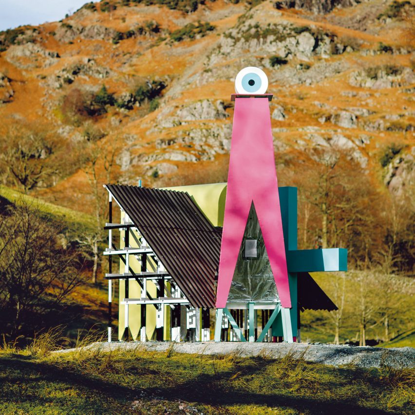
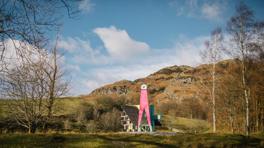
Ordnance Pavilion, UK, 2018, by Studio Mutt
"This was one of the first built projects by the British practice Studio MUTT. Commissioned by Lakes Ignite in 2018 as part of a celebration of the Lake District as a cultural landscape, it explores the visual language of the iconic Ordnance Survey maps to create a hybrid structure which makes a direct connection to the long history of eye-catchers in the British landscape.
"It also emblematises a 'do it yourself' attitude that characterises many of the buildings in this book, being designed, built and installed by the architects themselves."
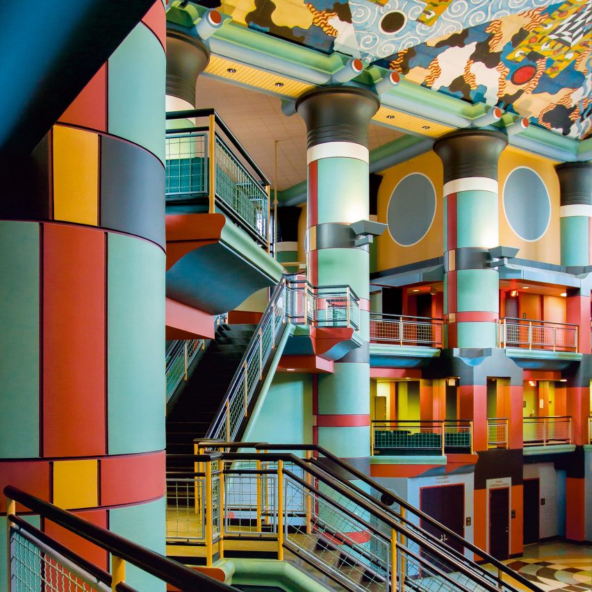
Duncan Hall, USA, 1996, by John Outtam
"John Outram is one of the great, largely unsung heroes of postmodernism. Trained at a time when modernism still carried all before it, Outram actually played an intriguing role in the very early history of what we would later know as high-tech.
"However, for Outram modernism had shorn architecture of its decorative, ornamental and mythic force, which he aimed at re-establishing in his work both as a designer and an incredibly powerful and original thinker. Rarely did Outram find clients who were prepared to go all the way on this extraordinary architectural journey. Duncan Hall is the exception."
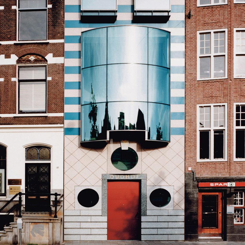
Oudhof, Netherlands, 1990, by Mart van Schijndel
"Postmodernism wasn't always about brash forms and stylistic exaggeration. It could also be sensitive and contextual, while still allowing for the possibilities of interpretation and re-working necessary to make an original architectural statement.
"It's a fine line, but one treaded with corresponding care and bravado by Mart van Schijndel in the Oudhof, which reinterprets the Amsterdam vernacular through the prism of archetypal postmodern tropes and design tactics, to create a building that's very much of its moment yet not disrupting the rhythms of the historic street."
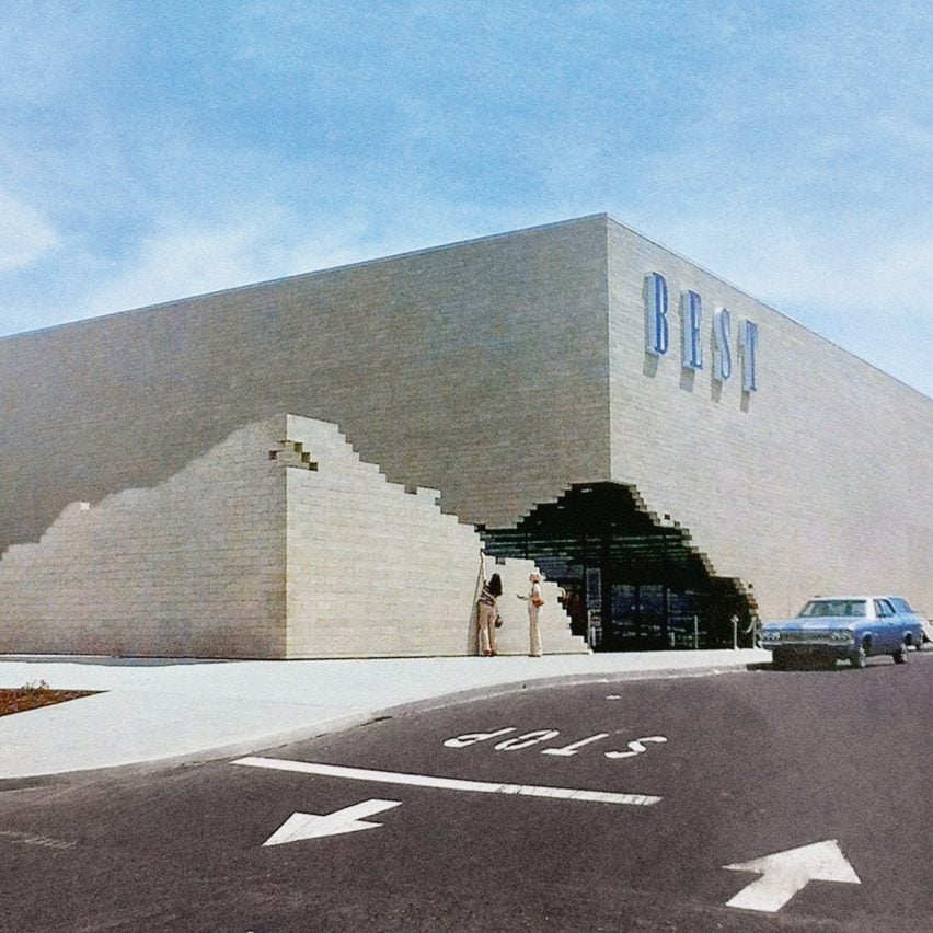
Best Products Showroom, USA, 1979 by SITE
"One of the iconic buildings – or series of buildings – of the postmodern era – and one of my personal favourites. Best was a consumer goods catalogue retailer which wanted to create a series of showrooms and in a move that would be unthinkable for an equivalent client today, commissioned the architect/artist James Wines and his experimental practice SITE to design them.
"Wines literally thought 'outside the box' in creating a series of stores where the box-like retail sheds were variously constructed as partially ruined, with facades lifting up or peeling off, or being taken back by nature. Sadly they no longer survive."
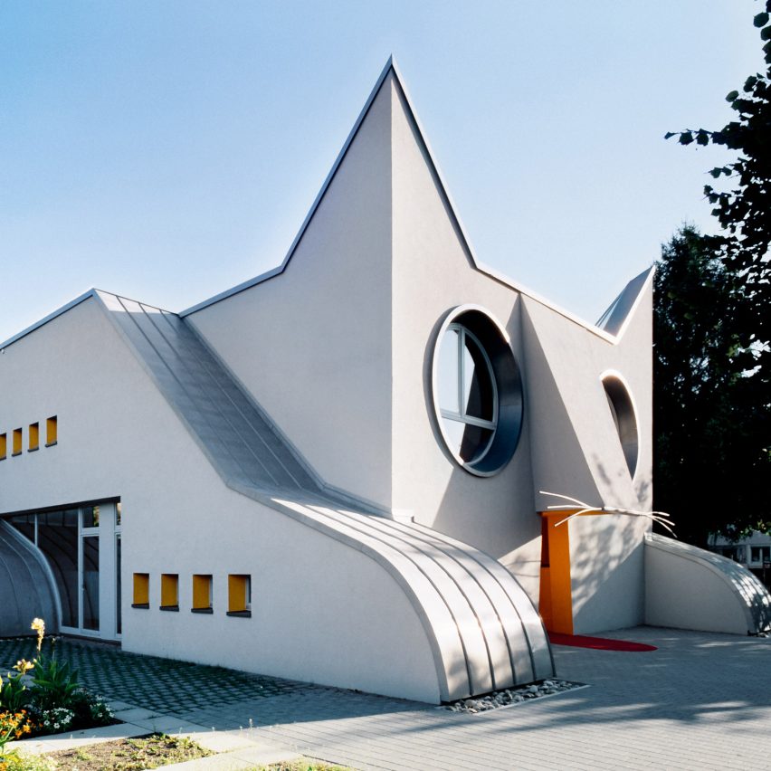
Kindergarten Wolfartsweier, Germany, 2002, by Tomi Ungerer and Ayla Suzan Yöndel
"There is a fascinating genre in postmodern architecture of buildings that look like animals, whether its an elephant, a fish, dog or in this case, a cat. It's the kind of thing that gets written off by those dreaded words applied to so much postmodern architecture: 'fun', 'quirky' or 'playful'.
"Yet this is to do much of it a massive disservice. To my mind, a building like the Wolfartsweier Kindergarten is a serious piece of architecture.
"When the primary users of a building are aged one to three what could be more compelling, appropriate and meaningful than a building designed to look like a cat?"

PPG Place, USA, 1983, by Philip Johnson and John Burgee
"While Philip Johnson's AT&T building in New York is the iconic postmodern office tower, his and John Burgee's One PPG Place in Pittsburgh is actually a far more successful example of a typology.
"Rather than look to the classical tradition, as mediated through eighteenth-century furniture as they had done at AT&T, for PPG Place the source was instead the gothic, in particular its late 'perpendicular' manifestation, which allowed an thrilling expression of the building's innovative structure and exaggeration of its verticality."
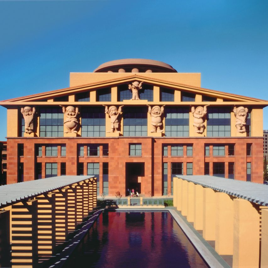
Team Disney Building, USA, 1986, by Michael Graves
"For many critics, this was when postmodernism went too far, when supposedly serious architects like Michael Graves and Arata Isozaki began doing work for that apparently crass purveyor of mass culture, Disney.
"They might have had a point when it came to Graves' Disney hotels, or his own Team Disney Building in Burbank where the seven dwarfs from Snow White and the Seven Dwarfs are repurposed as caryatids (although I love them). But certainly not with Isozaki's Team Disney Building in Orlando with its incredibly elegant composition of forms, colour and materials looking out across a lake."