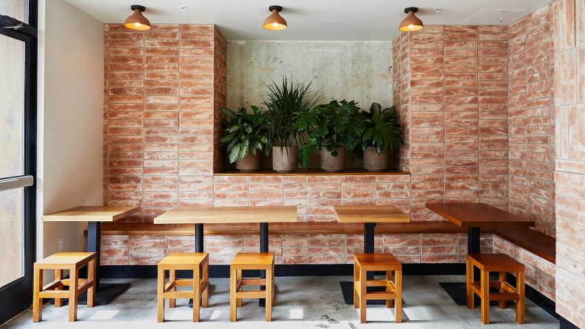
Wick Architecture & Design chose materials "that could be found on a construction site" to decorate this Mexican restaurant in Downtown Los Angeles.
Located in the Art District neighbourhood, Loqui occupies part of the ground floor inside a four-storey concrete building that is being converted into office, restaurant and retail space.
Local studio Wick Architecture & Design worked with LAND Design Studio to complete the 1,346 square foot (125 square metres) taqueria, which is the Loqui eatery's second location in LA.
The project provided an opportunity for the business to elevate its brand, according to the design studio.
"The first location in Culver City has always been a very 'mom and pop' style space, so the owners approached us about designing a second location that would be more forward in terms of executing a concept," said Wick Architecture & Design principal David Wick.
"The original location has earned a lot of street credit, but the new location captures the essence of the business and provides Loqui with an aesthetic branding."
Some original features and mechanics, including the concrete floors and ceilings and exposed plumbing, were left during the renovation. Others such as exhaust ductwork and electrical conduit were removed or rerouted and hidden behind newly constructed walls.
After the team stripped back the space, it added in simple materials that pay homage to Mexican design aesthetics.
"With an outer shell carefully carved out, the design team embarked on a plan to replicate some of the materials and visual elements of typical handcrafted Mexican structures," it said.
"The focus was on building something rustic that wasn't 'overthought or overwrought', resulting in material selections that could be found on a construction site, including terracotta brick, stained oak, olive stucco, and patinated steel."
An outdoor seating patio located at the restaurant's rear serves as its main entrance. Oak panels and patinated metal front the building's facade and the terracotta bricks used throughout the design are introduced here.
The pale red bricks front the entry gates, seating area walls and kitchen counter. They are arranged in alternating vertically and horizontally laid sections.
Olive-green stucco covers the walls of the restroom hallway to further add to the rustic look, while white tiles detailed with blue trim cover the kitchen walls.
Furnishings include stools, shelves, countertops and booth seating made of wood, potted plants and semi-recessed cone shaped light fixtures by FOLK Abigail.
Other restaurants in Los Angeles include a restaurant influenced by Moroccan and Turkish interiors designed by Studio Unltd and a rustic eatery outfitted with wood frames by local designers Jon and Maša Kleinhample.
Photography is by Nicole La Motte.
Project credits:
Design: Wick Architect and Design, Land Design Studio General Contractor: Analog
Structural engineers: Plump Engineering
Mechanical and plumbing engineers: Engineered Solutions
Electrical engineer: A+F Engineering
Tile: Wink Design Source
Terracotta brick: Arto

