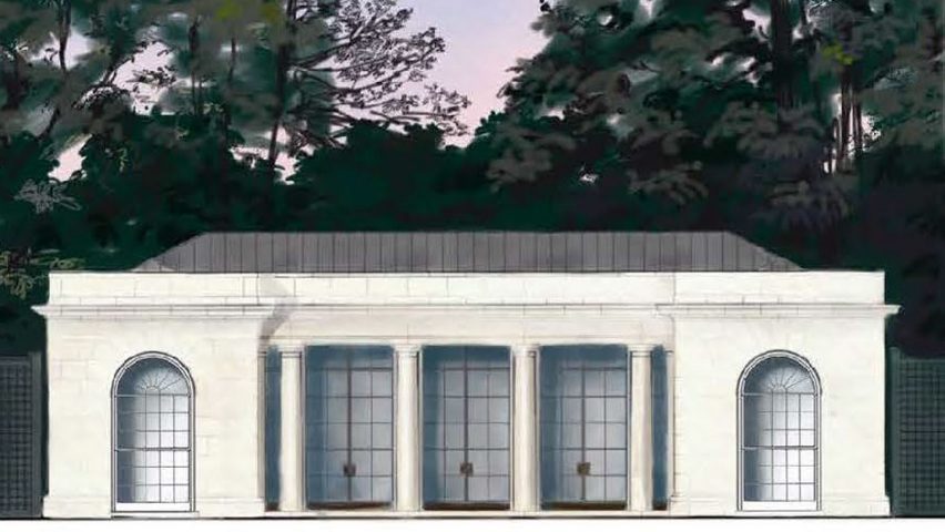
"Covid-19 superseded by a tennis pavilion?"
In this week's comments update, readers can't fathom why Melania Trump felt it a good time to show plans for the US presidential residence's new tennis pavilion.
Underhand serve: readers are baffled as to why Melania Trump chose now to reveal that a tennis pavilion is being built in the grounds of the presidential residence. It has been designed in a neoclassical style similar to The White House.
"This is a joke, no?" asked Geoff Bob. "Otherwise, unbelievable tone-deafness. Covid-19, economic collapse, her own husband's second term hopes – all superseded by a tennis pavilion."
Frank Hoffman agreed: "Imagine if Michelle Obama did this. The Fox News crowd howled about her vegetable garden for Pete's sake. Where's their outrage now, as Melania 'unveils' a whole new permanent structure in her last year at the White House while resources need to be dedicated to confronting the coronavirus pandemic?"
"I mean, it's fine," replied Jon. "It's perfectly suitable and contextual, etc. The timing, however, is not so great, as many others have pointed out. It's the same kind of tone-deafness as the 'I really don't care' jacket that the first lady wore during another national crisis, albeit less egregious."
Fix W had a different issue with the project: "Copying 200 year old designs. This building looks as antique as their policies."
As did this reader:
Are readers being harsh? Join the discussion ›

Sex and the city: British writer Caroline Criado Perez has written a book claiming that cities haven't been designed to suit the lives of women. Not everyone agrees though.
"I agree with this completely," said Sim on one hand. "Last week the design for the longest cycling bridge in Europe was revealed, while it was hailed as a triumph, as a woman I remember all the evenings and nights I would be cycling home alone and the idea of this bridge scared me."
"Come on!" replied Architecte Urbaniste. "This whole man versus woman urban design discussion is missing the point. Most architecture/urbanism is designed by teams of people containing both men and women. I've seen groups of women designing completely unliveable urbanism too."
"Of course there are problems with zoning," offered Marcus Cantu. "But reducing those complexities down to sex through a regurgitated boilerplate narrative is just lazy and boring. We live in an amazing time where if 'architecture and design does not work properly for females' there is nothing stopping females from designing architecture that does work for them."
"My take is that we live in our time," said Sir Fex. "This new narrative of complaining or vilifying all the earlier paths the human efforts have taken us is not a very good idea. Imagine in 3000AD how they will think of our 2000s human. Life is ever evolving. Make your mark and let's progress."
One commenter was less diplomatic:
Do you agree with Perez? Join the discussion ›

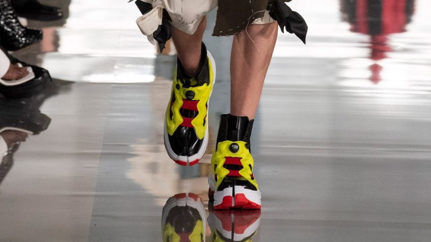
Toe's a crowd: commenters aren't convinced by a collaboration between Parisian fashion house Maison Margiela and sportswear brand Reebok – a high-heeled, split-toe trainer for the era of the "cyber-industrial revolution".
"The digital age?" laughed Geoff Bob. "Seems so yesterday."
"Doesn't mashing up designs from 1988 and 1994 make them 25 years late to explore anything futuristic?" replied Rd. "Or do they mean the cyber-industrial revolution has already passed and it's meant as a retroactive nostalgia?"
Guy Galt was also amused: "I've seen this type of toe before – on camels."
"We no longer know how to create new shoes," said Archiplain in dismay. "Frankly Reebok, it is not very beautiful."
This reader was particularly unkeen on the design:
Would you wear the shoes? Join the discussion ›

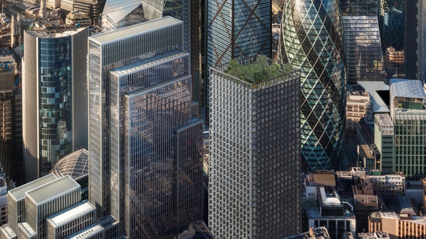
Stony response: Amin Taha is defending the conceptual stone office block he designed with structural engineer Webb Yates after readers called it boring. The aim was to create a cheaper and more sustainable alternative to concrete equivalents.
"The discussion is all about the material and nothing about the boring design," said Egad.
"The tower is a simple, sober yes boring design for the purpose of comparing like for like against standard commercial offices," replied Amin Taha. "The intention of the study is to compare cost, programme, build-ability and sustainability. Stone is after all only a material not a style and therefore free to use how one wishes."
Jay C White Cloud agreed: "Readers need to understand this was a study in architectural modality of means and material application! It does not have to be 'boring' at all if done with imagination and effective knowledge of the materials!"
"I'd rather call it straightforward rather than boring," added K Anderson. "It's an elegant and well-proportioned tower while taking advantage of the material's natural qualities and production process. Gold doesn't have to glitter."
This reader was a fan:
Are you impressed with the concept? Join the discussion ›