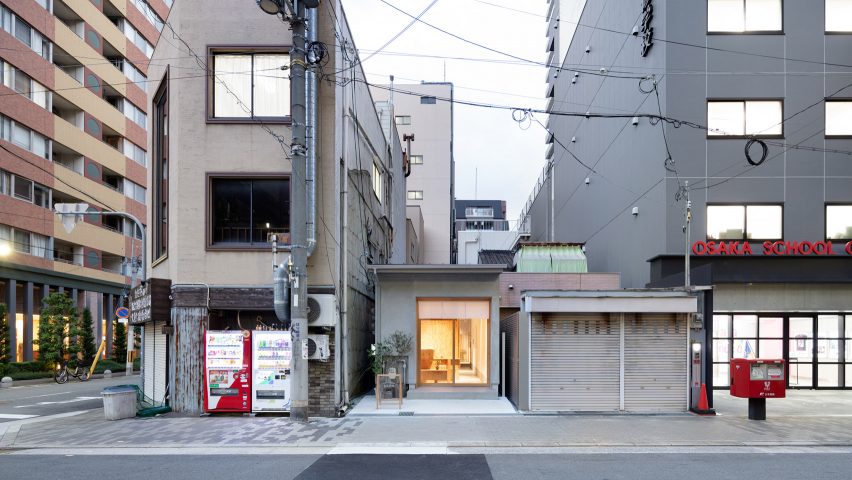
Land beauty salon is tucked in skinny slot between Osaka shops
Design studio Sides Core was charmed instead of challenged by the narrow floor plan of Land beauty salon in Osaka, Japan, which makes the most of its slender proportions.
Land is run by a married couple and is situated in Nishi-Ku, a ward of Osaka that is home to a number of trendy fashion and homeware boutiques.
The salon measures 59 square metres but is squeezed onto a narrow site between two buildings.
Osaka design studio Sides Core wanted to draw attention to in its interior design scheme for the space.
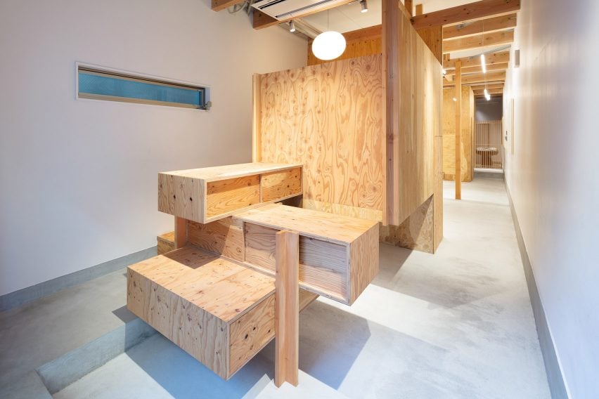
A passageway has been created on one side of the salon, allowing passersby on the street to see through the deep floor plan to the rear of the space.
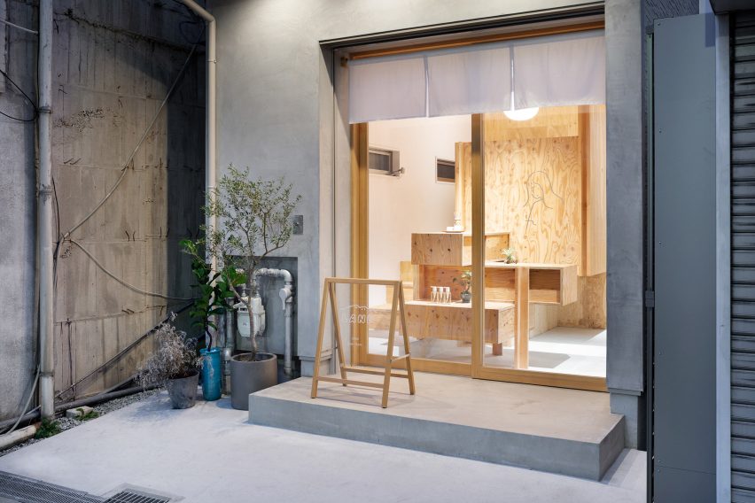
The facade of the salon has also been fitted with a noren, a traditional Japanese fabric divider that's cut with slits so that people can easily pass through it.
"Clients duck under the curtain and enter, feeling psychologically drawn down the passageway, further into the space," explained the studio.
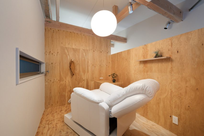
Cosmetic eyelash treatments will be carried out in a boxy timber volume that's been erected in the entryway.
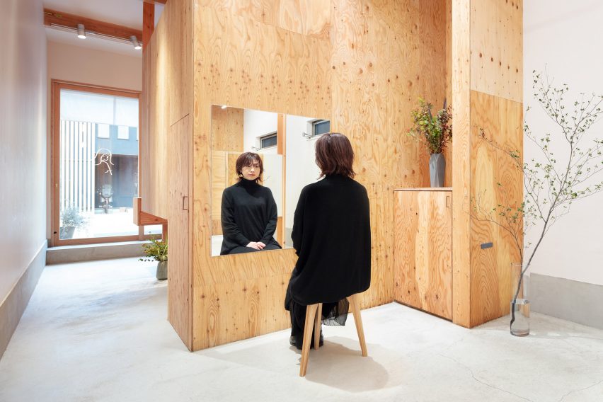
Accessed via a short flight of stairs, the floor of the room has been raised 90cm to create a sense of separation from the main body of the salon and provide clients with privacy.
At its centre are a simple white reclining chair and a spherical lantern.
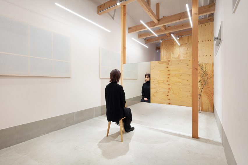
The volume also helps conceal the salon's four hair-cutting stations, which are divided by horizontal timber panels.
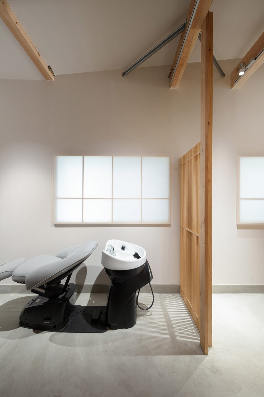
Behind lies the shampooing area and a space for head massages, closed off by slatted wooden screens.
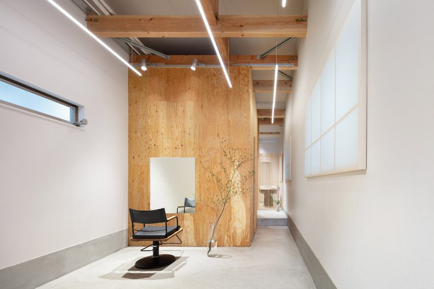
The salon has been finished with an overall minimalist aesthetic.
Just a handful of LED strip lights have been suspended from the ceiling and potted plants have been sparingly dotted across the floor.
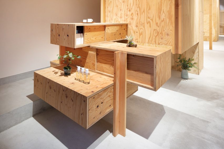
Rectangular wooden boxes are irregularly stacked in the entryway to form a service counter, inbuilt with drawers for grooming products.
The studio also intended it to loosely resemble a stepped tansu – a type of mobile storage cabinet from Japan.
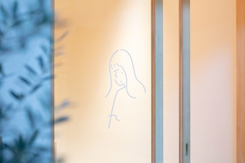
Illustrator Yu Nagaba create dLand's logo and a hand drawn-style decal of a young girl that has been applied to the front window.
"Framed by the facade's sliding glass doors, it seems to float in Land's passageway space, welcoming visitors in – the literal face of the salon," added the studio.
Sides Core was established in 2005 by Sohei Arao and Sumiko Arao.
Land joins a roster of beauty parlours that Sides Core has designed. The studio overhauled a hairdresser in 2016, incorporating a small library that could display the owner's personal collection of books and vinyl records.
Back in 2015, it also created a hair salon where the styling mirrors are suspended from the ceiling by a system of clamps and cables.
Photography is by Takumi Ota.