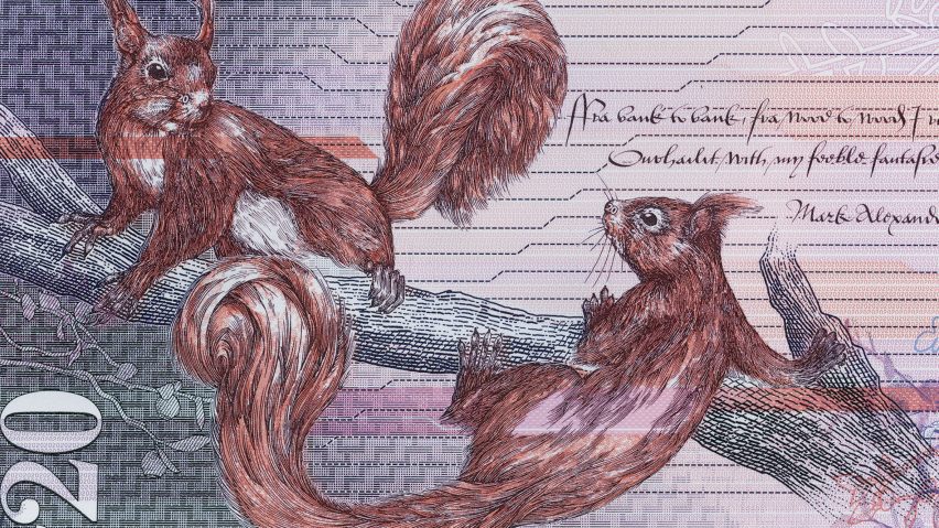
Royal Bank of Scotland's £20 note is designed to celebrate nature and culture
The Royal Bank of Scotland has launched the latest of its Fabric of Nature banknotes, featuring a design that aims to provide a more "unusual" representation of the nation.
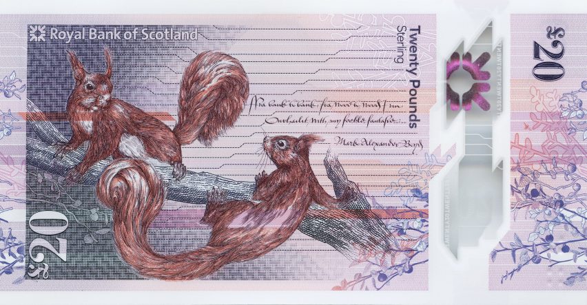
The £20 notes are the third in the series developed by a team of Scottish creatives comprising Edinburgh design agency Nile, Glasgow studio O Street and currency specialist De La Rue.
Each aspect of the design, from the typography to the illustrated animals and bespoke-designed textile backgrounds, represents something meaningful to the people of Scotland.
Nile conducted a thorough investigation to find out what the Scottish public would like to see on their banknotes, with over one thousand users contributing their opinions through co-design sessions and online communities.
"The idea of creating stories that are a bit more unusual and avoiding pictures of thistles and men with beards was a key finding from the research," O Street co-founder David Freer told Dezeen.
"The theme of nature and the cultural elements that surrounds it emerged as something that people in Scotland are particularly proud of," he added.
The Fabric of Nature concept was developed and realised through a collaborative process involving other creative agencies including Graven, Timorous Beasties and Stuco.
Glasgow-based Timorous Beasties illustrated the red squirrels featured on the back of the note. They also created a pattern featuring Scotland's infamous biting insects called midges that is visible under ultraviolet light.
O Street worked on the overall layout for the note and collaborated with the design team at De La Rue to ensure it conformed to the exacting security criteria demanded of currency.
"A bank note is an opportunity to communicate to a huge audience, so it's a really enormous responsibility," said Freer.
"Normally with graphic design, even if you're creating a logo or a brand, it's maybe going to be around for 10 or 15 years," he added, "but a bank note is going to be in everyone's pocket for 30 or 40 years, so you've got to get it right."
The project was initiated following the Bank of England's decision to switch from paper to polymer notes in 2016, which resulted in a change in ATMs and other infrastructure used to process cash.
The Royal Bank of Scotland's bank notes had remained unchanged for 30 years, so the bank appointed Nile to develop a series of notes that celebrates the best of Scottish culture and heritage.
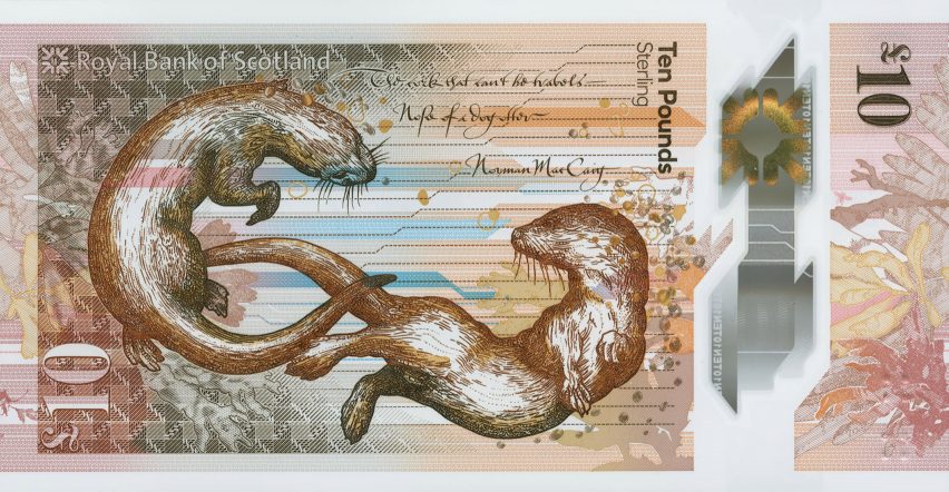
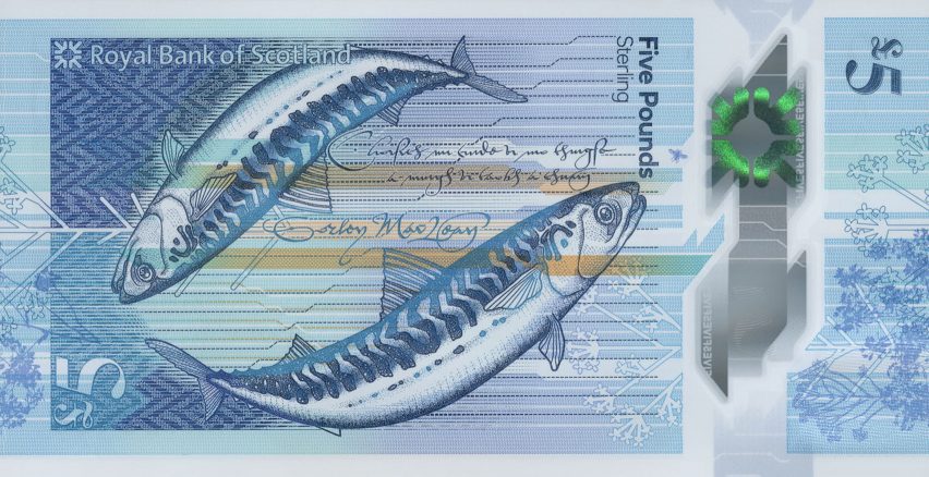
The £5 note was the first from the series to launch in 2016, followed by the £10 note in 2017, with the new £20 note being released into circulation on 5 March 2020.
The "Fabric of Nature" theme is explored through the creatures depicted on the various notes.
The mackerel on the £5 represent the sea, the otters on the £10 the coast, and the squirrels the forest. The design of the £50 note will include a bird for the air.

As with the rest of the notes in the series, the £20 note features a woman from Scotland's past who the designers felt has been overlooked.
In this case, the portrait is of entrepreneur and patron Kate Cranston, who commissioned Charles Rennie Mackintosh to create her famous Glasgow tea rooms in the late 19th century.
Other bespoke details incorporated into the design include the exclusive tweed pattern created for the background by textile designers Alistair McDade and Elspeth Anderson, along with native flora used to dye Scottish tweed that was illustrated by Stuart Kerr of design studio Stuco.
"This is something that people will be living with and looking at for years so it's important that there's a depth of story in there," Freer explained.
"There's a big trend for immediacy in a lot of design today but this is an example of slow design," he added. "People will hopefully still be discovering new details within these notes in ten years' time."
The Bank of England's latest £20 notes launched in 2019 feature David Chipperfield's Turner Contemporary gallery and a portrait of artist J M W Turner, while Norway's 50 and 500 kroner banknotes feature pixellated images of the country's coastline designed by architecture studio Snøhetta.