In this week's comments update, readers are debating how homes will change after the coronavirus pandemic ends and are divided over the Galleria department store in South Korea.
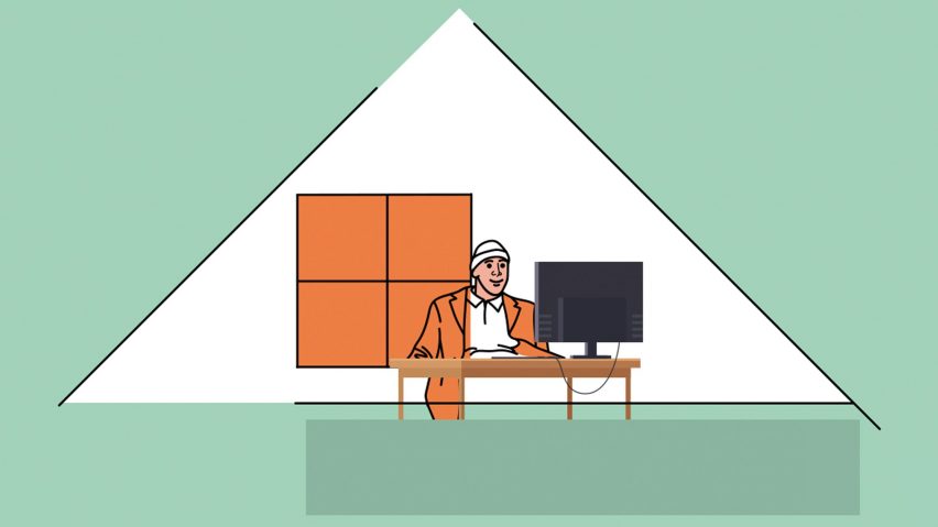
Panic room: Ukrainian architect Sergey Makhno has predicted how our homes will change once the coronavirus pandemic is over, but not everyone agrees.
"I find this article so sad and pessimistic," said Imenda. "We should use this time to think about how to build a better future, not how to build a scary house that reminds us every day that something terrible might happen."
Gerard McGuickin felt similarly: "Most of these 'predictions' read like a list for those with money and means: houses (not apartments), bunkers, self-sufficient power and water, filtration systems, and growing what you eat. Sustaining such notions for a world population that is increasingly moving to urban centres, seems ludicrous."
"This article seems to be about what some affluent people may want to do to their homes after the coronavirus outbreak," agreed Dominic Glover. "What about people who cannot afford to live in a private, spacious, detached home with a garden, a cellar, a separable office, and sophisticated environmental controls?"
"'Life after the Covid-19 outbreak will never be the same as before.' It will be the same. As many times before," concluded Salamoon.
This reader highlighted two potential changes though:
Will our homes be the same after the coronavirus outbreak? Join the discussion ›
Window shopping: readers are divided over the recently completed Galleria department store in Gwanggyo, South Korea. Designed by architecture firm OMA, the building has a stone facade with a controversial glass passage cut into it.
"At a distance it looks like a musty old tub of mouldy yogurt that's been sitting in the back of the fridge for a year," said Vee. "The shiny bits are the pools of water that separate from the goop and rise to the surface, glinting in the lonely cold light of the refrigerator."
Geof Bob was less harsh: "Hardly beautiful or elegant, but eye-catching, intriguing, possibly fun for the kids, and above all, inviting."
"It's hideous," added Alfred Hitchcock. "But maybe that's appropriate and what the client and local population wanted."
Bubba10 agreed: "This could have been just another forgettable glass and concrete box. I like it and it would definitely make me want to go into the store, which would seem to be the main goal."
This commenter was reminded of something else:
Are you impressed by the Galleria department store? Join the discussion ›
Box clever: Danish startup Stykka has developed a simple flat-pack desk that can be assembled out of three pieces of folded cardboard, but readers aren't convinced it is a good solution for those working from home.
"Don't tell me that you don't have a normal desk in your dining room," said Salamoon. "There is no need to spend more money on this and add more unnecessary work to delivery companies."
Love Your Hair agreed: "If I'm not repurposing cardboard boxes I have at home and I have to order this cardboard desk, why don't I just order a regular one?"
"A sturdy, beautiful desk that can be resold would be much better for the environment," suggested Robin. "It would even survive a spilled coffee."
Alex was also worried about the environment: "This desk is made of custom cut cardboard, that means material made only for this project, machine cut only for this project, shipping worldwide of a commonly available material – so yes contributing to more global pollution."
This reader had a thrifty idea:
Would you benefit from a cardboard workstation? Join the discussion ›
Green with envy: a home in Porto featuring original stone walls encased in green metal mesh and plenty of salmon pink has won over most, but not all readers. The house was remodelled by architecture studio Ottotto.
"This recent fad for a salmon-pink and emerald-green colour palette is vomit-inducing," criticised Alfred Hitchcock. "Whoever thought it was a good idea? It might look good for a plate of food, but to live in... "
Felix Etienne-Edouard Pfeifle disagreed: "Yes, the roof slope over the bed on the mezzanine looks problematic and yes, salmon pink and emerald green splashed throughout may not be something I would live with, but the project is beautifully captured here, reminiscent of 1930s Prague."
"Looks all very well thought out," praised Pierre Van Sice. "Combines design, comfort, lots of style and light. Even on a rainy day I picture myself enjoying the fireplace with the garden view. Love it!"
Roger was also impressed: "Even in a small house one can feel inside a cathedral sometimes. Great project, congrats!"
As was this commenter:
Are you a fan? Join the discussion ›

