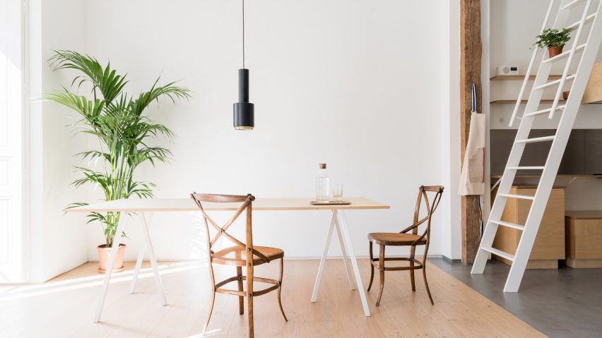
Architect Leticia Saá has woven historical features such as exposed brickwork and wooden pillars into the minimal interior of this open-plan apartment in Madrid.
Located in Madrid's Lavapiés neighbourhood, the two-bedroom apartment is spread across the top floor of a three-storey residential building that dates back to 1900.
The apartment had been unoccupied for 35 years prior to its renovation, which has been carried out by local architect Leticia Saá.
Its owners – a young couple – had previously lived in a tiny and cluttered flat, so were keen for their new home to feel large and spacious.
As a result, Saá has given the 130-square-metre apartment a largely open-plan layout where the bathrooms are the only completely private areas.
Social spaces such as the living room, kitchen and home office are located on one half of the plan, while the bedrooms and bathrooms are on the other.
The two sides are linked by a hallway which wraps around the building's stairwell and central courtyard.
To soften the appearance of the interior, which has been given a minimalist fit-out, Saá sought to incorporate some of the building's original quirks.
Time-worn brick walls, wooden beams and pillars have been preserved, as well as a brick fireplace. Surrounding surfaces have been freshened up with a simple coat of white paint.
" To create a space which exudes calm and serenity inside the hustle of the city, we wanted to use a minimalist but warm decorative and furnishing style," explained Saá.
" The architecture of the 1900s had a very strong impact in the historic city centre, so we wanted to recover the building techniques of that period and reveal them in some parts of the house."
To enhance the feeling of the apartment being one large, continuous space, Saá wanted concrete flooring to appear throughout the interior. This is in exception of the living room, where wide oak floorboards have been installed instead.
The change of flooring here is meant to signal a change in the mood of the space.
"I wanted to create a cosy and natural environment and make the living room different from the rest of the apartment," Saá told Dezeen.
The entrance hallway has been conceived as transitional space between the inside and outside. An array of houseplants sit in one corner, and a small interior window has been punctuated in a wall to create the sensation of a patio or a street.
The washbasin of the bathroom has been placed outside of its door, intended to act as a visual barrier between the guest quarters and the rest of the home.
"It was also placed here because of the lovely natural light which comes across the window," Saá said.
In the kitchen, which is located between the hall and the living room, Saá has continued the pared-back aesthetic. The space features handle-less plywood cupboards, a stainless-steel backsplash and a breakfast island with a white-steel frame.
A cardboard lamp by Dutch design studio Waarmakers hangs directly above.
"We consider [the kitchen] as an integrated element in the house," added Saá, "That's why the island has this light appearance, and only an induction cooker appears atop the counter."
A mezzanine level that's used as an extra guest room or reading corner sits above the kitchen and is accessed via a step ladder.
A home office and utility space are also located opposite the kitchen.
Like Saá, many architects opt to keep historic elements – White Arrow preserved ornate door frames and coving in its renovation of an apartment in Berlin, while TAAB6 conserved barrel-vaulted brick ceilings in its overhaul of a Barcelona townhouse.
Photography is by Iñaki Domingo of IDC Studio.

