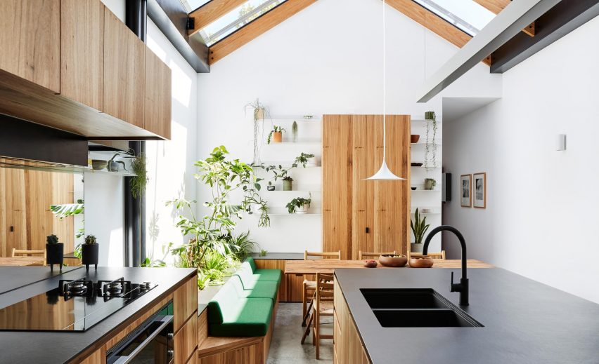
Austin Maynard Architects has transformed the quality of light inside a narrow Melbourne house, by creating a greenhouse-like space at its centre.
The Melbourne-based studio made only small changes to two-storey house Newry, but has made it feel much more spacious and bright.
No rooms were moved around, instead new openings were made to allow natural light to penetrate as much of the building as possible.
The most obvious new opening is a glass roof above the dining area, at the centre of the floor plan. It makes the space below feel like a conservatory, an effect amplified by the addition of an indoor planting bed.
Austin Maynard Architects had considered adding a simple skylight, but realised they could be more ambitious. By getting rid of a "leaky roof deck", enough space was made for four glazed roof panels.
Sliding awnings provide shade here when required.
"The fundamental concern with most terrace houses is a lack of natural light," explained the studio, which is led by architects Andrew Maynard and Mark Austin.
"This problem is generally resolved with some form of lightwell, open to the sky with some kind of garden greenery at the base," said the team.
"At Newry there is no lightwell, no 'box'; the garden greenery is inside, integrated within the space, exposed and easily accessed beneath a glass roof that allows for an abundance of natural light."
Another opening was required to make this space possible – removing a wall that previously separated the dining space from the living room and kitchen. This gives a more open-plan layout to the ground floor.
The old staircase was also replaced with a more lightweight structure, made from perforated metal. Not only does this allow more light through, it also creates a little bit of extra floor space on the upper level.
Room at the front and rear of the house were largely left intact. The location of the bathroom, behind the kitchen, wasn't considered ideal, but it wasn't in bad condition. So it was felt that the living space was the priority.
The clients also invested in a Tesla battery, to make sure they are both efficient and sustainable when it comes to energy use.
"The clients were aware of their limitations and were prepared to pick their battles," said Austin Maynard Architects.
"Instead of spending their tight budget thinly across the entire site, and compromising everywhere, they chose to completely subvert one area, the main living space, and do it very well."
Blackbutt timber joinery creates a cohesive aesthetic through the new living space, while flashes of bold colour help to add character.
A bench seat with bright green upholstery matches the colour of carpet and the balustrade on the first floor, while the hallway carpet is the same vibrant shade of burgundy as the hallway carpet.
"These were largely thanks to the client's great taste," added the architects.
Austin Maynard Architect has previously renovated several Melbourne properties, including the home and studio of founder Andrew Maynard. Other projects include King Bill and RaeRae House.
Photography is by Tess Kelly.
Project credits:
Architect: Austin Maynard Architects
Project team: Andrew Maynard, Mark Austin, Ray Dinh
Builder: Moon Building Group
Engineer: OPS
Building surveyor: Code Compliance
Energy consultant: Efficient Energy Choices
Land surveyor: Dickson Hearne

