Tom Kundig describes 10 highlights of his architecture career
Tom Kundig has selected his 10 favourite projects, including a house in Rio de Janeiro and a hillside winery in British Columbia, ahead of the release of a monograph detailing the American architect's work.
Called Tom Kundig: Working Title, the publication details 29 projects designed by Kundig, a principal of Seattle architecture office Olson Kundig.
The book, which will be released next month by publisher Princeton Architectural Press, presents each with photographs, drawings and sketches that offer insight into his working process.
Read on for Kundig's explanations of his 10 chosen projects:
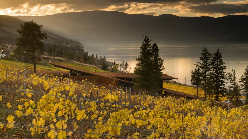
Martin's Lane Winery, Kelowna, British Columbia, Canada, 2016
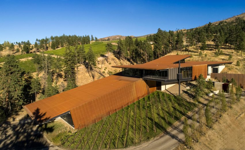
The owner of this winery had an ambition to produce the best pinot noir in the world, and he wanted a facility that would communicate both the world-class product and its gravity-fed method of production.
The building is rectangular with a central "fracture" down the middle; the production side of the building follows the direction of the site, using the downhill slope for the gravity-flow process, while the public side cantilevers out into the vineyard, following the horizon line.
This building respects the delicate nature of the winemaking process, and the way it fits into the landscape makes logical sense. My favorite element of the project is the magic that happens when the functional side and the poetic side come together in that way. This project is also the cover image of my new book.
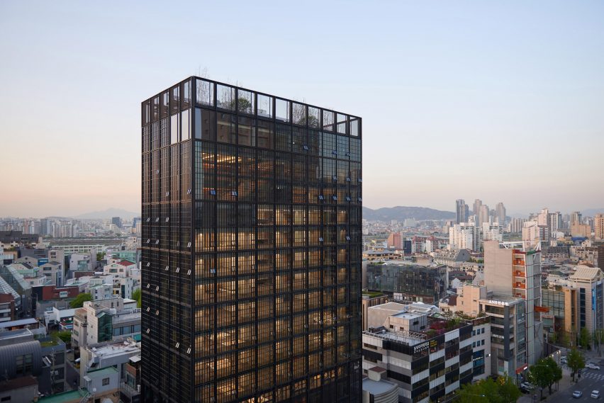
Shinsegae International, Seoul, South Korea, 2015
This is a special project for me, as it was my first high-rise tower. The site is on a busy road in Gangnam-gu, one of the largest districts in Seoul, and very visible to the surrounding neighborhood.
Shinsegae International is one of Korea's oldest and largest luxury fashion brands, and this tower is their new headquarters and flagship facility, so it was very important that the building stand as a representation of their business.
There are a number of nods to the fashion industry throughout the design, but one of the most prominent elements are seven custom, eight-foot-diameter steel wheels that open and close 35-foot-tall external panels. These kinetic components allow users to alter the exterior of the building throughout the day, animating the facade and engaging with the surrounding district.
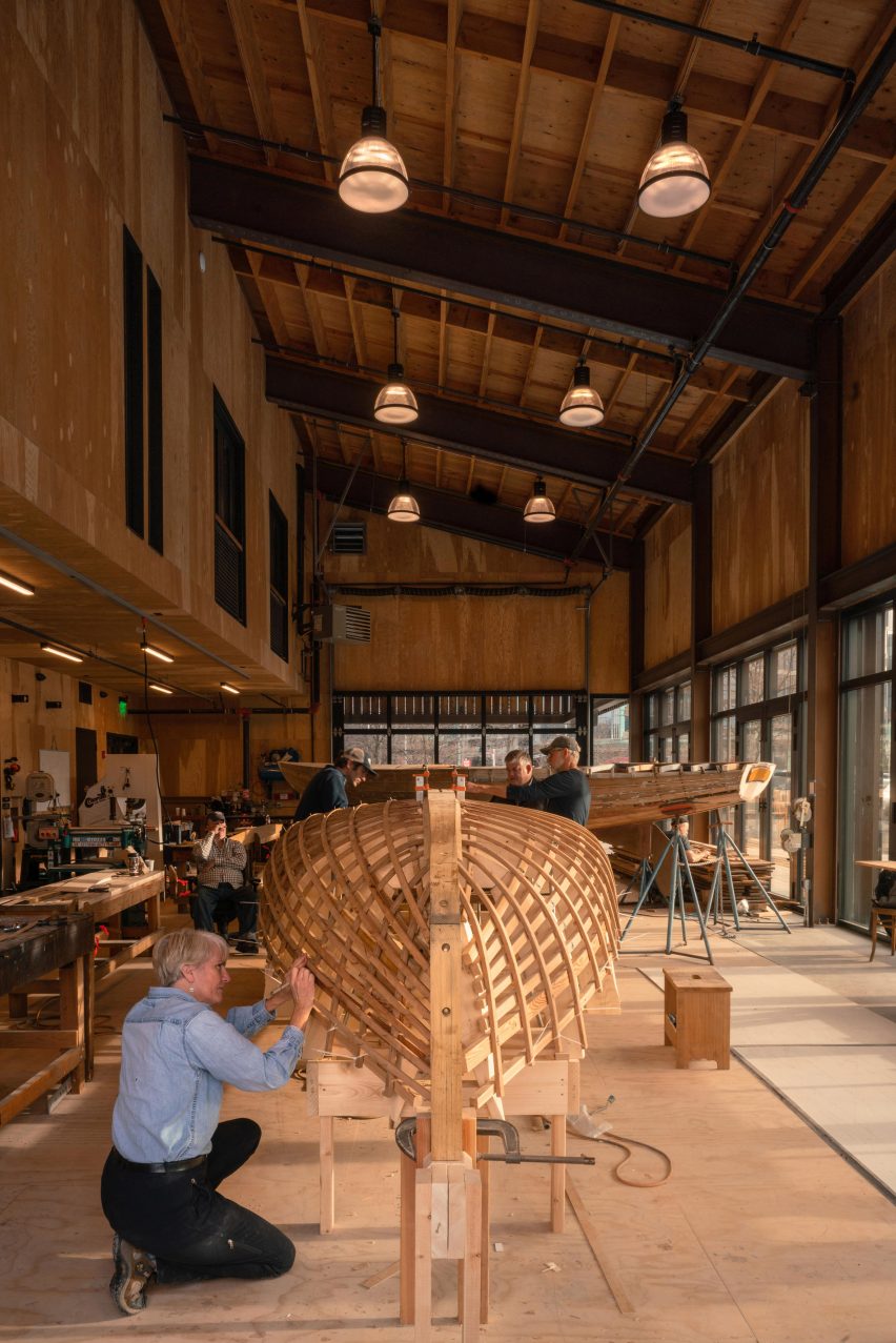
Wagner Education Center at The Center for Wooden Boats, Seattle, USA, 2019
This building is essentially a boat shed – and, like a boat shed, it's more about the boats than about the architecture. The architecture is deliberately simple, following the established language of a historical boat shed, while providing flexibility for the many activities that the Center for Wooden Boats hosts.
The building itself is just an armature that supports the display, restoration and appreciation of wooden boats. The main workspace includes double-height window walls to literally display ongoing work in the shop, while a wooden shutter system lets the users control the interior light levels.
This shutter system mirrors a central tenet of sailing: you have to work with natural forces and make adjustments to optimize performance.
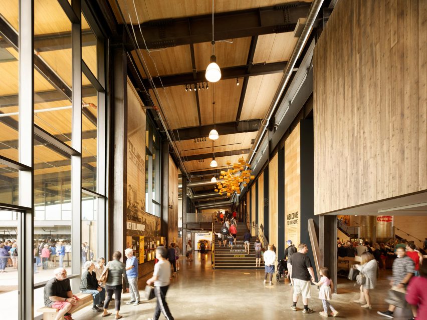
Tillamook Creamery, Tillamook, USA, 2018
The design of Tillamook Creamery reflects the history of the area and the importance of the local dairy tradition. I imagined the design in the spirit of a barn: a rational and flexible building that responds directly to the surrounding climate.
The building tells the story of Tillamook's farmer-owned cooperative through interactive and educational exhibits, as well as through the warm, simple materials palette and exposed structure.
The dining experience also centers around gathering, spilling out into the surrounding landscape as another way to celebrate the Tillamook community.
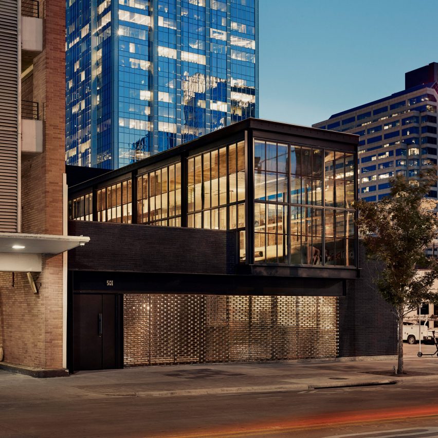
Comedor occupies one of the busiest corners in Austin's central business district, and it intentionally engages that corner position in order to frame an interior courtyard.
While the building's exterior creates a recognizable landmark on the street, the dining experience turns inward to insulate guests from the activity the street outside. Within the restaurant, you're aware of the presence of the city beyond, but protected from it.
The shape of the building further creates a protected internal courtyard, where guests can enjoy Austin's climate in a sort of urban oasis. Four retractable guillotine window walls – operated manually with hand cranks – open the dining room completely to the courtyard, allowing the activity of the restaurant to flow between spaces.
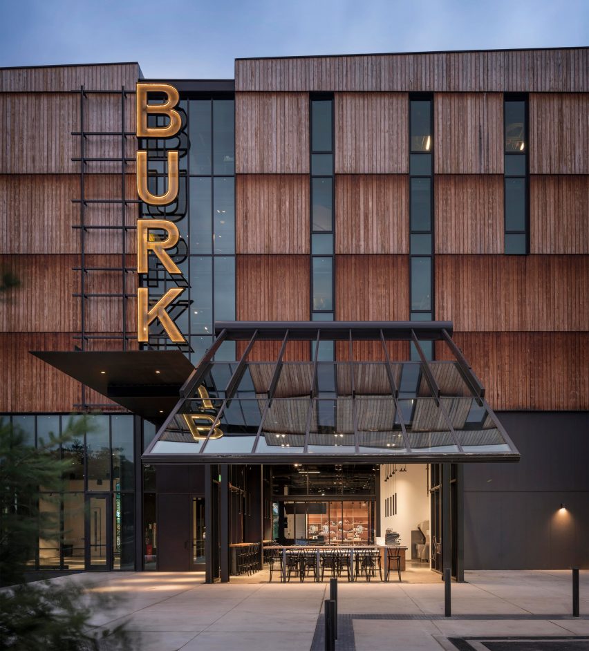
Burke Museum of Natural History and Culture, Seattle, USA, 2019
The Burke Museum of Natural History & Culture is the oldest public museum in Washington with a collection of over 16 million artifacts and specimens; in addition to outgrowing its existing building, the Burke wanted to try a new strategy for displaying its collections.
As a result, the building is extremely transparent and porous, with extensive visual connections between interior and exterior, as well as between guests and traditionally hidden "back of house" research spaces. The new building also had to predict the Burke's somewhat unpredictable future as collections continue to grow and exhibits and storage needs change over time.
To provide flexibility for future changes, the architecture of the new Burke Museum is deliberately rational and simple, it can be rearranged and reorganized as needed.
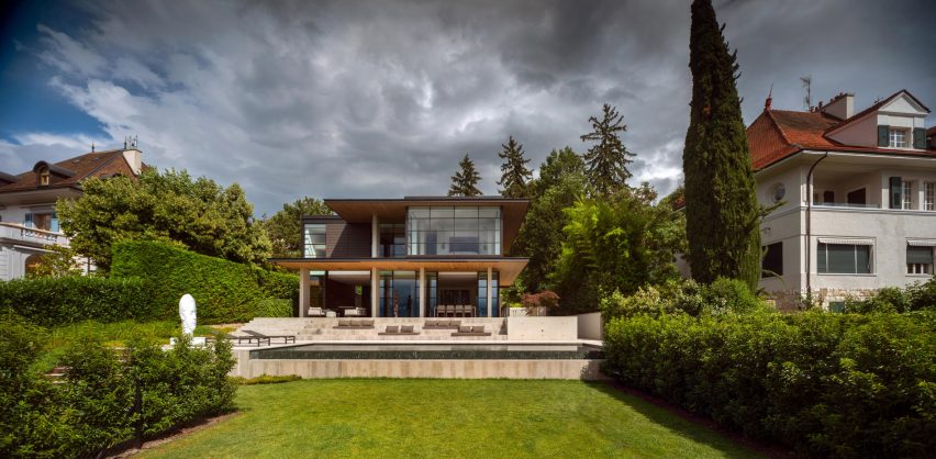
Chemin Byron, Geneva, Switzerland, 2017
This private home represents a modern insertion into a historic area outside of Geneva, Switzerland. The design intentionally responds to the proportions and scale of the surrounding neighborhood while reflecting a modern architectural language.
I worked to carefully integrate the home with the steeply sloping property, allowing the building to fit into the landscape rather than sitting on top of it. Chemin Byron was also my first project in Switzerland, which was exciting because I'm a Swiss citizen.
I spent a few years in Switzerland during my childhood and have important family connections there. It's my homeland in a sense, and I was excited to be returning home for this project.
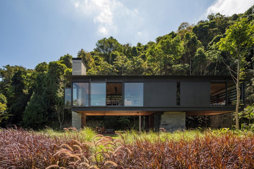
Rio House, Rio de Janeiro, Brazil, 2018
My clients on this project – my first in Brazil – wanted a small house where they could live together in a large landscape. Like me, they're the kind of people that would rather be outside than inside.
The home is deliberately small and hovers above the jungle, providing some separation from the humidity and insects while remaining very open to the environment.
Ultimately, the architecture provides a platform to enjoy the beautiful landscape, both smaller and more intimate refuge views back into Tijuca National Park and the larger horizon views into the distance.
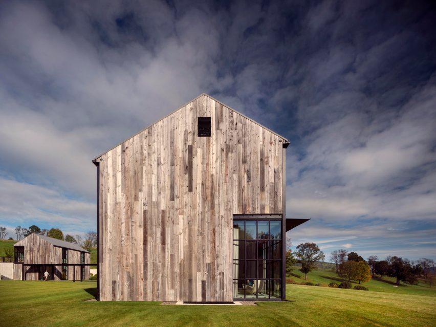
Millerton Farmhouse, Millerton, USA, 2016
This project presented an interesting design opportunity, because my clients wanted a space where their large, extended family could gather together but that would also feel welcoming for smaller groups or couples, or even individuals traveling alone.
As a result, the home's multiple buildings and covered walkways establishes a family compound that changes scales easily depending on how much of the family is gathering.
The design language is intended to reflect a modern interpretation of the vernacular farm architecture of upstate New York, with materials that harmonize with the surrounding landscape.
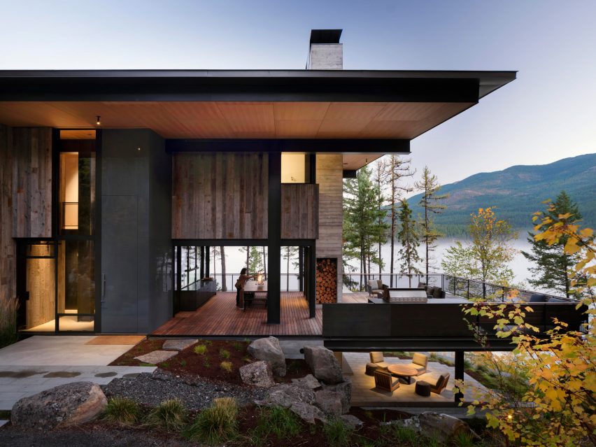
Dragonfly, Whitefish, USA, 2016
This project is intentionally designed to disappear into the mixed forest of western Montana, sitting lightly on the land like a dragonfly.
The proportions of the home's openings are a continuation of the scale of the forest and the openings between trees.
Likewise the roof establishes a horizon line that complements the boundary of the lake beyond. Dragonfly seems to grow out of the forest as it overlooks the lake below – celebrating its ecotone condition, but quietly, respectfully.