Readers are debating Weston Williamson + Partners' plans for a social-distancing workplace and sharing their thoughts on other top stories in this week's comments update.
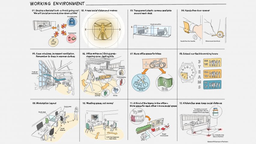
Transparent screens around desks, hands-free doors and a barista feature in Weston Williamson + Partners plans for a social-distancing office following the coronavirus lockdown.
"The pre-pandemic rules and regulations worked just fine"
But Dezeen commenters aren't sure the measures are necessary. "The pre-pandemic rules and regulations worked just fine," said Steve Hassler. "Unless we expect to live in a permanent pandemic state our energy would be better spent designing temporary solutions that could be stored, implemented, removed, and then stored again."
Tony Briggs agreed: "Regular washing of hands is more than sufficient and has been so for most of the modern era. Designing hand-washing stations in public places would seem more useful."
"I think it's worth trying to consider these things," continued Dan. "But if someone in this office has coronavirus these measures are unlikely to protect their coworkers – the prolonged time spent in an enclosed environment will hugely increase the chances of it spreading."
Jacopo was confused: "So offices will have a transparent plastic divider but some governments are encouraging groups of people to carpool? 'Sit together in traffic for hours but once you get to the office please stay away and eat alone!'"
Should offices be re-designed for social distancing? Join the discussion ›
Julius Raymund Advincula's typeface made from body parts is "horrifyingly fascinating"
Graphic designer Julius Raymund Advincula has used time in lockdown to create the Body Type typeface which is formed of folded skin and limbs. Readers aren't convinced.
"Lockdown boredom," said Squire. "The Black Death brought us the early Renaissance – Covid-19 has brought us squished up body part typeface."
"Is it available in a shaved, non-sweaty version?" asked Steve Hassler.
"Horrifyingly fascinating," concluded I Bike NYC.
Are commenters being harsh? Join the discussion ›
"If hotels were theatre" the ME Dubai hotel at the Opus "would win"
Readers think that the newly opened ME Dubai hotel at the Opus by Zaha Hadid Architects is over the top.
"I would be a bit worried that I was losing my mind if I went into that hotel," said Apsco Radiales.
"If hotels are theatre, this wins," added Patrick Kennedy.
"Futuristic tacky," concluded Love Your Hair Hope You Win.
What do you think of the hotel's interior? Join the discussion ›
Museum de Lakenhal "a striking cathedral to culture" after redesign
Happel Cornelisse Verhoeven and Julian Harrap Architects' renovation of the 375-year-old Museum de Lakenhal in Leiden, the Netherlands, has delighted commenters.
"First that lovely fire station now this," said JZ. "HCV are firing on all cylinders. Can't get enough of the thoughtful brick weavings."
JB agreed: "The scale of that new facade is confronting, but it's still bloody marvellous."
"A striking cathedral to culture," added Jon.
Do you think Museum de Lakenhal is "bloody marvellous? Join the discussion ›
Read more Dezeen comments
Dezeen is the world's most commented architecture and design magazine, receiving thousands of comments each month from readers. Keep up to date on the latest discussions on our comments page.

