Commenters dispute Airbnb founder's claim coronavirus will change tourism forever
This week, readers disagreed with comments about the future of tourism by Airbnb co-founder Brian Chesky and shared their views on other top stories.
In an interview with American news channel CNBC, Chesky shared his thoughts on how the coronavirus pandemic is likely to change travel and its impact on Airbnb, claiming that "travel as we knew it is over".
"I do think that instead of the world population travelling to only a few cities and staying in big tourist districts, I think you're going to see a redistribution of where people travel," he explained.
The impact of this, according to Chesky, will be felt most at major tourist destinations with travellers instead choosing less well-known or local destinations.
This statement was strongly contended by the article's commenters.
"I am not sure if I agree with the claim that people will avoid popular destinations," challenged Zea Newland. "It takes a few influencers taking some photos of their butt in a beautiful place and a new hype is created."
Joshua agreed. "Somewhat optimistic article. The airheads that flock to tourist hotspots (like those who crowd round the Mona Lisa having skipped everything else in the Louvre) will go wherever it's fashionable to go according to Instagram."
Others argued against the belief that change will be permanent, with dl77sea asking: "why do we keep assuming the pandemic will last 'forever'?"
"Brian has maybe not lived yet enough to witness how forgetful people are," pointed out IAH GVA. "We get the same type of pandemic every 20+ years and nothing has changed. 1969 pandemic, SARS, MERS and now Covid19... give people a few months/years and let's look back how things will have 'changed'."
HOSTA felt similarly, stating simply: "Nah, the second flights get clearance people will be back at it."
Are Brian Chesky's predictions for travel in the future all hot air? Join the discussion ›

The Crystal skybridge is nothing new according to commenters
A skybridge has connected two skyscrapers in China, but divided readers. The Crystal is the first part of Safdie Architects' Raffles City Chongqing complex which is due to complete this year, and features a cantilevered observation platform.
"Breathtaking and monumental," described Chris. While JZ's commentary was less complimentary: "The facade lighting is quite successful. Otherwise, like a giant steel culvert laid atop some nondescript 1980s developer towers."
"I wonder if this design would pass under the new government restrictions imposed to limit extravagant and bizarre buildings," pondered Jack Woodburn, referring to the China's policy to limit the construction of supertall skyscrapers.
Others felt the design looked familiar. "The Minecraft version of the Marina Bay Sands," said james.
"The Singapore effect," Puzzello agreed. "I wonder how many times this idea can be recycled?"
Are readers being unfair harsh? Join the discussion ›

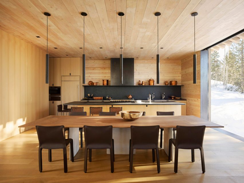
Olson Kundig's Wyoming house "could use a little less wood on the interior" say commenters
US architecture firm Olson Kundig has made a feature of large wooden window shutters in its design for a house in the mountains of Wyoming. While most readers are impressed, some feel the firm has over-used one material.
"Another nice house from Olson Kundig," praised apsco radiales. "But again far too much wood in the interior. I don't want to see floorboards on walls and ceilings – they are meant for the floor!"
HOSTA also described the home as a "pretty damn nice chalet", but went on to say: "I have to agree with some of the other comments, it could use a little less wood on the interior".
But the wood is not without fans. "The woodwork outside and in appears flawless," noted Geofbob.
"Beautiful materials with many great design features," said Ivana Curcic. "Personally, the scale is too big, except for the study nook that's narrow but tall, but such scale is generally aspired to in most of the US."
What do you think of the residence? Join the discussion ›

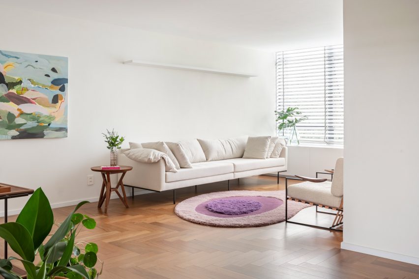
Commenters applaud Bloco Arquitetos' "tasteful renovation" of a 1960s apartment
The renovation of an apartment in Brasília has won the praise of Dezeen commenters for its minimalism and authenticity with the original interiors.
Brazilian studio Bloco Arquitetos added translucent glass walls to reveal the existing concrete block facade of the 1960s apartment.
"The combination of being authentic to the building's heritage and doing something authentically inventive is well done," commented JZ, adding: "not an easy balance to achieve".
"Very tasteful renovation which highlights the qualities of the original architecture," said Leo.
"It's very minimalistic but it's growing on me as I scroll through the images a second or third time," said Zea Newland, allowing themselves to be won over. "It seems like a nice place for contemplation without looking cold or uninviting."
For apsco radiales, the bathroom was what really stood out: "Love the size of the shower – you can play football in it, nearly. No banging your elbows on the walls there!"
Are you a fan of the minimalist interiors of the apartment? Join the discussion ›