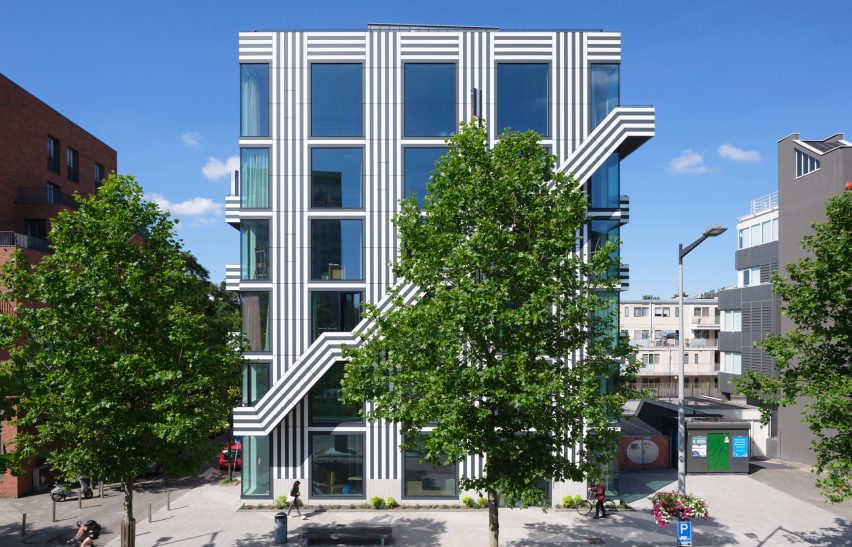
Graphic design studio Thonik's co-founder Thomas Widdershoven and MMX Architecten have transformed a bold typeface into a simple monochrome pattern that covers a six-storey building block in Amsterdam.
Built as an office for the Dutch graphic design studio, the entire exterior is covered in a simple combination of black and white lines that were pulled from the Mexcellent typeface – a trilinear-stripe font that was created for the 1968 Olympic Games in Mexico City.
As with the typeface, Widdershoven aimed to use the building as a way of exposing large numbers of people to graphic design.
"We are huge fans of the Mexcellent typeface because it connected a mass audience to graphic culture," the designer told Dezeen.
"This is something we have tried to achieve through this building too: bring graphic design to the streets for people to experience and enjoy," he added.
Along with Thonik's offices, which are on the second, third and fourth storeys, the building contains a sake bar on the ground floor and a Japanese Omakase restaurant on the first floor.
The upper stories contain an event space and are topped with a rooftop garden with views across the city's financial district.
Externally, all the floors feature the same large, floor-to-ceiling windows surrounded by graphic panels, which are made from one-centimetre-thick sheets of impregnated paper.
Widdershoven, who designed the building with Arjan van Ruyven of MMX Architecten, used the grid of the windows as one of the starting points for the design.
"This building is grid-based and very graphic in its construction – the windows and the walls create a homogenous grid, which is echoed by the lined pattern on the facade," said Widdershoven.
"Thinking in terms of a grid, which is a basic graphic system, is a good way to translate 2D into 3D," he continued.
"Both graphic design and architecture are in the public domain for everyone to see but a building has a longer lifespan – at least 50 years – and as such requires a design process that keeps longevity and long-term relevance in mind."
Cutting across this grid are the diagonal lines of the emergency staircase. Designed to be a prominent element on the main facade, this feature also acts as a counterpoint to the vertical and horizontal lines.
"The plot is quite small so we decided to create the external fire escape and gain some space on the inside," explained Widdershoven
"We wanted to balance the stairs with the entire facade – the stripes really help to accomplish that, which are vertical for the walls, horizontal for the balconies and diagonal for the stairs."
As the building was Thonik's first, Widdershoven leant on the studio's experience designing other so-called "supergraphics" for the Venice Architecture Biennale and at the Boijmans Van Beuningen museum.
"Looking back, it seems that our many years of experience creating graphics and visuals in their various forms have led to this moment," said Widdershoven.
"We have used our experience in creating 'supergraphics', especially our work for the Venice Biennale as a starting point. Curator Aaron Betsky commissioned us to develop the overall visual identity and scenography for the 380-metre-long Corderie of the 11th Architecture Biennale," he continued.
"We also drew inspiration from our work for the Museum Boijmans van Beuningen, for which we created a monochrome floor painting in the courtyard. The stripes we used there gave us the experience we needed to design the facades of the new studio Thonik."
Widdershoven worked with Thonik's other co-founder Nikki Gonnissen to create the office interiors, which combine minimal finishes with furniture that the studio already owned.
"We focused on re-using existing design elements," said Widdershoven.
"The bookcases, which we brought from our old studio, act as room dividers; the kitchen has been created with different modular elements taken from our three previous studios over the past 10 years, and our graphic carpets were made for an exhibition in China, and have since travelled to exhibitions in Tokyo, Venice, New York, Paris and Breda before finally arriving in our new studio."
Thonik is a Dutch graphic design studio set up in 1993 by Gonnissen and Widdershoven, who was creative director of Design Academy Eindhoven between 2013 and 2016. The studio is primarily known for its 2D designs, but is interested in creating more architecture following the completion of its office.
"Studio Thonik was a self-commissioned building," said Widdershoven. "We are new in the architecture game – amateur and adventurous – but we would love to do more!"
Photography is by Ossip.
Project credits:
Design: Thomas Widdershoven (Thonik) in collaboration with Arjan van Ruyven (MMX Architecten)
Interior design: Thomas Widdershoven and Nikki Gonnissen
Acoustic wall: Simone Post with fabric by Vlisco
Staircase: Envisions (Sanne Schuurman and Simone Post)
Cabinets and room dividers: Bart Guldemond
Curtains: Bas van Tol
Furniture: Hans Lensvelt
Bespoke rugs: Thonik

