"If you have to design something crazy then go for the electric option" says commenter
In this week's comments update, readers are discussing Virgin Galactic's concept for a high-speed passenger aircraft and sharing their views on other top stories.
Aerospace brand Virgin Galactic has unveiled a concept for a high-speed passenger aircraft called Mach 3, which would be able to carry between nine and 19 passengers.
The aircraft is designed to fly at an altitude above 60,000 feet and would be capable of travelling at Mach3, or 3704 kilometres per hour, which is three times the speed of sound.
"There goes Concorde again"
But readers aren't impressed. "Oh look, there goes Concorde again," said Alec Brown.
"If you have to design something crazy then go for the electric option," added Jacopo. "Maybe a hybrid like the Prius?"
Christian was also unconvinced: "Virgin Atlantic can't even make it to America anymore – how is Richard going to get us to space?"
Le Canal Hertzien agreed: "Virgin should think about ways of crossing the Atlantic in 40 days so quarantine is over by the time his passengers reach Uncle Sam's shores."
Are readers being harsh? Join the discussion ›

"Renzo Piano just gets it" say readers
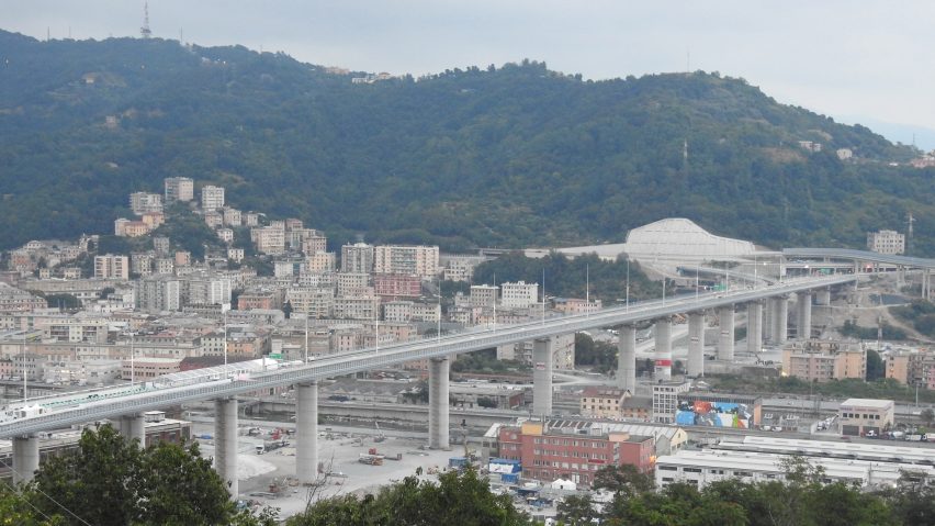
Readers have given thumbs up to Renzo Piano's Genoa San Giorgio Bridge in Italy, which has been built to replace the Morandi Bridge after it collapsed in a storm nearly two years ago.
"Renzo Piano just gets it," praised John McWaters. "I hope they power-wash the rust stains from the pillars though and keep it well maintained over time."
Rodrigo Galvan-Duque agreed: "Italians should feel proud of themselves for having built this beautiful solution in such a short time."
"Please take note on how to properly design, build, and execute a public infrastructure project," added Michael Wigle. "Seattle is in the midst of replacing a viaduct that will cost over $2 billion euros and began 12 years ago... "
What do you think of the Genoa San Giorgio Bridge? Join the discussion ›

Commenters give "kudos for highly sustainable concept and fluid design"
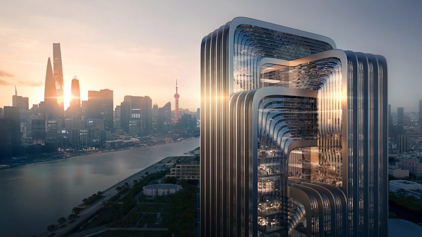
Commenters are pleased by the green credentials of Zaha Hadid Architects' design for the CECEP Shanghai Campus in China, which will utilise renewable energy technologies and recycled materials. Some are less keen on its aesthetics though.
"Glad to hear it's a green building," said Raffi. "But Zaha Hadid would not have designed something like this. I did not know 80s glitzy styling was back in fashion."
"Someone left their elbow on the extrude button in CAD," replied Benny.
Sacrecoeur was positive all round: "Kudos for a highly sustainable concept and fluid design."
Is the CECEP Shanghai Campus to your taste? Join the discussion ›

Reader thinks fashion boutique "looks like a huge drill screwed the store"
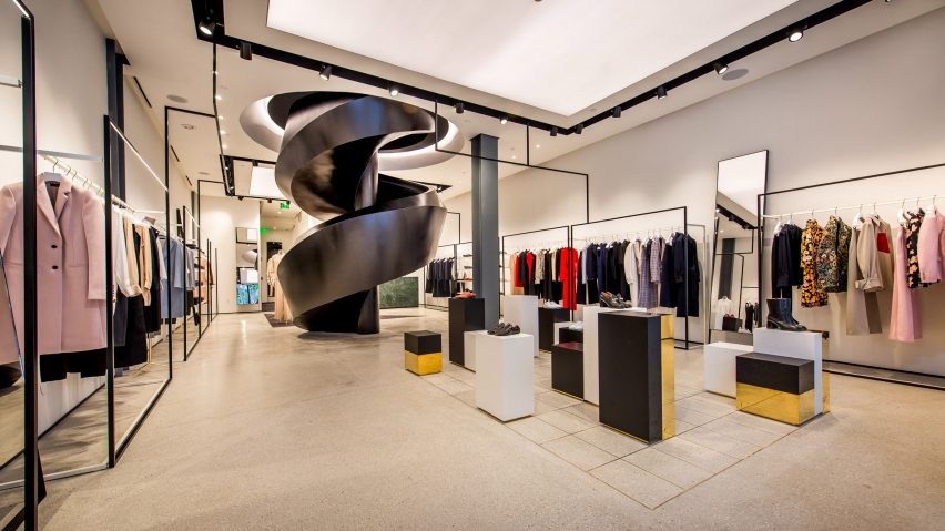
A black metal corkscrew staircase is just one of the divisive details London studio Sybarite added to fashion label Joseph's store in the Miami Design District. It was designed to reference the city's seaside architecture dating back to the 1940s and 50s.
"References to the cool, funky art of the design district and 80s art deco Miami architecture?" said Mary Gaughan. "Perfect."
Sim disagreed: "It looks like a huge drill screwed the store. Awful."
"It looks like a huge drill screwed the store. Fantastic," replied Kevin McGrath.
Do you think Sybarite stepped up to the challenge? Join the discussion ›
Read more Dezeen comments
Dezeen is the world's most commented architecture and design magazine, receiving thousands of comments each month from readers. Keep up to date on the latest discussions on our comments page.