Rolls-Royce unveils "confident but quiet" rebrand by Pentagram
Pentagram has redesigned Rolls-Royce's visual identity, updating the iconic Spirit of Ecstasy emblem to become the luxury car brand's main logo.
One year in the making, the new branding aims to modernise the Rolls-Royce Motor Cars company and help it appeal to a younger audience.
Pentagram overhauled the iconic Spirit of Ecstasy emblem to become the primary logo for the company but retained the well-known double-R monogram as a nod to its history.
The rebrand also helps differentiate Rolls-Royce Motor Cars from the Rolls-Royce engineering company, which is primarily known for making aircraft engines and which also uses the RR monogram.
Designed by sculptor Charles Robinson Sykes in 1911, the Spirit of Ecstasy figurine of a woman leaning forwards with her arms outstretched behind stands on the bonnet of the majority of Rolls-Royce cars.
It has gone through 11 main iterations, with the current version reduced in size and supported on a spring-loaded mechanism so that it can automatically retract if the car is hit.
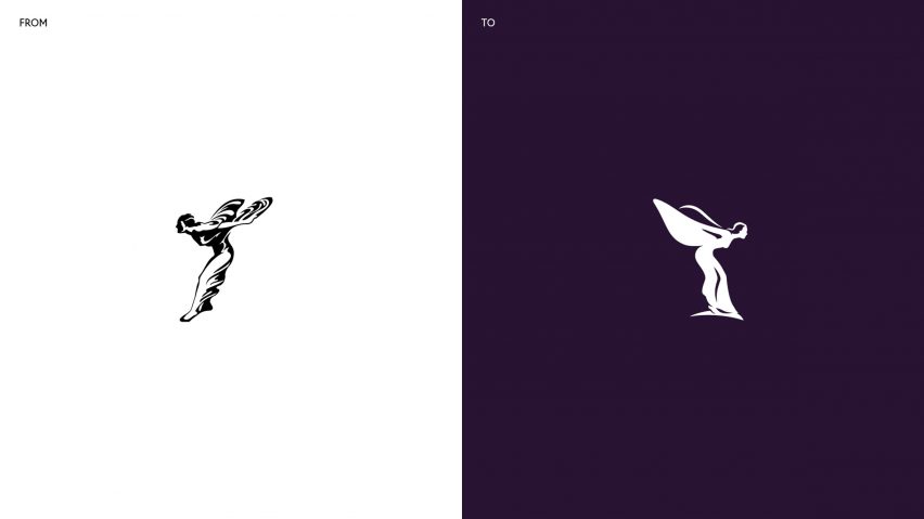
To make the Spirit of Ecstasy symbol the focus of the rebrand, Pentagram simplified a previous drawing of the ornament.
"It was too complex to be used on digital formats, and it didn't feel modern or well-balanced anymore," said Pentagram partner Marina Willer about the former design. "So it was time we redrew it to make it feel like it was moving forwards."
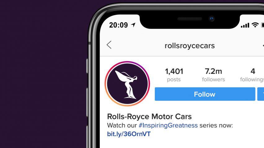
The updated logo will now lead the car company's brand identity, replacing the chrome-effect double-R "badge of honour" previously used as the icon on digital platforms like Instagram.
The designers took the idea of "moving forwards" literally, flipping the previous Spirit of Ecstasy icon from left-facing to right-facing.
They also reduced the number of reflective marks and added a thin base under the figure's feet, in a bid to make it clear that it is referencing the statuette and not an actual person.
Willer and her team paid close attention to physical attributes like the size of the figure's waist, the shape of her wings and the detailing on her face.
"Things like the size of the waist were so important," she explained, "because we didn't want to indicate that she was too skinny, as that wouldn't set a good example, and we didn't want to make her too feminine and sexual either."
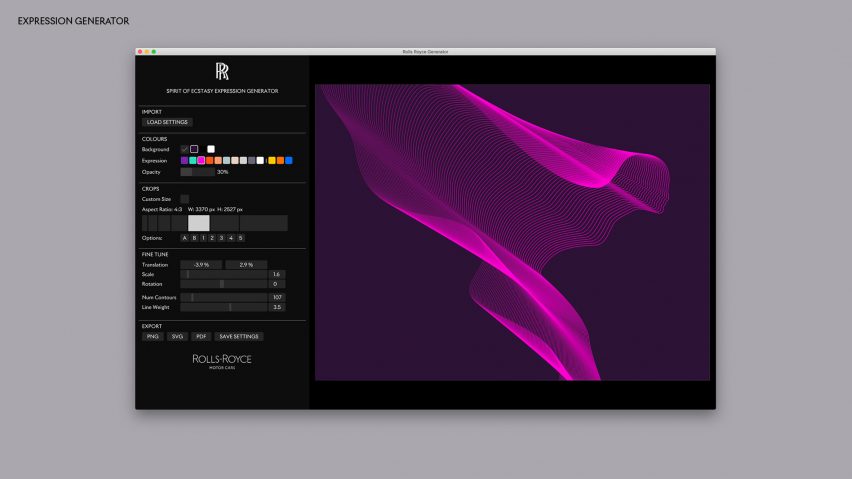
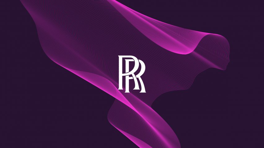
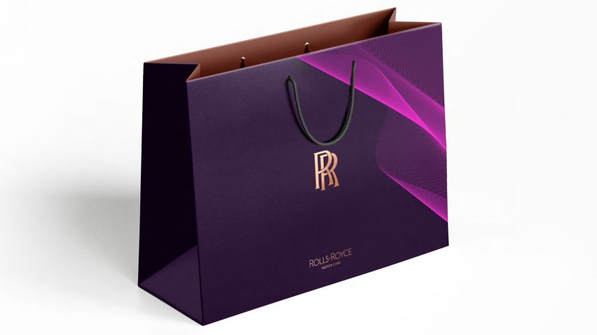
The Spirit of Ecstasy icon has also been reproduced in a more abstract manner as an illustration that the studio likens to "a silken fabric".
This was created by inputting various codes into a processor to create a pattern made up of multiple parallel lines that curve and overlap to form the shape of the female figure.
According to Willer, the illustration aims to give the impression of Rolls-Royce as a more forward-thinking and technologically connected brand.
"We wanted to convey this balance between a work of art that is special but is made with high degrees of technology and science behind the scenes," she explained.
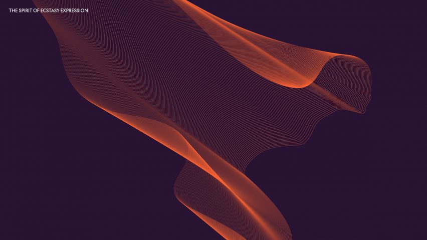
This pattern indicates a three-dimensional presence without actually having a "fake" 3D-effect design that aims to be a replica of the real thing, Willer said.
"Three-dimensional branding is a thing of the past," she added. "But [the adoption of flat design] is not even to do with trends."
"We felt that we weren't doing any justice to the badge of honour by copying it with some fake, 3D effect – that should be saved for the real thing, and the same with the Spirit of Ecstasy," she continued.
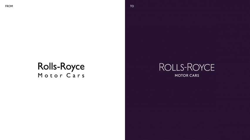
The team also overhauled the company's wordmark, aiming to create a more refined and "future-facing" version of the existing design.
This included changing the typeface from Gill Sans Alt to a similar font, called Riviera Nights, which features bevelled ends to the letters L and E to give an indication of movement.
Each of the letters has been capitalised and the R's have been enlarged to offer a more instant visual connection with the monogram.
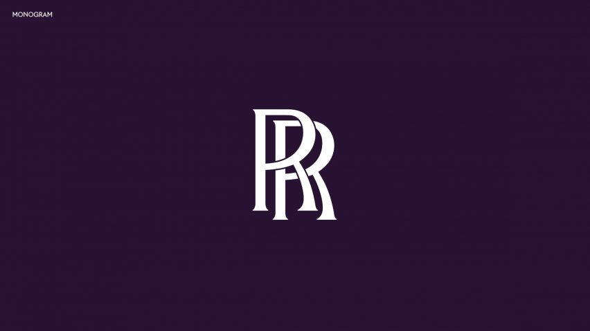
Pentagram decided to leave the double-R monogram unchanged, however, because of its "incredible heritage".
"We didn't feel it was appropriate to change it," said Pentagram partner Marina Willer.
"We did experiment with it a bit, but felt it would always look like we were trying to produce some kind of fake version of it because it is so valued and recognisable."
Rolls-Royce's new visual identity will come into effect from 1 September 2020.
Last year Pentagram updated the identity of the Rolls-Royce engineering company to make it appropriate for the digital era. At the time, the designers tweaked the double R logo and remove the wordmark from the branding.
Images courtesy of Rolls-Royce Motor Cars.