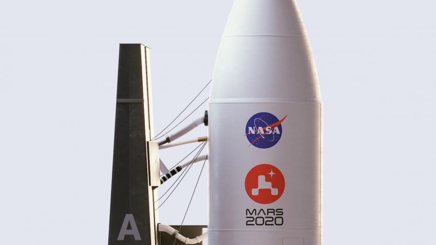
This week on Dezeen, design studio House of van Schneider unveiled the logo for NASA's robotic rover and Pentagram gave the Rolls-Royce visual identity a makeover.
House of van Schneider has designed the branding for NASA's 2020 mission to send a rover to Mars to look for signs of past life.
A red circle symbolises the red planet, overlaid with a pixellated outline of the robot and a star that represents Earth glimpsed from Mars. This logo is going on the main rocket as well as the rover, along with badges and keycards used by scientists on the project.
"We never had our work on a rocket, or sent to space, let alone on Mars. This was a first for the entire House of van Schneider team," said founder Tobias van Schneider.
Design studio Pentagram revealed the rebrand it designed for Rolls-Royce Motor Cars, based around the signature statuette that perches on the bonnet of its cars.
Called the Spirit of Ecstasy, the figure of a woman with diaphanous wings has been updated and flipped to be a simplified logo for Rolls-Royce.
"Things like the size of the waist were so important," said Pentagram partner Marina Willer, "because we didn't want to indicate that she was too skinny, as that wouldn't set a good example, and we didn't want to make her too feminine and sexual either."
A red circle was revealed as the winning design of the competition to make the logo for Expo 2025 Osaka. Graphic designer Tamotsu Shimada won over the jury and the public with a circle of blobs that look like cell nuclei – and googly eyes.
Japan embraced the anthropomorphic qualities of the design on social media, producing memes and fanart of the logo as an alien creature, a video game character, and even a loaf of bread.
Melania Trump also had the attention of design Twitter this week. Her redesign of the Rose Garden at the White House went viral after she shared pictures of her foray into landscape architecture.
It wasn't the first time that the First Lady – who left her formal architecture studies to pursue a successful modelling career –turned her hand to design. We rounded up four examples here.
Photos of the new Apple Marina Bay Sands shop in Singapore have also been popping up on social media. British practice Foster + Partners is building the spherical store on the water, where it will be reached via a footbridge.
Foster + Partners' founder Norman Foster also unveiled his design for a temporary parliament building for the UK. The proposal includes a debating chamber and office spaces for 650 politicians wrapped in bomb-proof glass.
Planted facades had a moment in architecture news this week. Chinese architecture studio MAD laid claim to building America's "largest living wall" by wrapping a housing development in Beverly Hills with a swirl of succulents.
Norwegian firm Snøhetta covered a timber office in Austria with a layer of greenery trailing up a latticed metal frame.
In other architecture news, major infrastructure projects had their vents cunningly disguised by architects. Architecture studio Neiheiser Argyros shrouded the exhaust vents and fire escape of a London Underground station with a stylish pavilion and cafe.
To hide a ventilation shaft for the upcoming HS2 railway line, architecture firm Grimshaw has proposed a decorative roof of weathered steel to transform it into a local landmark.
Ingenious wearables featured in design and technology news on Dezeen. Graduate designer Dorothee Clasen has created a retainer called [In]Brace that allows the wearer to communicate with a computer using just their tongue.
Amelia Kociolkowska, another graduate designer, has created a wearable spandex pouch called Carrie that allows for the convenient and discreet carrying of period products.
This week our readers were excited about a larch-clad holiday home on the Isle of Wight, a hilltop house in Costa Rica with views of the ocean, and a government building in India covered in an Ikat pattern of bricks.
This week on Dezeen is our regular roundup of the week's top news stories. Subscribe to our newsletters to be sure you don't miss anything.

