Schemata Architects updates traditional Japanese bathhouse with tiles and Towada stone
Schemata Architects has renovated a traditional sento, or public bathhouse, in Tokyo adding modern touches including a bar serving beer.
Named Koganeyu, the project involved refurbishing a public bathhouse that was originally built in 1985.
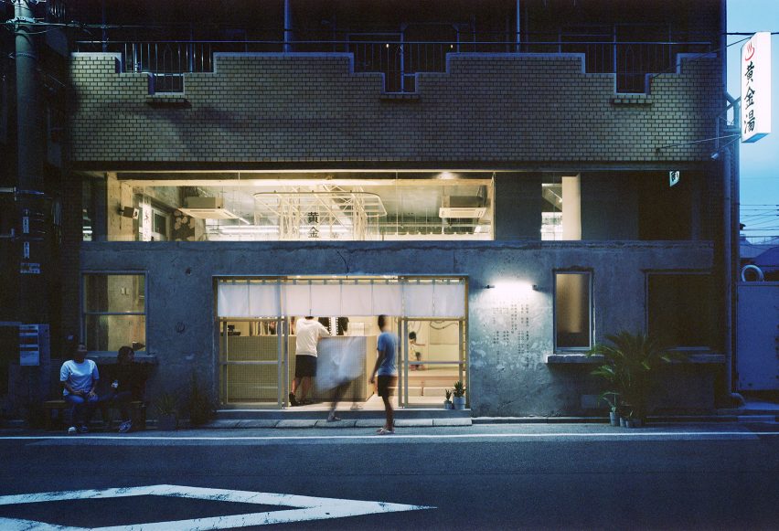
Tokyo based Schemata Architects kept traditional elements, such as the half wall separating the men and women's bathing areas, but introduced contemporary colour schemes and attractions for younger bathers.
"Traditionally, sento was a necessary public function for an area because people didn't have bathrooms in their houses," project architect Kotaro Shimada told Dezeen.
"However today 95 per cent of them have it, so gradually sento has been disappearing from the city," Shimada added.
"We think this culture is really important and want to keep also for the next generation, so we thought that a new sento has to have other functions that make people today want to go often."
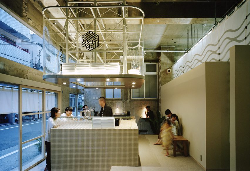
Schemata Architects designed a bar area that serves beer at the front of the sento that's visible from the street.
The bar is an adaption of the traditional sento layout, which originally had a reception desk called a bandai facing in towards the bath for staff to keep an eye on the bathers.
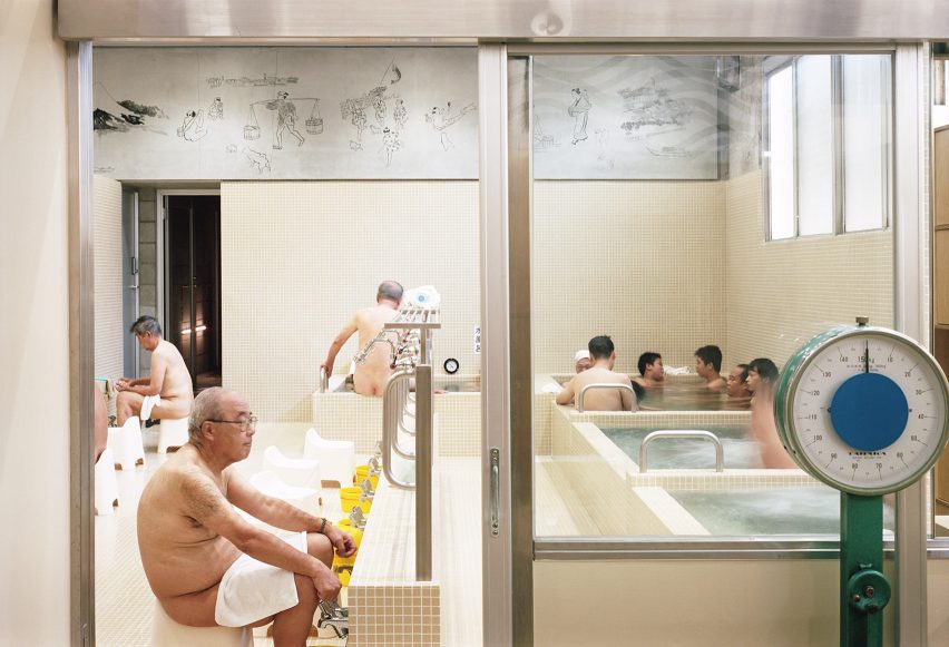
More modern bathhouses put this booth out front, but Schemata Architects decided to take it one step further and have it as an island that can double as a DJ booth for events.
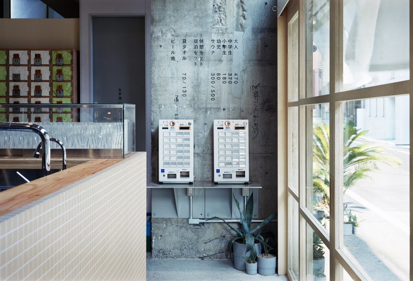
Industrial-style concrete walls have been left bare to contrast with the neat square tiles in soft beige that cover the bar. Soft lighting adds to the atmosphere and clean fluffy towels are stacked above the brushed metal shelf.
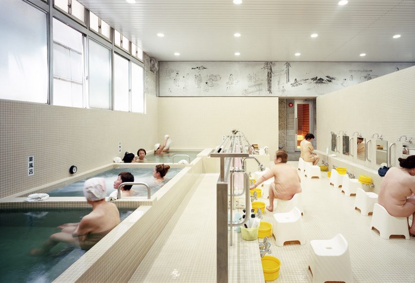
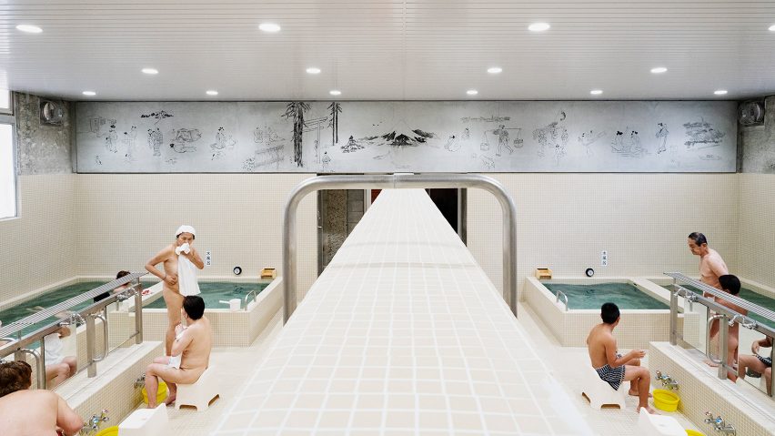
The bathing area is divided according to sex, with men on one side and women on the other. A traditional half-wall separates the two to afford privacy to the nude bathers while allowing couples or families to communicate verbally and share soap over the wall.
Schemata Architects deliberately used the same tiles as the bar area for this feature and added a metal railing that runs from one side to the other.
"During bathing time people are separated into men and women by the 2.25-metre- high boundary wall, but after they will be getting together in the end over this 1.15-metre-high counter with beer," explained Shimada.
"We hope using same materials could help people to feel the romanticism like that."
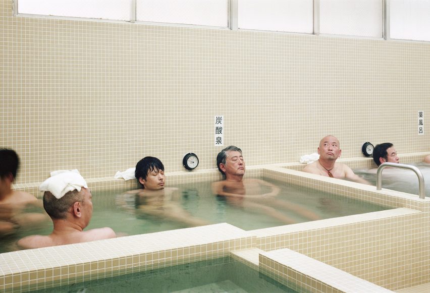
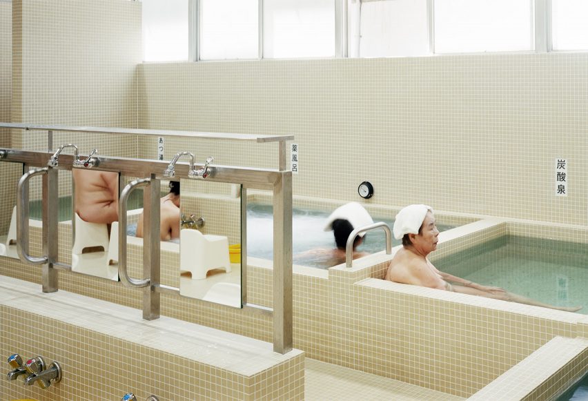
Small square porcelain tiles were selected because they're easy to clean, and the mortar around the edges helps make them less slippy underfoot. Schemata Architects chose beige because it's "warm, bright and universally good".
The insides of the heated baths are made from Towada stone, which looks blue-green when it's wet.
"It makes the water look blue and clean and its texture feels a bit luxurious," said Shimada. "Towada stone is a popular material for onsen, but I've never seen it used in this kind of local bathhouse in Tokyo."
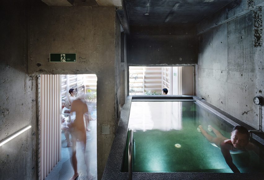
Schemata Architects used a darker palette for the sauna and cold plunge pool area. The concrete has a dark aggragate that makes it more grippy and lightly massages the foot.
An outdoor area with seating lets customers cool down between baths.
The floors of the reception bar and locker room are made of sandy-coloured woven vinyl chosen by Schemata Architects because it drys quickly and is pleasant to stand on even with wet feet.
Birch plywood was selected for the locker doors in the changing rooms because it's resistant to moisture and complemented the pale colour scheme.
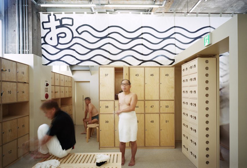
Schemata Architects commissioned artists to reinterpret a couple of traditional sento decorations. Yoriko Hoshi painted a mural of people and Mount Fuji that scrolls around the top of the bathing area.
Iichiro Tanaka designed the noren – traditional fabric split curtains – that divide the male and female changing rooms. Tanaka chose the exclamation Oi! in homage to the greetings exchanged by men and women over the wall. The branding and signage are by Takahashi Hiroko.
Founded in 1998 by Jo Nagasaka, previous projects by Schemata Architects include the renovation of a capsule hotel in Tokyo and a skinny red tower with a grocery shop at the base.
Photography is by Yurika Kono.
Project credits:
Architect: Jo Nagasaka / Schemata Architects
Project team: Kotaro Shimada
Product and graphic design: TAKAHASHIHIROKO
Advice: Aqua Planning
Structural consulting: Ladderup Architects
Construction: TANK
Waterworks:
Kamio Corporation
Sauna: Thermarivm
Lockers: FUJIEI
Collaboration:
Yoriko Hoshi, Iichiro Tanaka
Kitchen: HOSHIZAKI
Sound plan:
WHITELIGHT