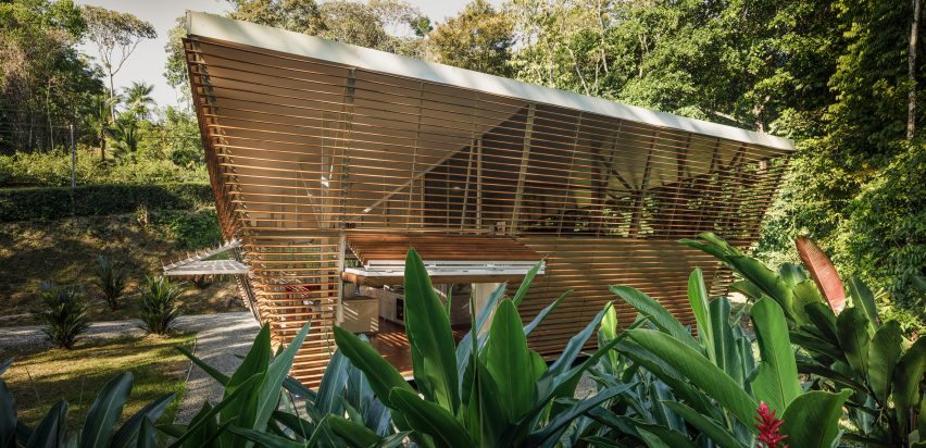
In this week's comments update, readers are discussing No Footprint House in Costa Rica and sharing their views on other top stories.
The architect who designed a prefabricated house in Costa Rica, which was created as a prototype for a series of future zero-carbon homes, is engaging with readers who have commented on the story.
Studio A-01 built No Footprint House in the Central Valley of Costa Rica before transporting it to its site in Ojochal, a small village located in the Puntarenas province.
"Is there any protection against bugs and creepy-crawlies?"
But readers have questions for the architecture studio. "Nice effort, but a bit impractical," said Apsco Radiales. "Is there any protection against bugs and creepy-crawlies if you open the slats?"
"There is no absolute protection," replied architect Oliver Schuette. "It helped tremendously to raise the building from the ground and to surround it with edgy pebbles. Landscaping and plants can do a lot to keep certain 'unwanted guests' away from your house. We try to go with nature-based solutions as much as we can. Beyond that it's co-existence and survival of the fittest."
"Prefabrication of passive houses is really delicate because passive houses have so many orientations: the site, the sun path, the wind direction, the urban orientation," continued Bras Cubas. "But this house has no orientation at all."
Schuette replied: "The most sensitive issue we discussed when we went through the design process was how can you create a generic and prefabricated building system that still has the capacity to respond to personal needs and site-specific conditions? Our answers included the overall building positioning, a centralised service core to keep all technical components away from the facades, an open plan around the core that can be naturally ventilated on all sides, and – maybe most important of all – a double layered facade that gives us the opportunity to react on a smaller scale and on each side of the building."
Do you have any queries for the architect? Join the discussion ›
"Actively trying to dislike this but I can't" says reader
The aptly named Berlin Cube Office block, designed by architecture studio 3XN, has sparked debate thanks to being shaped like a cube and its faceted glass facade. It was built on Washingtonplatz in central Berlin.
"Interesting but sort of one note," said Bubba10. "No subtlety or having the design unfold. You get it all at once. Bam, done."
"Actively trying to dislike this but I can't," replied Heywood Floyd, on the other hand. "I think it is executed very well and the photography is really helping the facade concept. It's like a one-liner in comedy – just because it's short doesn't mean it's not funny."
JZ agreed: "Conceptually strong and optically fascinating. In a constant state of assembly and fracture. So flat while maintaining a crazy amount of depth in perspective."
Are you a fan of the Berlin Cube Office block? Join the discussion ›
Commenter asks if glass-bottomed bridge is "sponsored by Instagram?"
The longest glass-bottomed bridge in the world has been completed by the Architectural Design & Research Institute of Zhejiang University in southern China, but readers are cynical.
"Sponsored by Instagram?" asked Steve Hassler.
"No way I'm stepping foot on this," said Miles Teg. "No way sir."
"Also known as the world's longest slip and slide," added Kevlar.
Are you brave enough to walk the Guinness World Record-breaking bridge? Join the discussion ›
"I want to dress like a jester and hang out on this street" says reader
Commenters are divided over Camille Walala's design for a large-scale mural, which covers eight different buildings on Leyton high-street in London. The project was crowdfunded by the local residents in an attempt to overhaul the area.
"I want to dress like a jester and hang out on this street," said Erich Trumpelstiltskin.
Le Ego was less enthusiastic: "Whilst I commend the great effort and sentiment behind it, simply slapping some paint on a few buildings isn't going to revive a high-street whose problems extend far beyond its aesthetics."
"Rampant subjectivity at its worst and most public," concluded J Hardman. "Imagine a designer or architect just proclaiming 'I've done this because this is my style' – they would get pilloried for it. But hey, it's colourful and kooky so yeah, crack on, do whatever."
What do you think of Walala Parade? Join the discussion ›
Read more Dezeen comments
Dezeen is the world's most commented architecture and design magazine, receiving thousands of comments each month from readers. Keep up to date on the latest discussions on our comments page.

