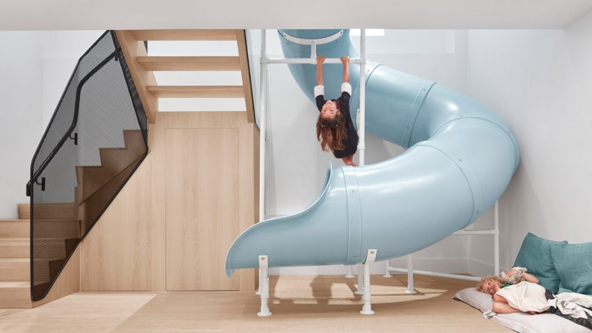
Reflect Architecture has renovated a house for a young family living in Toronto, Canada, by brightening its truncated interiors and twisting a blue slide through its centre.
The update to the house, which is named Walker, was focused on reconfiguring the existing layout to create lighter, open spaces that better serve the family's lifestyle and encourage them to spend time together and play.
Walker's centrepiece is the children's spiralling blue slide, which plummets through the heart of the house and connects the basement level to the ground floor.
The slide was designed by Reflect Architecture to animate the lower-level so that it did "not feel like a basement" and to also help bring in natural light via the large opening that it required.
"Both of the parents are entrepreneurs in the health and wellness space and consider downtime and play to be important for mental and physical health, so a large part of the home design was consideration around the integration of play within the home," said the studio's principal architect Trevor Wallace.
"We cut a large opening in the ground floor to connect the two levels of the unit and bring both natural light and giggling children down to the lower level."
The existing house was initially divided up into three floors of separate living units, which the family were renting out to help offset the cost of buying the home.
Now their tenants have moved out, Reflect Architecture was asked to combine the ground floor and basement level into a single dwelling for the family of five – leaving only the first floor available to rent.
"They were a small, young family with one child when they bought the home and the house was a stretch for them as the area is expensive and Toronto’s housing market was, and still is, on fire," Wallace told Dezeen.
"When I got the initial design brief, they noted wanting to keep the second floor as a separate unit to ease the ongoing financial pressures of having a big family in an expensive city."
The three children's bedrooms are now on the basement level, alongside three bathrooms and a spare guest bedroom. The master bedroom and ensuite are at the centre of the ground floor.
To connect the two floors, there is also a folding wooden staircase next to the slide that is lined with a perforated-metal balustrade and lit by night lights integrated into the ceiling.
The remainder of the ground floor is filled with the family's communal spaces. This includes a study and a south-facing cooking, dining and entertainment area.
This open-plan living area is placed at the front of the house and framed from the outside through a new large, which the studio designed so that the house feels "integrated within the neighbourhood and welcoming to guests".
Meanwhile, the study was placed at the rear of the house to create a contrasting quiet and private space with a connection to the garden.
It is complete with sliding doors to the outside, a full-wall whiteboard and central tables with integrated power sockets.
Externally, changes to the dwelling are visible where some existing windows have been relocated to suit the new interior configuration.
The street-facing facade of the ground floor has also been updated with metal panels, wooden louvres and dark wood cladding that has been treated using the Japanese technique of shou sugi ban.
Inside, Walker is complete with a deliberately simple material palette, requested by the client to offer "a calming canvas on which they could live their lives".
This includes wooden floors, teamed with white walls that can be decorated with books and art. However, pops of colour are also present, such as in the kitchen area where navy blue cabinetry has been teamed with marble countertops.
Other houses from Dezeen's archives that feature slides include Skyhouse in New York by David Hotson and Ghislaine Viñas and Moon Hoon's Panorama House in South Korea, where a wooden slide is slotted into a combined staircase and bookshelf.
Photography is by Riley Snelling.

