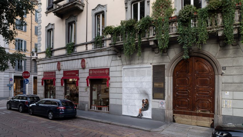
Nendo completes Marsotto showroom in Milan with dimpled marble facade
Passersby can perch in the facade of Italian marble brand Marsotto's new showroom in Milan, which has been designed by multidisciplinary studio Nendo.
From afar, the front of Marsotto's showroom in Milan's Brera district looks as if it's sealed up by blocks of veiny white marble.
To achieve this, Nendo lined the entire facade – including the flush front door – in marble tiles, being careful to set them in line with the existing stonework on the building.
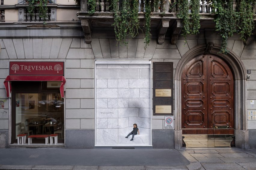
At one point the tiles dip inwards to form a small nook where passersby on the street can sit.
"Because the traffic circle facing the showroom will soon be greened and turned into a small park, part of the facade was made into impromptu street furniture with a soft recess on it, in the hopes that neighbours might sit as if on a bench and rest for a spell," Nendo explained.
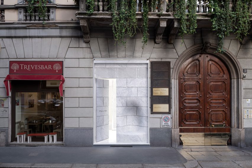
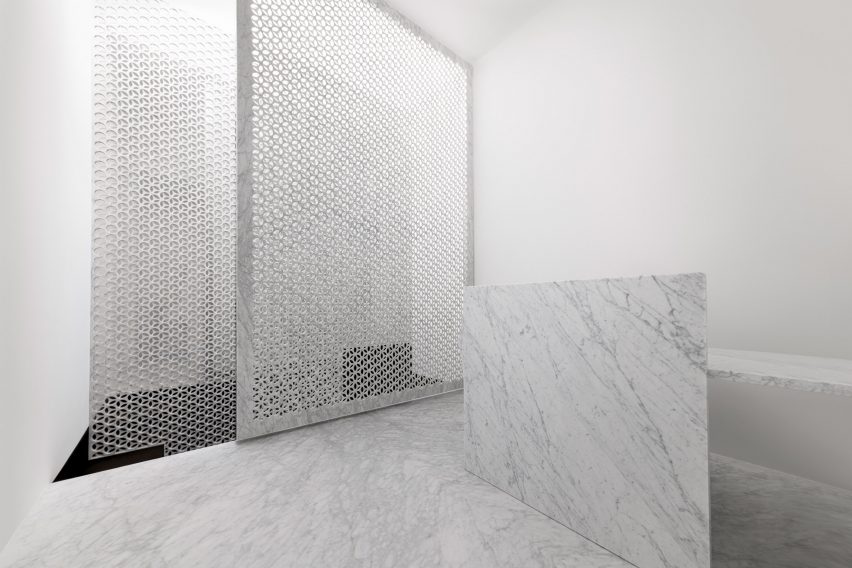
Beyond the showroom's front door lies a small white-painted entryway. Pale marble has been used again here to cover the floor and to form a screen which obscures the staircase leading down to the basement.
The screen is made up of two overlapping slabs of 10-millimetre-thick marble, each punctuated with holes that measure 65 millimetres wide.
"The partition's tempered transparency and lightness reduce the oppressiveness of the marble constitution, softly drawing visitors to the basement exhibition space," the studio added.
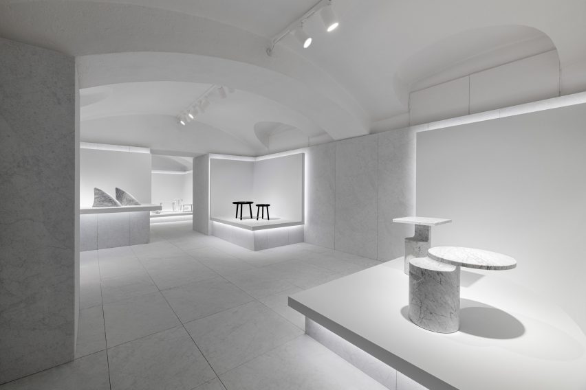
Downstairs, the showroom has been divided into four different rooms. To keep a majority of the floor area free to accommodate different exhibitions, Nendo created three-sided display plinths that sit in the corner of the rooms.
Each of them is backlit with bright-white strip lights.
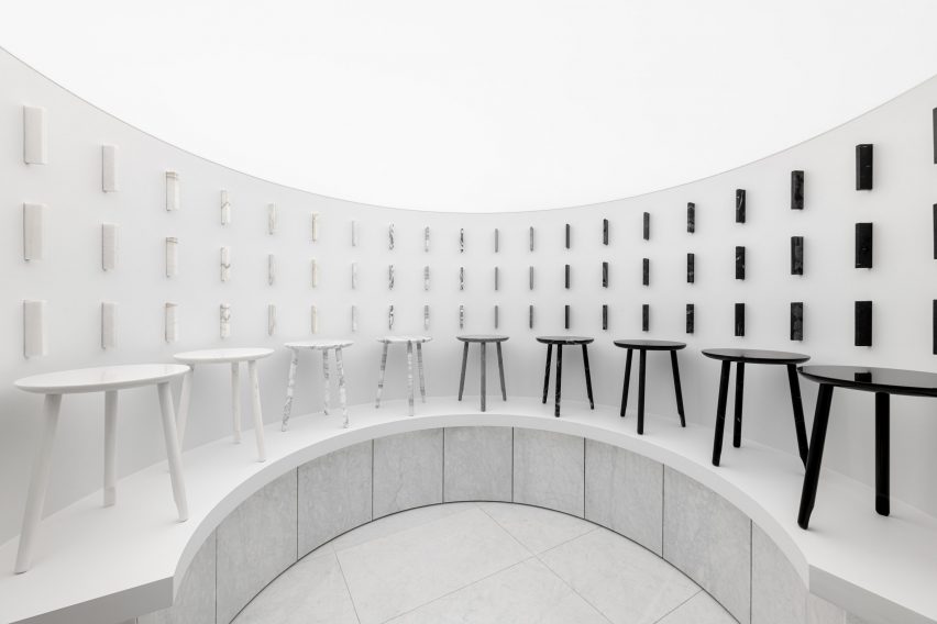
Some of the plinths dramatically curve inwards to form a half-moon shape. One of these has been used to present sample blocks of different types of marble that Marsotto offers.
Stool seats in matching finishes are displayed in a row underneath.
Another room in the basement has been kit-out with one of Marsotto's dining tables and wall-mounted shelves so that, when necessary, it can be used to host lunch meetings.
This isn't the first time that Nendo has worked with Marsotto. For the 2016 edition of Milan Design Week, the design studio created an exhibition space for the marble brand that was half white, half black – furniture was arranged to match.
Four years ago Nendo also came up with the Sway table for Marsotto. Designed to "provide a new expression of agility to marble", the table looks as if it's tilting to one side.
Photography is by Hiroki Tagma.