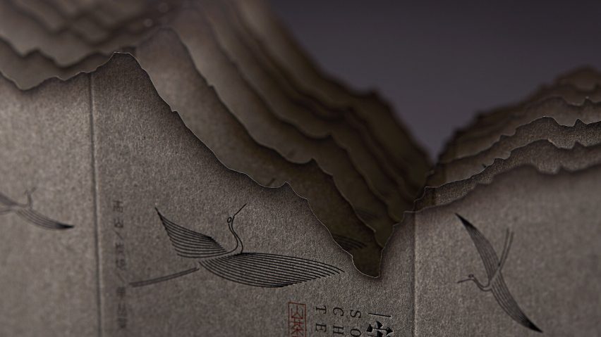
Shanghai-based graphic design studio Lin Shaobin has created packaging for tea that uses burnt paper to emulate traditional Chinese ink paintings of misty mountains.
The Mountain Tea Song packaging project was commissioned by Guangzhou Zifang enterprise for a restaurant in the Chinese city of Guangzhou called Song's Chinese Cuisine.
Lin Shaobin took design cues from the Song dynasty – an era that begun with Emperor Taizu of Songa and saw a period of wide artistic development in China that lasted from around 960-1279 AD.
As tea is the most popular beverage of choice in Song's Chinese Cuisine, Lin Shaobin were tasked with designing a unique packaging that reflected both the creative inspiration of the restaurant as well as the location from which the drink is sourced.
The Mountain Tea Song tea leaves are grown high up in the mountains at elevations of up to 1000 meters before being charcoal roasted in three different concentrations from light to strong according to different baking times.
Lin Shaobin wanted this process to be represented in the tea's casing for the consumer to see, and therefore chose to use the effect of burning the edges of paper.
The studio burnt three different colours of paper – camel, grey and beige, which are used to distinguish the different strengths of tea – before scanning the results onto a computer and printing the digital images.
Just as real burning paper creates organic outlines, the printed images were laser-engraved to achieve similar irregular edges, which emulate the undulating peaks of troughs of a mountainous landscape.
The studio then overlapped three burnt pieces of paper to create a sense of depth for each of the three packaging designs.
While each of the boxes are stamped with simple illustrations of flying cranes, one of the designs features a gilded bronze-hued circle positioned behind the mountains to represent a moon.
According to Lin Shaobin, the burnt paper edges also resemble the delicate lines drawn in traditional Chinese ink paintings, particularly from the Song dynasty.
"Consumers who drink Chinese high-end tea generally pay more attention to tea ceremony, culture and art, so they also prefer landscape paintings with artistic conception and imagination space," it said.
The studio wanted the Mountain Tea Song packaging design to reflect the high quality of the product and the "elegant tone" of the brand.
Lin Shaobin's Mountain Tea Song packaging has been shortlisted for graphic design of the year at Dezeen Awards 2020 alongside a minimalist chocolate packaging by Norwegian practice OlssønBarbieri for CF18 Chocolatier and a series of stamps by Finnish studio Berry Creative.
The Climate Change stamps are printed with heat-reactive ink that reveals hidden images under their black surface when rubbed with a finger as a comment on the negative effects of global warming.

