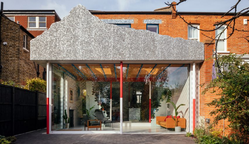
A fake Disneyland mountain informed this playful revamp of a family house in south London by architecture studio CAN.
Architect Mat Barnes, founder of CAN, renovated and extended the two-storey Edwardian house in Sydenham for his own family.
The project included adding a rear extension, topped by a fake mountain made of foamed aluminium. This element is designed in tribute to the Matterhorn Bobsleds ride at Disneyland in California.
This element gives the project its name, Mountain View.
"I loved the idea of elevating this heavy mountain on an unfeasibly thin structure," said Barnes.
The imaginative details don't end there. The house also contains a monochromatic lounge filled with architectural fragments and a kitchen made from recycled chopping boards and milk bottle tops.
"We're surrounded by so many colours and textures in the outside world that to me it feels natural to bring many different patterns and fabrics inside too," added Barnes.
The renovation centres around the rear extension, which made it possible to create an open-plan living and dining space opening onto the garden.
Instead of fully demolishing the original rear walls, sections of them remain. They create a soft partition between the kitchen and dining area in the original part of the building, and the new lounge space beyond.
These vibrant spaces are filled with contrasting colours, from the bright orange of the staircase underside to the royal blue of the trusses that span the ceiling. Even the kitchen is designed to stand out, with alternating panels of blue and grey.
There are further references to mountain geography, such as structural columns painted red and white like ranging poles, or the south-facing wall with its rough, rock-like texture.
At the same time, there are plants and artworks spanning floor to ceiling, including a mosaic-tiled staircase emblazoned with the words "waste not want not" and a pair of cartoon-style arrows.
"The height of the room brings us such joy," said Barnes. "It feels somewhat grand or cavernous, with the variety of materials bringing texture and an unexpected warmth."
The living room at the front of the house was envisioned as a contrast to the multicoloured rear. Almost everything in this room is painted in the same shade of blue, including the architectural mouldings that decorate the walls.
Upstairs, a reorganised layout allowed Barnes to add an extra bedroom and bathroom. There are now four bedrooms in total, including a master en-suite.
The redecorated family bathroom features an orange ceiling and chequerboard-patterned walls, made of blue and white tiles – a reference to an old fireplace in the house.
The hallway is noticeably calmer, with white walls, exposed wooden floorboards and a glazed ceiling. Here, the changing daylight gives the space its character.
"It's a lovely house to live in, for the kids to play in, and for us to enjoy," added Barnes.
"It is also great to hear our daughter tell everyone she has a mountain on top of her house!"
Barnes founded CAN in 2016, having previously been an associate at Studio 54 Architecture. His first solo projects include a blue and white striped house extension.
Photography is by Jim Stephenson.

