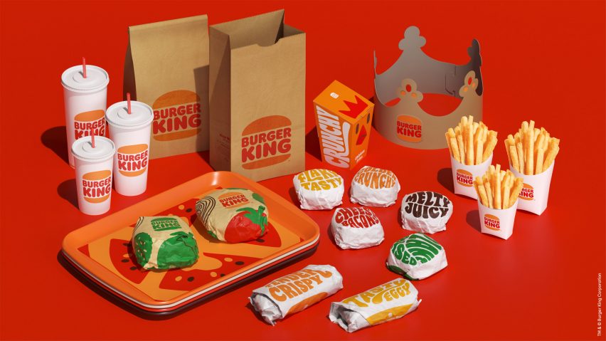
American fast-food restaurant Burger King has rebranded for the first time in 20 years with a revamped logo, packaging and uniforms designed by creative agency Jones Knowles Ritchie.
Burger King has carried out a comprehensive rebrand to update all elements of its visual identity with a design that it describes as "mouthwatering, big and bold, playfully irreverent and proudly true".
As part of this revamp the fast-food chain has ditched its previous logo, introduced in 1999, in favour of a flat design that is more aligned with the logo used by the brand throughout the 1970s, 80s and 90s.
As with the pre-1999 designs, the simplified logo is more clearly two bun halves sandwiching the words Burger King.
"We were inspired by the brand's original logo and how it has grown to have an iconic place in culture," explained Jones Knowles Ritchie. "The new logo pays homage to the brand's heritage with a refined design that's confident, simple and fun."
Alongside the new logo, Jones Knowles Ritchie has redesigned the brand's food packaging which will include the items' names written in a new custom typeface called Flame Sans.
"An irreverently bold typeface, Flame Sans evokes the natural, organic shapes of food," said Jones Knowles Ritchie.
"Warmer colours bring vibrant, fresh ingredients and the brand’s trademark flame-grilling method to life in packaging, crew uniforms, and digital experiences."
The overhaul includes redesigned uniforms for staff that will use a deep brown as their base colour. This will be paired with the new logo and trim in red, orange and white.
Merchandising, menu boards, restaurant signage and marketing assets will also include the font and revised colour palette.
Burger King will start rolling out its rebrand immediately and is aiming to overhaul all of its restaurants over the next few years. The brand hopes that the redesign will help attract customers to its food.
"Design is one of the most essential tools we have for communicating who we are and what we value, and it plays a vital role in creating desire for our food and maximizing guests’ experience," said Raphael Abreu, head of design at Restaurant Brands International, which owns the Burger King brand.
"We wanted to use design to get people to crave our food; its flame-grilling perfection and above all, its taste."
Over the past couple of years, Burger King's fast-food rival chain McDonald's has introduced a series of simplified restaurants and packaging designs.
Last year advertising agency Leo Burnett created minimalist posters for the brand with just lists of ingredients, while its pared-back restaurant in Chicago designed by Ross Barney Architects drew comparisons to an Apple store.

