Rebrand takes Burger King back to "when it looked at its best" says designer
Burger King's first rebrand in 20 years focuses on the American fast-food restaurant's food and its past says its designer Lisa Smith, executive creative director at Jones Knowles Ritchie.
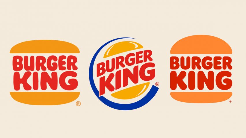
The comprehensive redesign of Burger King's visual identity by Jones Knowles Ritchie included the creation of a retro logo that closely resembles the logo used by the brand in the 1970s, 80s and 90s.
"We explored a lot of different design territories, but kept coming back to the brand's original iconic logo from 1969 and 1994 when Burger King looked at its best," Smith told Dezeen.
"We were inspired by how it has grown to have such an iconic place in culture – from Back to the Future, Gremlins through to more recently Stranger Things and BK’s Warhol campaign," she continued. "The new logo pays homage to the brand's heritage with a refined design that's confident, simple and fun."

The revamped logo replaces the previous design introduced in 1999, which was made up of a more stylised burger surrounded by a blue crescent. According to Smith removing the artificial-looking blue swish was a reference to improvements in the brand's food.
"Our choice to remove the color blue was somewhat symbolic of Burger King's recent removal of colors, flavors, and preservatives from artificial sources," she explained.
Rebrand aims to "improve BK's quality and taste perception"
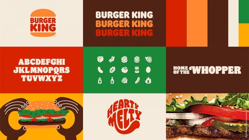
Alongside the retro logo, Jones Knowles Ritchie revamped the restaurant's packaging, uniforms, merchandising, menu boards, restaurant signage and marketing assets. All elements of the design, from the colour palette to the custom typeface called Flame Sans, were derived from the food.
"The approach to help improve BK's quality and taste perception through design we set out to evoke the great taste of the food," explained Smith.
"Whether that's the way we used color – inspired by the food and trademark flame grilling, how we photograph products with mouthwateringly delicious macro photographs of food and fresh ingredients, the shapes and forms of the 'flame' font, or the playfully irreverent style of illustration we've created."

A large part of this was combating existing negative perceptions of Burger King's food.
"Our creative approach reflects what Burger King is doing with the food, free from colors, preservatives and flavors from artificial sources," said Smith.
"We wanted to use design to help close the gap between the negative perceptions a lot of people have of fast food, and the positive reality of our food story by making the brand feel less synthetic, artificial and cheap, and more real, crave-able and tasty," she continued. "Put simply, to make the Burger King brand and the food even more craveable."
"Digital experience a huge driver"
As with most major brands, Burger King has a strong digital presence and the rebrand was designed to work across multiple digital platforms.
"The digital experience was a huge driver in developing the Burger King's rebrand, but what brand isn't digital-first these days?" said Smith.
"The approach to this is to make sure every brand identity asset whether static or in motion truly be distinctive and unique to the brand, so whether you're seeing just one element – the logo, the colors, the typography, the photography or all of them together they stand out and are recognizable."

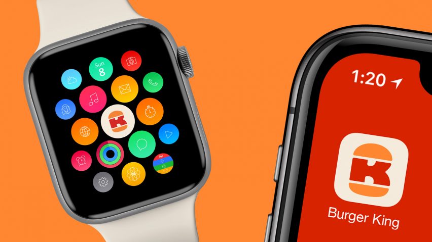
As part of the digital overhaul, Burger King will be using a new favicon that turns the letters B and K into a burger on its app and some other online platforms.
"In the new favicon we get to be a little more playful – turning the mark into a hidden B and K – an Easter egg for true design aficionados," added Smith.
Burger King will start rolling out its rebrand immediately and is aiming to overhaul all of its restaurants over the next few years.