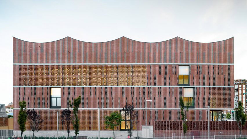
A mix of solid and perforated bricks creates rich patterns in the facade of this Barcelona sports centre, completed by three collaborating architecture studios.
Albert Salazar Junyent and Joan Carles Navarro of AIA, Antoni Barceló and Bárbara Balanzó of Barceló-Balanzó Arquitectes, and Gustau Gili Galfetti all teamed up on the design of Camp del Ferro.
Located in Sagrera, in the north of the city, it contains three indoor sports courts for the Sant Andreu district, an area where public sports facilities were scarce.
The architects chose brickwork for Camp del Ferro's exterior, as a mark of respect to the neighbourhood.
Not only is brick a common material in the area, but it also allowed for a mix of opacities, patterns and textures. Solid and perforated bricks in different shades create a variety of irregular stripes and bands, helping to visually break up the massing.
"The construction system is based largely on brick, deliberately revisiting the old factories, warehouses and workshops that are so numerous in the area," said the architects in a group statement.
"The low maintenance, bare brick facades alternate empty and full; opaque, translucent and transparent; and masonry units of different formats and colours, with the aim of lightening the whole."
While the effect may appear random, it was designed with functionality in mind. Perforated bricks allow sunlight to filter into the sports courts but also moderate glare, creating optimal conditions for play.
With the same thinking, the south elevation incorporates angled sun shades, made with the same perforated bricks.
The architects describe the intention as "giving the built volume a texture, a grain, a vibrant pixelation, while also adapting to the different orientations".
With such a large building, cladding wasn't the only technique the architects employed to reduce the perception of size. They also opted to sink a lot of the structure underground.
Two of the three sports courts are located in the basement, with natural light able to enter through high-level windows.
The third is then located at first-floor level, directly above one of these, while the roof of the other is used as an entrance plaza.
"The decision to partially underground the volume not only reduces its visual impact, it also generates an open urban space that is ceded to the city," said the architects.
"This space acts as a public foyer to accommodate occasional large influxes of visitors and users."
Arranging the building in this way led to a highly efficient layout, with all service and storage facilities clustered together at the centre. This helps to the minimise the building's energy requirements, which helped it achieve a LEED Gold sustainability certification.
Other contributing factors included the building's high thermal mass, as a result of its brick walls and plant-covered roof, and the integration of natural, cross ventilation.
Project credits
Architects: AIA, Barceló-Balanzó Arquitectes, Gustau Gili Galfetti
Structure: BAC
Energy efficiency: AIA
Contractor: UTE (OHL/Calaf)
Site management: SGS
Project management: Qstudi
LEED management: Develop Index Ambiental

