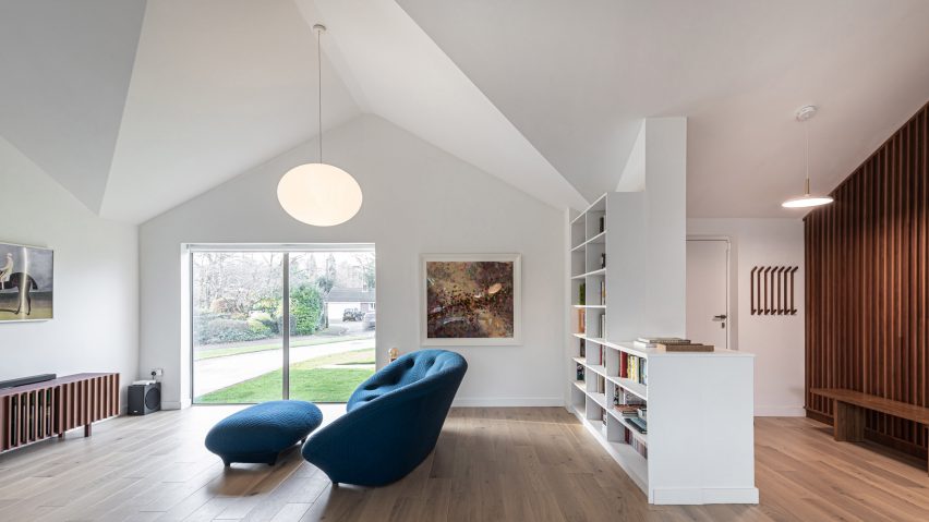
Intervention Architecture has overhauled a 1970s bungalow in Birmingham, transforming an interior that once seemed small and cramped into one that feels bright and spacious.
By removing partition walls, extending backwards and realigning the roof, the architecture studio has been able to create a generous open-plan interior for the single-storey property in Edgbaston, which is home to a family of three.
Renamed as Honey and Walnut House, the renovated bungalow now boasts a large open-plan living space with vaulted ceilings, expansive glazing and walnut joinery.
"As a form the bungalow holds huge potential, especially in the context of contemporary living," said studio founder Anna Parker.
"If you minimise new extensions to a bungalow form, you can instead place focus on opening up the key structure," she told Dezeen. "This assists in achieving a feeling of spaciousness in a cost-effective way."
Following this approach, the project team added a very simple, full-width extension at the rear of the property. They then swapped the original roof structure for one that is inset, which helped to rebalance the proportions of the building's exterior.
Inside, the old suspended ceilings were removed so that the sloping underside of this new roof could be revealed.
"The family wanted to create a large single space for kitchen, dining and sitting, with a library wall, TV area and connection with the garden," said Parker.
"The previous arrangement contained small cellular spaces with low ceilings, but fortunately all were non-load bearing partitions so we were able to open up the spaces entirely and vault the roof," she explained.
Parker has become an expert at making the most of constrained spaces, with previous projects including a Barbican flat renovation and a coach house conversion.
Like these projects, Honey and Walnut House has a floor plan designed to work as hard as possible. The new layout divides the house neatly into three zones, with the living spaces in the centre, bedrooms and bathrooms on one side, and garage and utility spaces on the other.
While the clients wanted their home to feel open, they were wary of creating a space that felt too cold and minimal. To avoid this, furniture was planned from the outset as a means of subtly dividing space.
In the living space, an in-built bookshelf provides seclusion for the lounge area, while the kitchen is clearly defined by a large island unit.
Materials also help to create a feeling of warmth. Oak flooring runs throughout the interior, while a wall of dark wood battens marks the tradition between the living spaces and the bedrooms.
"Our approach to the interior design was integral to the overall experience of the living spaces," said Parker.
"Unique to the project is the detailed panelling in darkened timber battens. Including secret doors to sleeping spaces, this sets a backdrop which contrasts with the lighter, brighter main space."
Joinery details also give character to the bedroom interiors. The master bedroom features a central bed and an oak window seat, while the plywood-lined children's room features a mezzanine deck and a climbing wall.
The same goes for a study room, which features a fitted walnut desk and shelving unit.
"The juxtaposition of light honey tones and dark walnut textures enhances natural light into the space, while also creating zoning and directionality throughout the spaces," said Parker.
Photography is by Handover Agency.
Project credits
Architect/interior designer: Intervention Architecture
Contractor: Kiwi Design & Build
Structural engineer: CDP

