"It is not cultural appropriation to take cues from the local culture" says commenter
In this week's comments update, readers are questioning who should design the Aboriginal Art and Cultures Centre in Adelaide and sharing their views on other top stories.
Diller Scofidio + Renfro and Woods Bagot have revealed visuals of the Aboriginal Art and Cultures Centre in Adelaide, Australia.
The architecture studio was inspired by traditional Indigenous shelters when designing the building, which will host a mix of exhibition and event spaces to celebrate the "past, present and future" of Australia's First Nations.
"I don't think this building evokes anything remotely Aboriginal"
Readers aren't convinced that the right studio was chosen for the job though.
"So let me be clear, an architecture firm in New York is designing an Aboriginal Art and Cultures Centre in Australia?" asked Sim. "So a group of – probably white – people will fly from New York to Australia to attend meetings and visit the build... A group of – probably mainly – white people, who also may not be very aware of Aboriginal culture?"
Chris was also concerned: "It would be nice for Indigenous Australians to build their own museum. Only then will it feel like a museum designed by them for their history. Not someone else's vague interpretations and flimsy archispeak."
"I don't think this building evokes anything remotely relating to Indigenous Australians," continued Simon M.
"Calm down there," replied Zachary Flagle, on the other hand. "An architecture firm was selected based on their capacity to practice architecture, not where they come from or the colour of their skin. Would you rather have someone with minimal architectural skills design this complex program? It is not cultural appropriation to take cues from the immediate site context and local culture. That is an architect's job."
Should Diller Scofidio + Renfro and Woods Bagot design the centre? Join the discussion ›

Richard Rogers' final building is "an engineering marvel" says reader
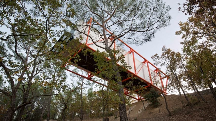
Commenters are discussing Richard Rogers' final building – a gallery that cantilevers 27 metres out above the hillside at the Château La Coste vineyard in southern France.
"As a final piece to celebrate one of the great careers in architecture, I find this a perfect symbol to represent his work and ideas," said Archi. "Really is a beautiful, highly-detailed, engineering marvel."
Kurious Oranj agreed: "It's a lovely little coda to the career of an architect who has always foregrounded the engineering aspect of construction and the tensile engineering really does hark back to the early days of the Pompidou etc."
"It's very similar to the ZipUp House he designed over 50 years ago," added Alfred Hitchcock. "Career comes full circle."
Are you impressed by The Richard Rogers Drawing Gallery? Join the discussion ›

Coral Bloom resort by Foster + Partners is the height of "hubris" says commenter
Readers are debating a resort on the Shurayrah island in Saudi Arabia that has been designed by Foster + Partners to "blend in with the natural environment".
"When it is finished there may be no coral left to inspire luxury resorts," said Steve Leo.
"Hubris," continued Ann Jones.
"I have to say it is increasingly worrying that so-called starchitect offices keep accepting this kind of, in the best case, questionable commissions without any kind of critique," added SJ. "Maybe they think, 'well, if they are doing it anyway, it's better for everyone that I design it?'"
Does the Coral Bloom resort blend in? Join the discussion ›

"The Chrysler and Empire State Buildings deserve some breathing room" says reader
Commenters are concerned that Skidmore Owings and Merrill's design for a supertall skyscraper in New York would prevent people from being able to see key landmarks.
"I'm usually pro-development, but this is too much," said Heywood Floyd. "I don't see where all of the air rights for such a massive tower could have come from. It's bigger than One Vanderbilt."
Vandra agreed: "I'm sure it's no accident they aren't showing this project in relation to its neighbours. It's literally across the street and almost twice the height as the Chrysler building. I'm not anti-development in NYC but Chrysler and Empire State are the landmark towers that deserve some breathing room."
"Something missing in those drawings... Oh, I know! The poor Chrysler Building, which the SOM project will bury forever," concluded Mark Leydorf.
Do you think 175 Park Avenue will be too tall? Join the discussion ›
Read more Dezeen comments
Dezeen is the world's most commented architecture and design magazine, receiving thousands of comments each month from readers. Keep up to date on the latest discussions on our comments page.