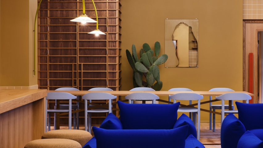
Stockholm-based Note Design Studio used neutral colours and contrasting bright hues to reinvigorate the interiors of the Douglas House office building in London.
Note Design Studio designed the Douglas House office space, which has 700 desks spread over six floors, for office developer The Office Group (TOG). It had previously designed the Summit House property for the company.
The Swedish studio aimed to "break the grid" of the 14,235-square-metre 1930s office building, which has a vertical layout and red brick-facade.
"As a building, Douglas House is very 'rational' in its architecture," designer Jesper Mellgren told Dezeen. "Even though it stretches quite far horizontally, it was vertical in its structure and spatial program."
"We realised early that we wanted to 'break the grid' of the building and deliver an interior less predictable than what is expected from the industrial appearance of the facade," he added.
"That also related to a more abstract idea about breaking the conformity of our everyday lives, to design a place that actually shakes you up a bit when entering for your workday."
While many office spaces are designed to enhance productivity, Note Design Studio said its focus for Douglas House was more on creating the right feeling and mood.
To create a space that would, in the words of the studio, bring a "gentle punch" to office design, it used contrasting colours and materials throughout the space.
"The palette ranges from deep ochres to brisk light blues, calm chalk tones, popping reds and vivid blues," designer Charlotte Ackemar said.
The studio aimed to keep as much of the original details as possible but had to replace a lot of materials that were in poor condition. The original wooden floors, however, were lifted, renovated and put back into place.
"We have worked with giving the building a more defined character by using materials that will live long together with the building itself," Ackemar said.
A curvilinear wall made from glass blocks has been added to the ground floor to connects its three main public spaces.
"It stretches through the whole building giving spatial richness to the promenade between different functions of the ground floor as well as a vivid backdrop enhanced by the activity of the meeting rooms that are blurred through the glass blocks," Mellgren explained.
"The curve also creates unique footprints for the meeting rooms and the three communal spaces, which with a straight wall would have been more or less identical to one another in terms of space."
Other materials used for the project were chosen for their durability, as office buildings experience extensive wear and tear, and their reusability. They include steel, glass and ceramic tiles, as well as 100 per cent recyclable Tarkett IQ plastic wall and floor coverings.
Douglas House was also given solar panels and a green biodiverse roof to further enhance its sustainability credentials.
Note Design Studio also added a number of design touches to the interior, including a reception desk in Ettore Sottsass veneer for Alpi in a striking blue-grey colour, and pieces from brands including Artrex and Muller van Severen in bright hues.
Newly commissioned pieces from artists and designers including Jenny Nordberg, Jochen Holz, Wang & Söderström, Philipp Schenk-Mischke, James Shaw, Mijo Studio and Studio Furthermore also fill the building.
Douglas House also includes an "oxygen room" – a plant-filled space where the idea is that workers can relax and connect with nature, the "recharge room", gym, cafe and a mothers' room which is dedicated to nursing mothers.
"We have worked with the whole building and designed small or big things on every square metre basically," Ackemar said. "A lot of the office spaces are done in the same manner, but the public and communal spaces all have their unique design attributes."
Douglas House has 700 desks for over 1,000 employees and opened in November 2020. Note Design Studio thinks the final design has succeeded in creating a different kind of office space.
"From our point of view it differs on many levels – it has a lot more expression than you normally see in an office space, a diversity of tempos and functions allowing people to choose what suits them best that specific day," designer Johannes Carlström said.
Among the studio's other recent projects are the pastel-coloured Mantelpiece Loft interiors in Stockholm and a reusable trade fair stand for Vestre.
Photography is courtesy of The Office Group.

