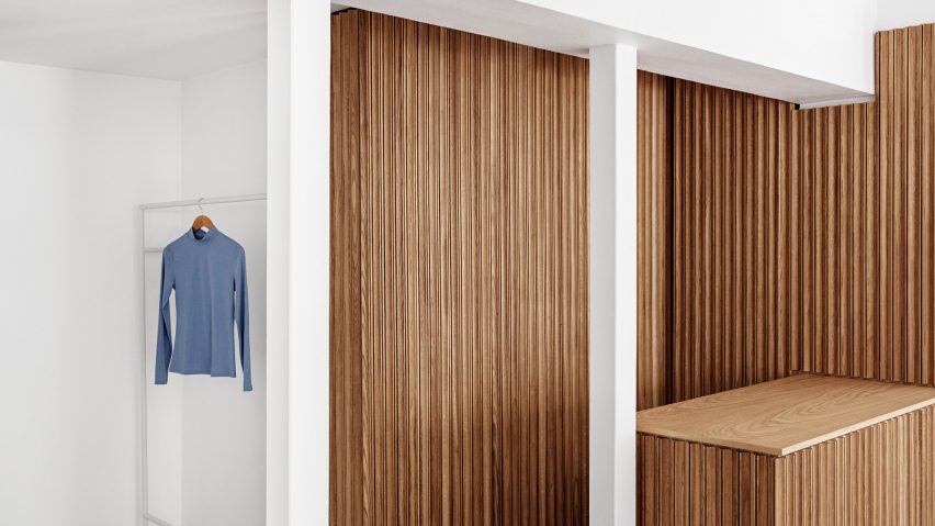
The minimalist, utilitarian interior of this store in Copenhagen by local studio Aspekt Office provides a neutral backdrop for the colourful clothing and homeware that it sells.
Located on Niels Hemmingens Gade where it meets the city's pedestrian shopping street Strøget, the OCE concept store occupies a building that dates back to 1736.
OCE stands for objects, clothes and experiences, in reference to what's on offer in the lifestyle brand's roughly 50 Chinese stores and its growing number of European outposts.
Terkel Skou Steffensen and Hans Toft Hornemann of Aspekt Office were asked to create an interior for the brand's Copenhagen store that would help to attract Scandinavian customers.
"The design requirements for the new store were clear and concise," said the studio, which has provided creative direction for OCE for several years.
"OCE wanted us to create a Nordic atmosphere and add a Scandinavian look, feel and expression to their brand, to be able to attract Scandinavian costumers. That was paramount."
The studio decided to divide the store into different zones, one dedicated to fashion and the other to homeware.
Upon entering at ground floor level, customers are greeted by an oak service counter that provides a warm counterpoint to the all-white interior while effectively splitting the area in two.
"In general, we have worked with as few colours as possible to make [OCE's] colourful products stand out and take the primary focus," said Steffensen and Hornemann.
"To obtain the essential Scandinavian look and feel, we have worked with carefully selected materials. Scandinavian design is a design movement characterised by simplicity, minimalism, functionality and beauty, and we had to mirror that in OCE's new store."
In the home department to the right of the counter, the interior was kept "sterile and raw", with products displayed on simple white and coral-coloured steel shelves.
On the other side, the fashion department sees clothing hung on white steel rails and changing rooms concealed behind grey wool curtains. A grey linoleum floor, designed to resemble concrete, was used throughout to create a calm and relaxing atmosphere.
Several of the shop's display tables are topped with a speckled, terrazzo-like material that is created from recycled yoghurt pots by UK company Smile Plastics.
"Since the store is very small and compact, we made it our mission to utilise even the tiniest little corner," explained the studio, which has transformed the previously unused space under the stairs into an exhibition area with built-in shelving.
"In this way, we highlight the stairs of the store and lead people to the first floor."
The store's minimal white interior was also designed to be respectful to the surrounding architecture.
"The store is located in a pedestrian area, surrounded by historical buildings with bricks facades and stucco decorations," the studio explained.
"Another common feature of these buildings are the large, high windows that allow in as much light as possible, but also allow you to see the beautiful surrounding edifices," it added.
"We wanted the shop to have a look that blends in homogeneously, no dramatic pops of colour, no discontinuity with the neighbouring interiors that you can see through the windows. The soft palette blends in with the surrounding environment, the materiality chosen is simple and discreet, yet modern and fresh."
Other designers who have attempted to capture a Scandinavian aesthetic in a retail setting include Ulrika Bernhardtz, the creative director of lifestyle brand Arket, who designed the brand's Copenhagen store using an all-grey palette.
In London, architecture firm Farrells conceptualised the interior of a mixed-use shopping and dining development to reflect Japanese and Nordic culture, while the Soho store of clothing brand Eytys references Swedish brutalism and postmodernism.

