Studio Tamat creates casual interiors for Rome restaurant Tre De Tutto
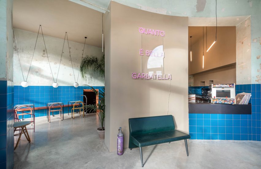
Studio Tamat hoped to create the feeling of a casual local bar with its design for Tre De Tutto, a restaurant in the south of Rome.
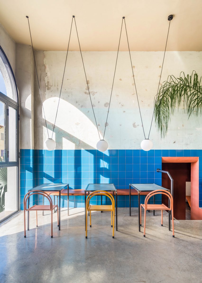
Although the restaurant only recently opened, its interior is designed to feel lived in, with its simple tiled walls, humble furniture and peeling plaster.
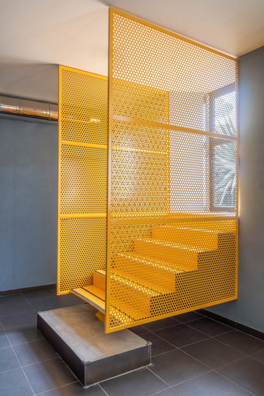
These are contrasted by bold contemporary details that include geometric lighting fixtures, a neon sign and a yellow suspended staircase.
Tre De Tutto is located in Garbatella, a neighbourhood with a distinctly 1920s character. The space was previously a bakery, but had been abandoned for some years.
Studio Tamat's design follows the concept proposed by restaurant owners, to create a space that takes inspiration from the local neighbourhood traditions and culture.
"Owners Mirko Tommasi and Daniele Notte proposed revisited classics of Roman cuisine, taking inspiration from one of the most authentic neighbourhoods in Rome," explained studio co-founder Matteo Soddu.
"In the same way, our goal from the beginning was not to distort the pre-existing space, but to enhance it and at the same time, bond with its clientele," he said.
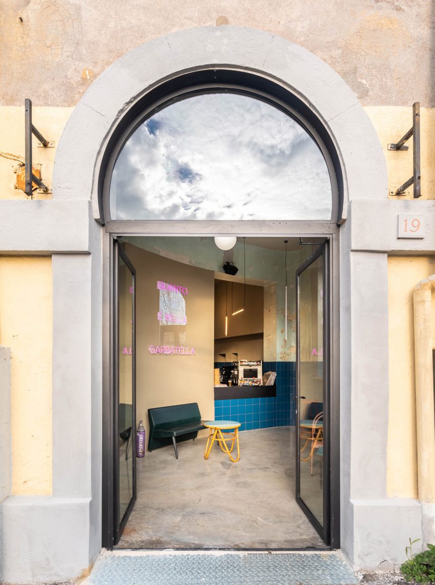
The neon sign offers the same message, reading "Quanto é Bella Garbatella", which means "How beautiful Garbatella is".
The restaurant is divided up into various rooms, with some at ground level and others set half a storey below.
The triangular upper level consists of three rooms that are usually reserved for breakfast and aperitifs, including a bar and a lounge area. The lower level contains two dining rooms, along with the kitchen and storage areas.
Both levels have a slightly different design character, with a colour palette designed in collaboration with consultant Sabina Guidotti.
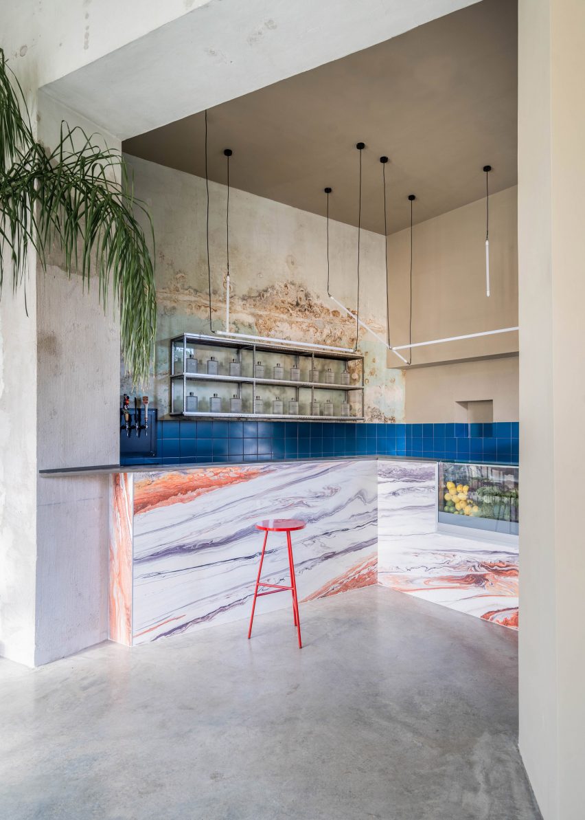
Upstairs rooms have a bold colour palette, with blue majolica tiles set against contrasting mortar, plus a marbled bar counter in vivid shades of orange and purple, and three grand arched windows.
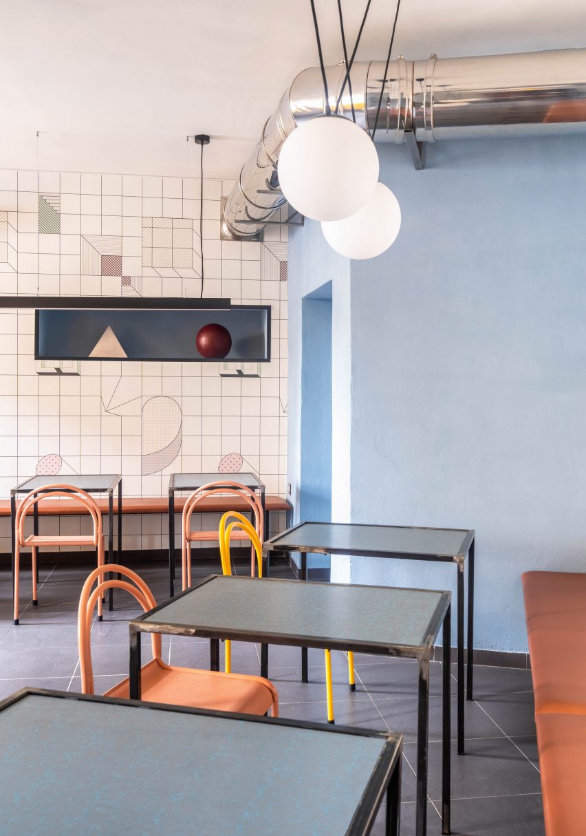
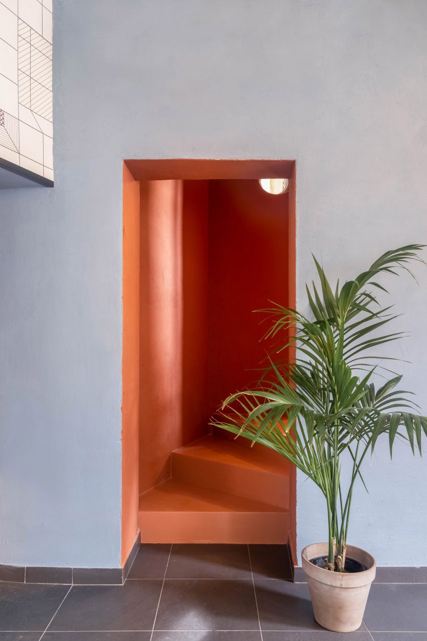
A coral-coloured "staircase tunnel" leads downstairs, where rooms feature pale blue walls and wallpaper with cartoon-style graphics.
The yellow staircase features on this level, connecting one of the dining rooms with the street.
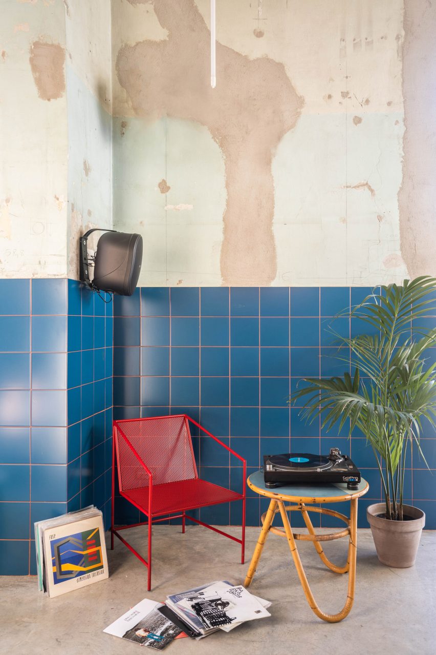
Humble finishes and timeless elements feature throughout, including a resin-topped concrete floor, vintage metal chairs, leather-like upholstered benches and large pot plants.
"We left the rough walls, with the original layers of plaster, to dialogue with the contemporary design of the architectural elements that characterise the space, from the clean-cut counter that dominates the bar, to the exquisitely pop staircase of the restaurant," said Soddu.
Tre De Tutto's menu matches its design, with a selection of drinks inspired by local history and "unpretentious" dishes that include pasta, panini and antipasti.
Photography is by Seven H Zhang.