Studio Anton Hendrik Denys and Steen Architecten have transformed an industrial office building in Belgium by cladding it in corrugated metal and adding colourful graphic interiors.
Studio Anton Hendrik Denys, in collaboration with Steen Architecten, stripped the existing office building in Heverlee back to its core and used the company's corporate identity to create a design that it calls a "contemporary twist on modernism".
The AEtelier office was designed for an IT consulting company in Belgium and contains a combination of private workspaces, meeting rooms, open plan communal areas, and event rooms that can be used for events and conferences.
"I love and always apply a minimalistic design-language, but simultaneously I feel the need to add something extra," studio founder Anton Hendrik Denys told Dezeen.
"Modernism often balances minimal shapes wonderfully with splashes of colour and new, unfamiliar materials."
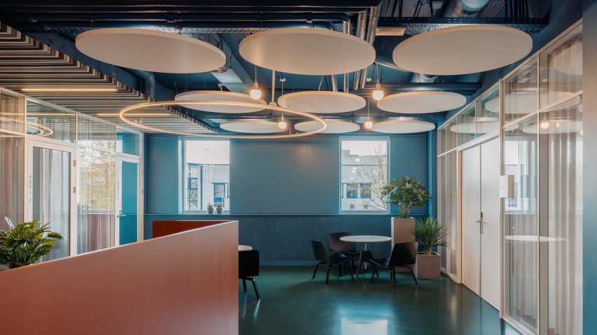
Informed by the bold interior colour schemes of the 1960s, the designer chose a deep blue colour for the walls of the office and used teal carpeting and a green floor throughout.
A welcome desk and lockers at the entrance of the office have a muted grey colour palette and are framed by a wood-panelled backdrop, while the blue walls and ceiling create a colourful contrast.
An existing dropped ceiling was replaced with circular soundproofing panels that expose the height of the space and its industrial piping and fixtures.
Circular acoustic panels have been added to the ceilings throughout the interior. These are mimicked in large halo lighting fixtures suspended over tables, as well as on cabinetry details that feature circular cut-outs, and have also been added to a wall in a private office.
Denys used colour in an informative way to define different spaces. The orange hue used for the company's corporate identity was chosen for kitchen areas, bars, toilets and soft furnishings, to make these easy to find.
"The main colour of my client's corporate identity happened to be orange, which was both a welcome coincidence and a perfect starting point to build my midcentury-inspired colour palette," Denys said.
"In the meeting rooms eventually, less bright shades of the main colours were applied to create a more relaxed atmosphere," he added.
A visual language was developed by Jaap Knevel, an information designer, to create iconography and signage so that staff and guests can easily navigate within the space.
The green floor defines shared spaces and guides users through the building. These hard floor surfaces are juxtaposed with a soft teal carpet that covers the floors of private offices and meeting rooms.
Studio Anton Hendrik Denys and Steen Architecten also renovated the exterior of the building, which is now clad in corrugated aluminium that contrasts and frames glimpses of the bold interior that can be seen through the windows.
The aluminium cladding continues into a central landscaped courtyard that houses plants, as well as bright red furniture and a concrete bridge that connects two parts of the office.
"For the outdoor renovation, the goal was to create a calm and subtle look that would serve as a frame for the bright interior," Denys explained.
"Creating a contrast between a silver-ish facade with windows framing shots of blue, orange, green and pink behind them," he added.
"I wanted to move away from the general perception of how office spaces should look like nowadays," Denys explained.
"Besides that, I wanted to create a space that could be reorganised as time evolves and people might have different needs for their work environment."
Studio Anton Hendrik Denys was founded by Anton Hendrik Denys, a Belgian-born designer based in Copenhagen who works across art, furniture design, interior and spatial design.
Colourful office interiors are on the rise. Beyond Space recently completed this colourful office designed around a reconfigurable grid system, while Note Studio also created a bold interior that aims to "break the grid" of 1930s office buildings.
Photography is by Hannelore Veelaert.
Project credits:
Designer and creative lead: Studio Anton Hendrik Denys
Collaborating architect: Steen Architecten
Landscape design: Van Dyck Tuinarchitectuur

