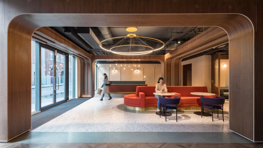
Tigg + Coll Architects has revamped the common spaces of a student housing block in east London, to create areas where students can feel comfortable being around others.
The London-based studio has designed a completely new layout for the ground floor of Chapter Old Street, creating a range of spaces for relaxing, studying or meeting up with friends and family.
As both the design and build stages took place in the midst of the Covid-19 pandemic, social distancing and isolation were in the minds of the architects throughout.
The space has a "broken-plan" layout, meaning that spaces are subtly divided up by partial walls and frames. This creates an open feel, but also provides natural separation between different areas.
"We were intrinsically conscious of creating broken spaces that students would feel comfortable to use, no matter what the future held," said studio co-founder David Tigg.
"Be it spaces for gathering in small groups at a study desk or individuals waiting for friends to come down from their rooms, it was important to try and consider how people would feel about proximity and what we could actively do about it," he told Dezeen.
"Our use of screens and arches were part of this interplay of breaking these spaces down, to give focus to activities, but also a tool to create physical subdivision for individuals or small groups."
Previously only 30 per cent of the ground floor was accessible to students. Tigg + Coll's scheme has created a more efficient layout that makes more of the area available, allowing the space to feel like a lounge rather than just an entrance lobby.
This feeling is enhanced through the use of heavy fabric curtains, comfortable furniture and soft lighting.
"It is really important that these areas feel relaxed and inviting, so that students will feel at home and want to really use the spaces rather than just pass through them," Tigg said.
The interior design concept references the building's location near the former site of the Curtain Theatre, which is famous for being the first home of Shakespeare's theatre company, the Lord Chamberlain's Men.
Details are inspired by theatres from across history, from the art-deco buildings of the 1920s to the Hollywood glamour of the 1950s.
The most distinct of these are the curved walnut arches, which take their cues from the classic proscenium stage. These are complemented by fluted glass screens, brass lighting fixtures and a terrazzo floor.
There are also some "set pieces" – a colourful two-tier reception desk and a large red seating banquette.
Chapter Old Street is the latest in a series of student housing buildings that Tigg + Coll has worked on, including Chapter's venue in King's Cross.
Tigg believes the key to creating functional spaces in the buildings is to makes spaces as versatile as possible.
One of the ways of achieving that at Chapter Old Street was by paying attention to acoustics. The glazed screens and theatrical curtains help to reduce overt noise reverberation, ensuring that conversations can be kept fairly private when necessary.
"It sounds obvious but I think one of the key lessons is to always remember that you are trying to design a home, a space that people will be excited about living in but also feel comfortable enough to use as they see fit," Tigg added.
"You want to allow people enough bandwidth for curating the use themselves, to a degree."
Other projects by Tigg + Coll Architects on Dezeen include a London house extension with a bright-red steel frame and a student housing block in Spitalfields, London.
Photography is by Peter Landers.
Project credits
Client: Greystar Europe
Architects/interiors: Tigg + Coll Architects
Main contractor: Corley & Woolley
M&E: Corley & Woolley
Acoustics: KP Acoustics
Joinery: Faber bespoke
Furniture supplier: Conran

