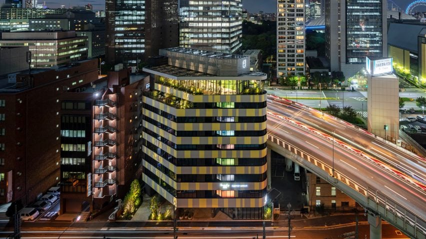
Klein Dytham Architecture has designed a hotel in central Tokyo with a series of colourful, two-tone bedrooms and a Pantone colour of the year exterior.
Built on a tight urban site in the city's Suidobashi district, the hotel was designed to provide accommodation for both business and leisure guests, which gives it its name – Toggle Hotel.
"The hotel can be used as a business or work-cation – on – or for leisure, visiting concerts and sports events in Tokyo Dome nearby – off," explained Klein Dytham Architecture co-founder Mark Dytham.
"Like a toggle switch!"
The nine-storey, triangular block is wedged between a raised expressway, a railway line and the Kanda River.
This largely grey urban setting informed the colourful exterior and interiors of the hotel, which was designed to stand out from the neighbouring infrastructure.
"Toggle Hotel was meant to stand out like a billboard when seen from the expressway on the north-east side or the Chuo Line train on the south side," explained Klein Dytham Architecture co-founder Astrid Klein.
"We also wanted the hotel to embrace the city with framed views of the trains, cars and the occasional boat from each of the rooms," she told Dezeen.
On the exterior Klein Dytham Architecture choose to combine grey with yellow, the two shades that Pantone recently named as its colours of the year for 2021.
At the hotel, the colour combination was informed by the nearby road markings and colour of the railway line – the Chuo Line – that runs in front of the building.
"The graphic inspiration came from the road marking on the adjacent expressway – as well as being a signifier to pay attention, yellow also stands for a sunny smiley face in the monotonous grey urban fabric," Dytham told Dezeen.
"That it turned out to be the Pantone colour combination of the year was pure coincidence," he added. "We received planning permission for the colour and pattern almost two years ago – but proves we are always right on point!"
Within the hotel, the interior spaces were largely decorated in two-tone colour schemes.
The reception and cafe located at the top of the building is half green and half grey, while the corridors on each of the bedroom floors are uniquely coloured so that guests know that they are on the right floor.
All of the rooms are brightly coloured with furniture, bedding, carpets and soft furnishings in the same colour to create a striking visual impact.
Continuing the hotel's two-tone colour theme, each of the room's bathroom areas is coloured a soft pink.
Guests will be able to pick their rooms based on their colour preferences and the architects hope the colourful interiors will add to their enjoyment of the hotel.
"You book your room by size and colour combination – here are almost 60 different combinations in this 85 key hotel," said Klein.
"Colour can be uplifting, energising or calming and inspiring."
"We do not get enough colour in our daily environments, so we thought that a stay at Toggle could be a new refreshing colourful experience."
Tokyo-based Klein Dytham Architecture was founded by Klein and Dytham in 1991.
The studio recently created a "fairytale clubhouse for the Risonare Nasu hotel in rural Japan and previously built a shingle-clad clubhouse and visitor centre alongside an ice rink in Japan's Karuizawa region.
Photography is by Shingo Nakashima.
Project credits:
Architect: Klein Dytham architecture
Co-architect: Irie Miyake Architects and Engineers
Structural engineer: Irie Miyake Architects and Engineers
MEP: Irie Miyake Architects and Engineers
Graphic design: Shun Kawakami & Artless
Lighting design: Daiko Electric
Contractor: Kitano Construction
FFE contractor: Tanseisha

