"Why can't the virtual spaces be less representational of the real world?" asks commenter
In this week's comments update, readers are debating a range of capsules containing fantasy architecture projects and sharing their views on other top stories.
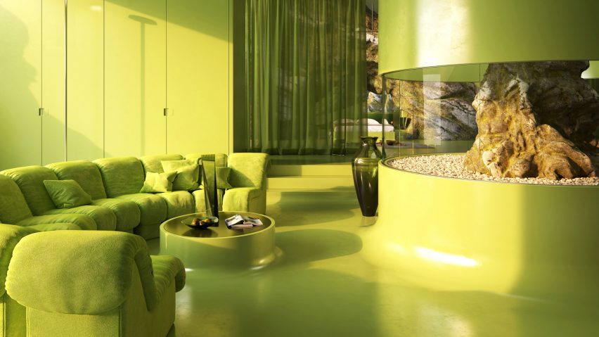
Digital designer Anthony Authié of Zyva Studio and visualisation artist Charlotte Taylor have collaborated on a range of capsules containing fantasy architecture projects.
The collectable capsules contain visuals and files of virtual projects the duo have produced over the last few years including Villa Ortizet and Neo-Chemosphere, two fictional dwellings the duo worked on together.
"Can't they see the irony in this?"
Some readers aren't convinced. "Go outside," said Jb.
Miles Teg continued: "Are they actually saying the 'virtual' world is taking over, whilst designing a physical device? A capsule thing just to show some renders? Can't they see the irony in this?"
"If the real world is being taken over by the virtual then why can't the spaces be less representational of the real world and more exploitive of the virtual?" asked Puzzello.
Corporate Overlords was more positive: "I like it. It's a great business idea and it's fun. Perfect for industrialised countries that no longer make anything but hot air."
Are commenters missing the point? Join the discussion ›

"I was about to freak" says reader
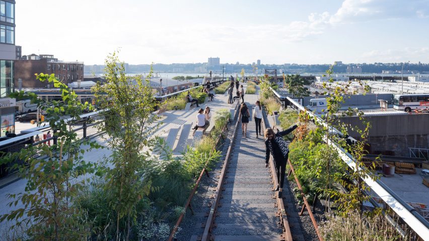
Commenters have plenty to say about fictional plans for a new pedestrian walkway on top of the High Line in New York. Dezeen published the story on April Fool's Day.
"I was about to freak," said Yethica. "And then I realised what day it was."
"Before commenting check the date," added Speed.
"This concept is the bastard child of April Fool's day and Monty Python," concluded M. "C'est adorable!"
Did you fall for "The Even Higher Line"? Join the discussion ›

"A 21st century cathedral" says commenter
Readers are discussing a viewpoint in San José, California, which SMAR Architecture Studio has designed with rods that will sway in the wind and generate the power to light themselves.
"Congrats! It is beautiful," said Brian Salvatierra, "but this is similar to the Taiwan tower of Sou Fujimoto."
"A 21st century cathedral," added Rob Weeve.
Zea Newland was less keen: "In Silicon Valley people prefer LED lights over actual stars it seems."
What do you think of Breeze of Innovation? Join the discussion ›

"Beautiful small house" says reader
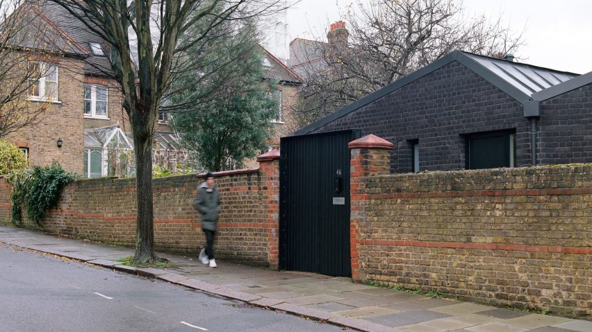
Commenters are impressed by Phillips Tracey Architects' design for a compact black-brick house in west London. The building references a pair of garages across the street.
"Compact, efficient program," said B. "Well designed, interesting and on a budget! Well done."
Leo agreed: "Beautiful small house. I just think the position of the sofa, facing the wall, is a bit awkward. But I would move in any time."
"Very nice, down to earth project with some refreshing play of roof line," added Milton Welch.
Are you a fan of Jupp House? Join the discussion ›
Read more Dezeen comments
Dezeen is the world's most commented architecture and design magazine, receiving thousands of comments each month from readers. Keep up to date on the latest discussions on our comments page.