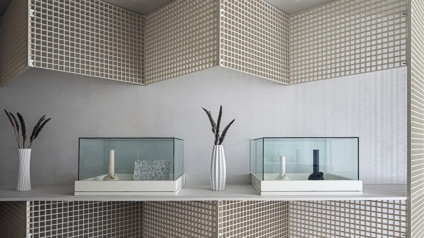
Toronto-based StudioAC has used industrial grating to create faceted walls within the interior of luxury cannabis dispensary Edition.
Following the opening of the dispensary's first store in Toronto's downtown Annex neighbourhood last year, the local practice was invited back to create a second, larger store in the St Clair West area of Midtown.
In Edition's original Annex outpost, off-the-shelf industrial grating was used to form minimalist display fixtures that house a curated selection of cannabis strains and luxury smoking accessories.
The new store uses the same metal grids, which StudioAC has praised for their "affordability" and "enticing visual quality", but takes the idea one step further by having them line almost the entire interior.
Set at a 90-degree angle, the square and rectangular panels create zigzagging, self-supporting structures that run along the length of the store.
"The use of the industrial grating was initially inspired through some museum installations and public art pieces we had done before Edition hired us," said StudioAC founders Jennifer Kudlats and Andrew Hill.
"In the St Clair store, we wanted to play further with the grating's self-supporting attributes and the introduction of the triangulated geometry saw the installation require much less secondary support or blocking, thus increasing the cost and construction efficiency," told Dezeen.
The generous proportions of the new store allowed StudioAC to create wider fixtures compared to the slimline, linear ones used in the Annex location.
"The increased width led to an approach that wrapped the space with a faceted gesture," the studio said. "This introduced a completely new geometry to the space while maintaining the Edition aesthetic through the use of an identical material palette."
The industrial grating was used to clad three sides of the store's interior, as well as forming long display tables, a service counter and a privacy screen in the shop window that shields product displays from the street, as per cannabis retail regulations.
"Square intersections allowed for simple connections and swift installation," said the studio.
"This geometric rigour was a welcome approach as it produced a strong aesthetic identity while maintaining the monochromatic backdrop desired to display a variety of retail items."
To maintain a clean, minimalist interior, floors and counters are finished in micro cement while walls are painted with a limewash.
Edition's products are presented on white trays under glass vitrines and lit from above using simple fluorescent lamps alongside a series of recessed ceiling spots. A third display counter lines the store's fourth wall, blending into the architecture.
Canada legalised the recreational use of marijuana in 2018, making it the largest country with a legal marketplace for weed.
Elsewhere in Toronto, Paolo Ferrari has created the interiors for a marijuana dispensary that "rejects staid cannabis clichés" with mirrored ceilings and custom-made sniff jars connected to digital display screens.
Photography is by Double Space Photo.

