Kaan Architecten hides "autonomous" extension at the heart of Antwerp's Royal Museum of Fine Arts
Dutch architecture practice Kaan Architecten has concealed a minimalist wing within the existing 19th-century structure of the Royal Museum of Fine Arts in Antwerp.
Invisible from the outside, the extension was added as part of an ongoing, €100 million overhaul of the museum that began ten years ago and includes the restoration of its existing galleries and offices.
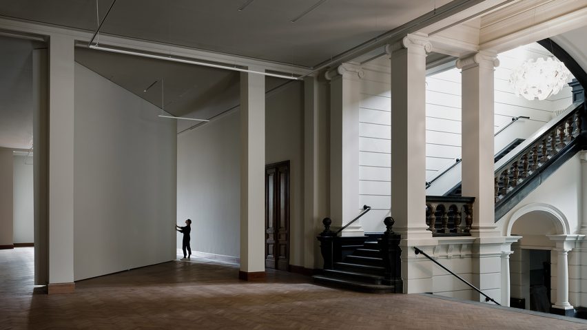
Also known as KMSKA, the Royal Museum of Fine Arts Antwerp is one of the last and greatest examples of neoclassical architecture in Antwerp. Completed by architects Jacob Winders and Frans van Dyck in 1894, it now houses an extensive collection covering seven centuries of art.
Kaan Architecten has been working on the building's masterplan, restoration and extension since 2003 when it won an international competition commissioned by the Flemish Government.
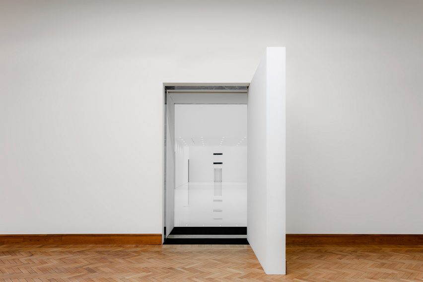
The studio designed the extension to be completely hidden within the museum's existing inner structure, so it remains invisible from the outside and preserves the integrity of the original 19th-century building.
"The 21st and the 19th-century museum couldn't be more different and more intense," said Kaan Architecten co-founder Dikkie Scipio.
"They embody an emblematic contrast in dimensions, light and atmosphere while being designed as flexible spaces to welcome future exhibition."
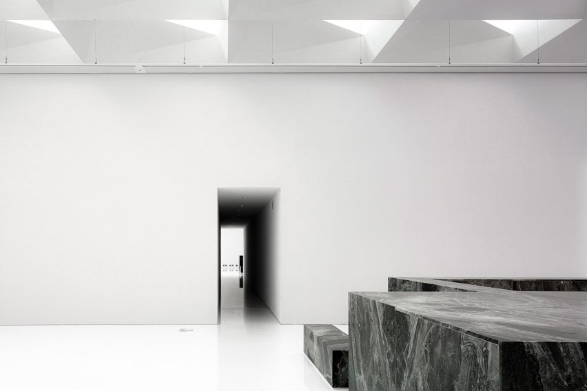
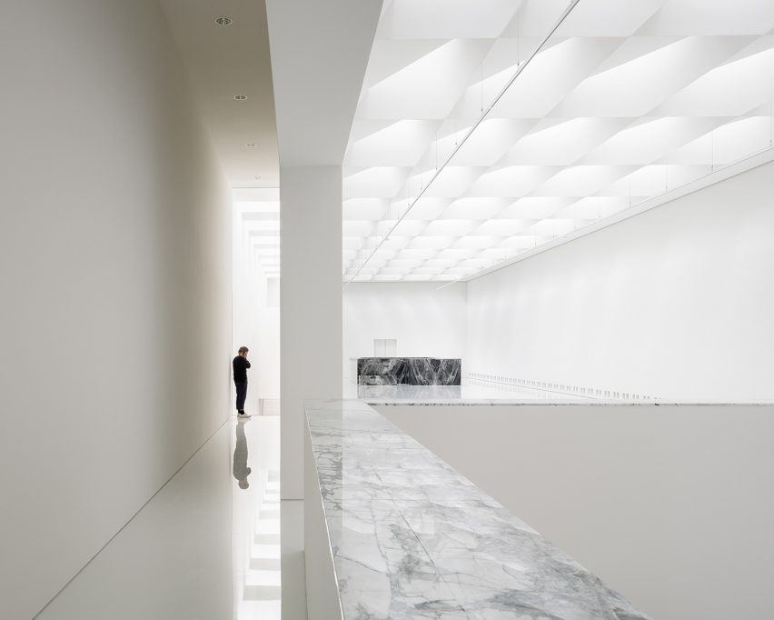
Described by the firm as "a completely autonomous venue", the new wing is made up of a sequence of bright white exhibition halls with floors made from high-gloss urethane.
It was built within the building's four original patios and sits in contrast with the rich colours, oak doors and plasterwork ceilings of the historical museum.
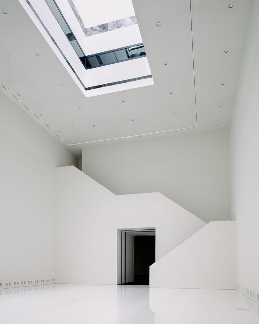
The rooms are flooded by daylight from 198 triple triangulated, north-facing roof elements located on the top hall that funnel light through four large light wells.
These measure up to 23 metres from floor to ceiling, creating views through the building and giving the new wing the nickname of the "vertical museum".
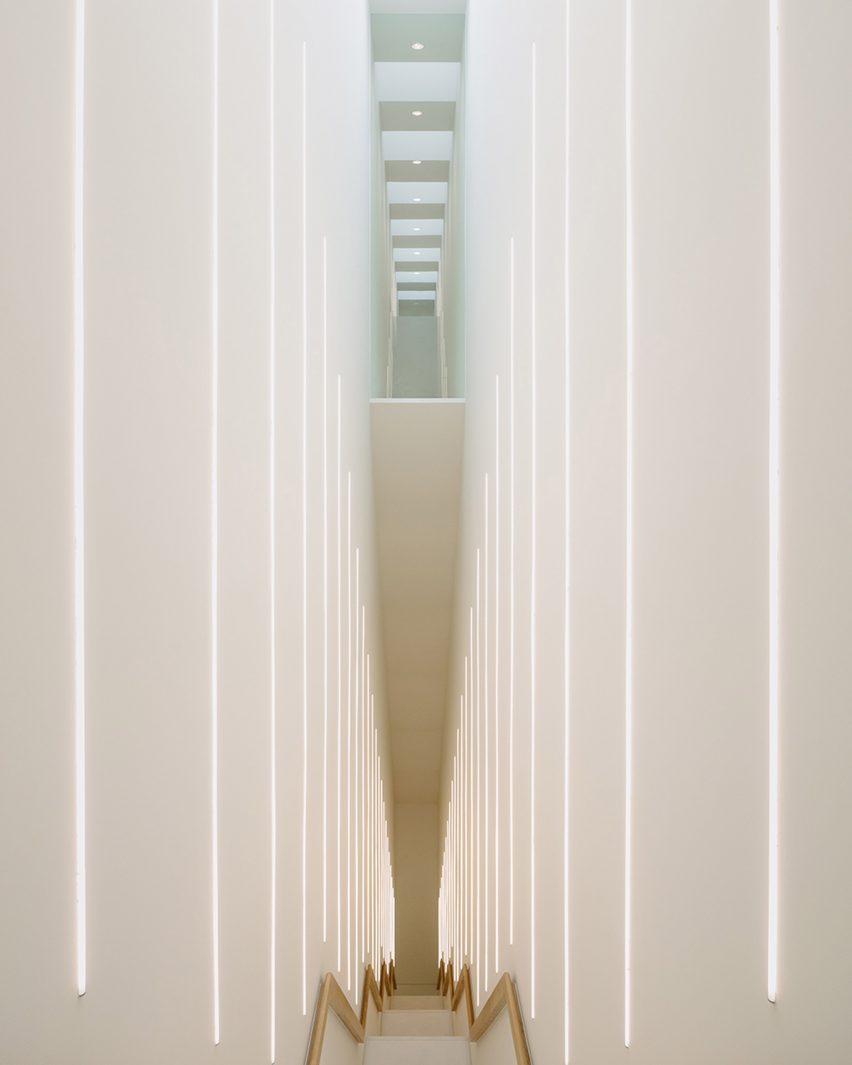
"These skylights are designed to guide and diffuse the light, and their structure also features additional lighting to compensate for the seasonal loss of daylight," said the studio.
At the points where the new extension overlaps with the historic museum, the Kaan Architecten added subtle marble inlays that reference its original materiality.
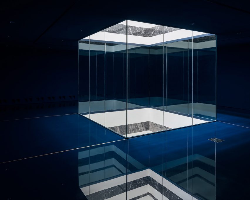
A long, linear staircase leads to the top floor and also provides access to an intermediate floor, where etchings and drawings are displayed.
In these darker spaces, the floors, walls and ceilings are finished in an intense dark blue shade that is visible from the floor below through the light wells.
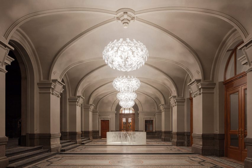
The museum's overall layout was designed by Kaan Architecten as an "enchanting journey" and divided into three realms including a public entrance area, central exhibition spaces and offices at the rear of the building.
Visitors enter through a set of towering restored oak doors that open onto the foyer, which also houses a cafe, bookshop and a circular staircase down to the street level to access the cloakroom.
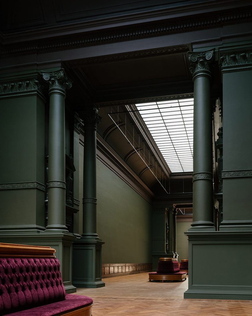
Visitors can take two different routes through the building – one following the grand staircase up towards the main floor of the renovated 19th-century museum and the other heading straight towards the new wing.
"The experience is never predictable yet always in balance: both routes are challenging and designed to serve the art," said Kaan Architecten.
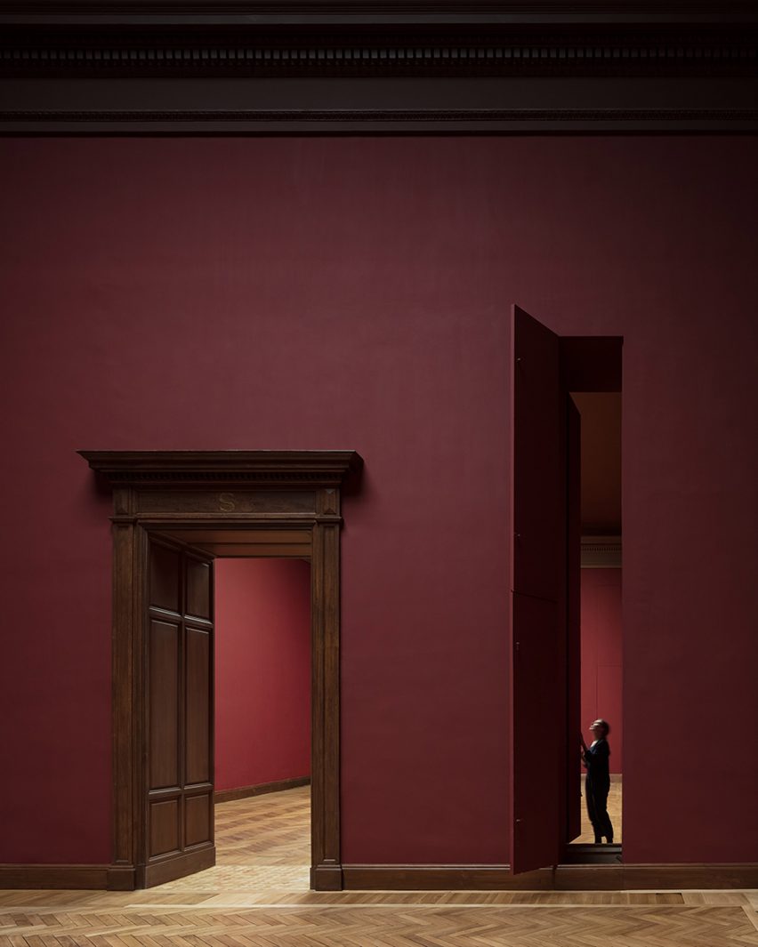
The grand exhibition rooms of the historical museum house the permanent collections and are finished in colours used in the original 19th-century design such as dark pink, green and red. These complement the building's original features including oak doors, tall columns and ornamental plasterwork ceilings.
On the first floor, large windows provide plenty of daylight, while a 5.5 by nine-metre pivoting wall can rotate to change the flow of visitors and allow large artworks to access the designated extra-wide elevator.
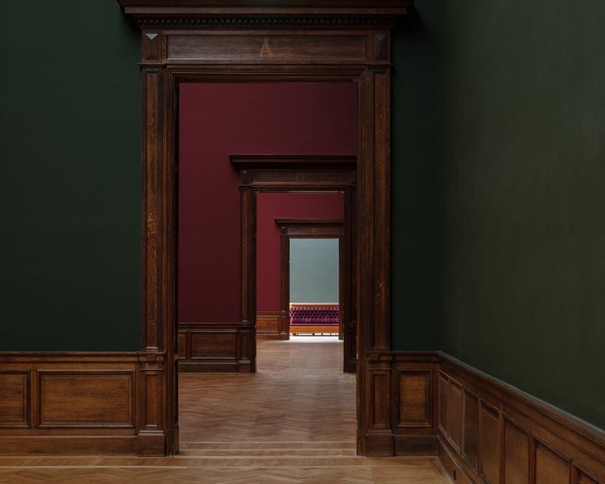
The museum's collection depot has been relocated inside the original air-raid shelter underneath the two main exhibition halls. From here, outsized paintings can travel through one of the original 19th-century hatches to the upper floors, where they can be delivered to the halls through a set of slender vertical hatches.
The renovation project is ongoing and the team is currently working on integrating the office spaces into the KMSKA structure, while Scipio is supervising the masterplan.
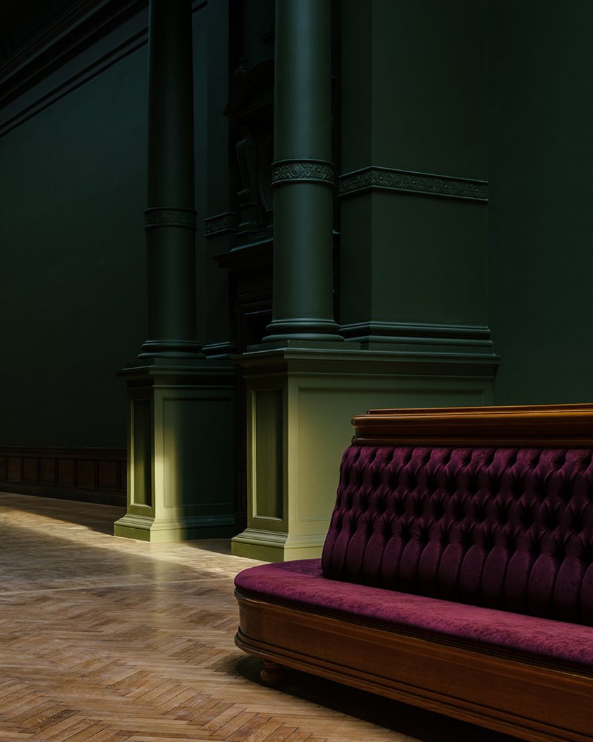
Other ongoing work includes the scenography, museum garden and the creation of a new art mosaic in the entrance.
Other recent work by Kaan Architecten includes a pavilion to commemorate Dutch victims of the second world war and the Cube study centre at Tilburg University.
Photography is by Stijn Bollaert and Sebastian van Damme.