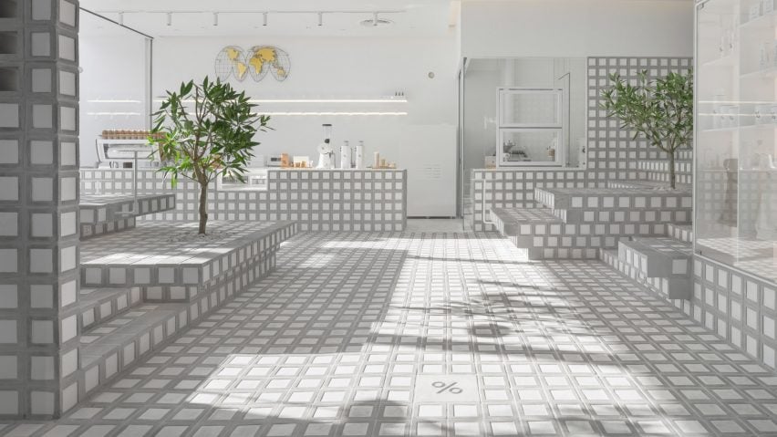
Precht forms counter and stepped seating from handmade bricks in Bangkok cafe
Austrian architecture studio Precht has used more than 7,000 handmade bricks to create the floors, walls and stepped seating in this Bangkok cafe for coffee brand % Arabica.
Located within a retail space in Central World – the largest shopping centre in the Thai capital – the 120-square-metre cafe benefits from a large, glazed facade that looks onto a busy plaza.
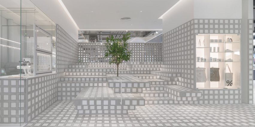
It features stepped seating areas located to the right of the entrance and at the rear of the space, while a counter, roastery and storage room run along its length.
"When we started the design process, memories from previous travels in Thailand came to mind," said Chris Precht, who co-founded Precht alongside his wife Fei Tang Precht.
"I was always impressed that Thai culture values the 'chat' – an engaged conversation that is often depicted in local murals."
"In Austrian coffee house culture, we are reliant on chairs and tables for a conversation," he continued. "But in these Thai murals, the landscape or the traditional architectural topography was used in a joyful way."
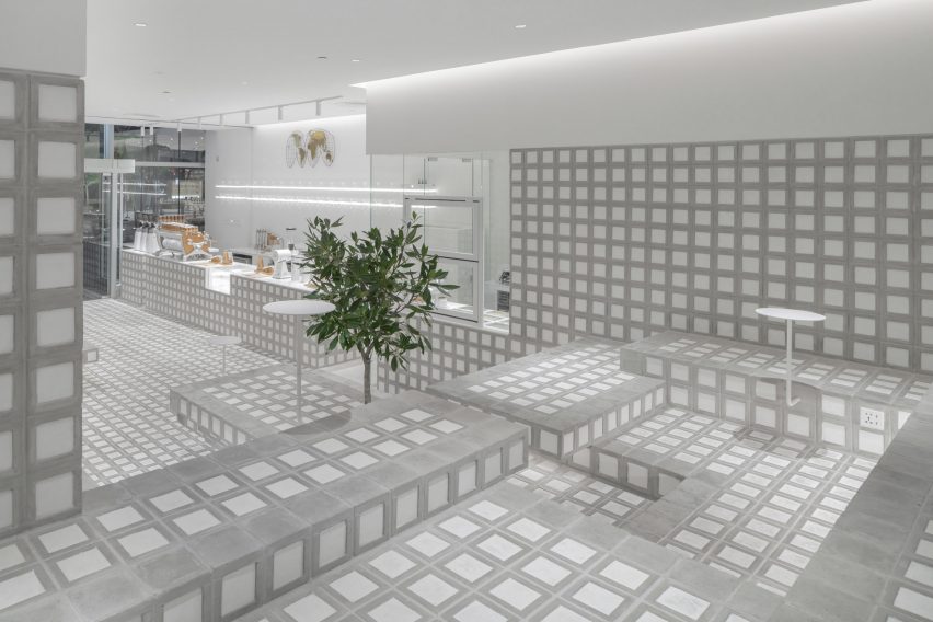
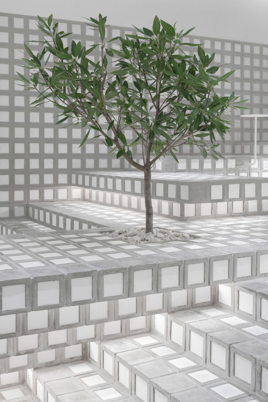
Informed by these informal conversation settings and the rectangular terracing found in traditional Thai buildings, Precht stacked thousands of bricks, handmade by local craftspeople, to create a stepped "seating topography" within the % Arabica cafe.
Each block measures 15 by 15 centimetres and is made from a "concrete-like" material, with some left hollow and others inlaid with white ceramic tiles.
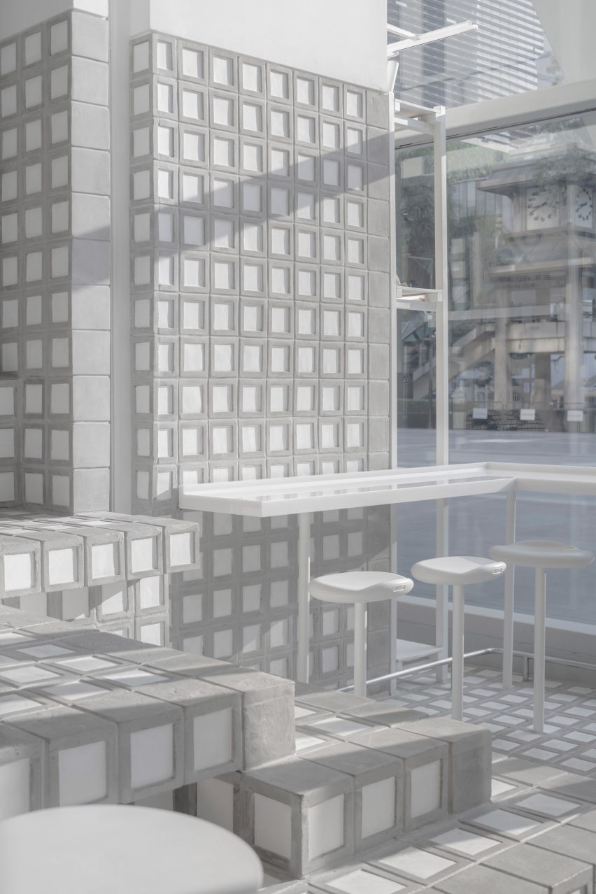
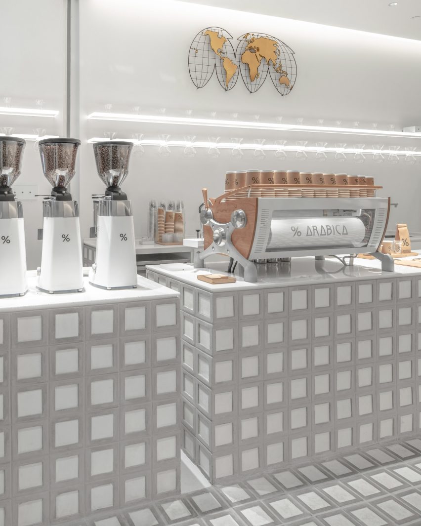
The brick modules were used to form the steps, seats and serving counter inside the % Arabica cafe. The same bricks were also used to line the store's walls and floors.
"It's one simple module for the entire programme," said the studio.
Both the blocks and the ceramic tiles were handcrafted by local artisans to create a design that is tactile and rooted in its context.
"We wanted to bring a certain handcrafted atmosphere to the place," Precht told Dezeen. "We think a haptic feeling fits the story of a barista and the making of a coffee."
"The handcrafting of the blocks infused the clean, nearly minimalist design with a little hint of wabi-sabi – rich in texture, with delicate imperfections, keeping the space bright and fresh, yet haptic and sensual," he added.
The hollow blocks were used to form a perforated brick wall, which divides the % Arabica store from the interior of the shopping mall while allowing passersby to see inside.
Integrated planters with trees were added to create the feeling of one connected landscape, where the floors merge into the furniture and walls.
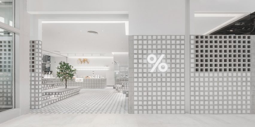
The cafe is located right next to the dramatic Apple store that Foster + Partners designed for the plaza of Central World. Opened last year, the shop has a timber-clad column at its centre and an overhanging roof that resembles a tree canopy.
Other recent interior projects in the city include Enter Projects Asia's rattan restaurant design and Space Popular's green-hued spa interiors.
Photography is by WWorkspace, Sherman Chong and Chris Schalk.