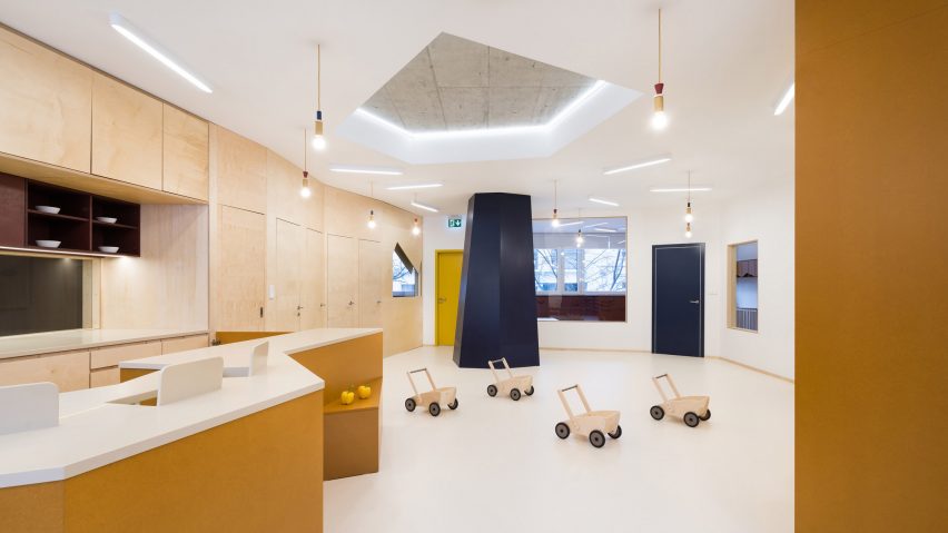
Malvína Day Nursery was designed to ease separation anxiety in young children
No Architects has incorporated plenty of windows, places to hide and varying floor levels into this welcoming nursery in the Czech capital of Prague.
Located in the city's Karlin district, Malvína Day Nursery is arranged across the 130-square-metre ground floor of a larger kindergarten. Previously an office space, the nursery caters to young children between nine months and two years of age.
Local firm No Architects was asked to convert the space into an environment where children would feel safe and secure while giving them the freedom to explore their interests.
"We truly believe that design informs the way people behave and develop relations, and with kids it works completely visibly," No Architects co-founder Jakub Filip Novák told Dezeen.
"We wanted to create an atmosphere that would be helpful for children's development and that would challenge them in a positive way."
The nursery rooms are organised around a central space with large windows so that there are clear sightlines across the floor plan.
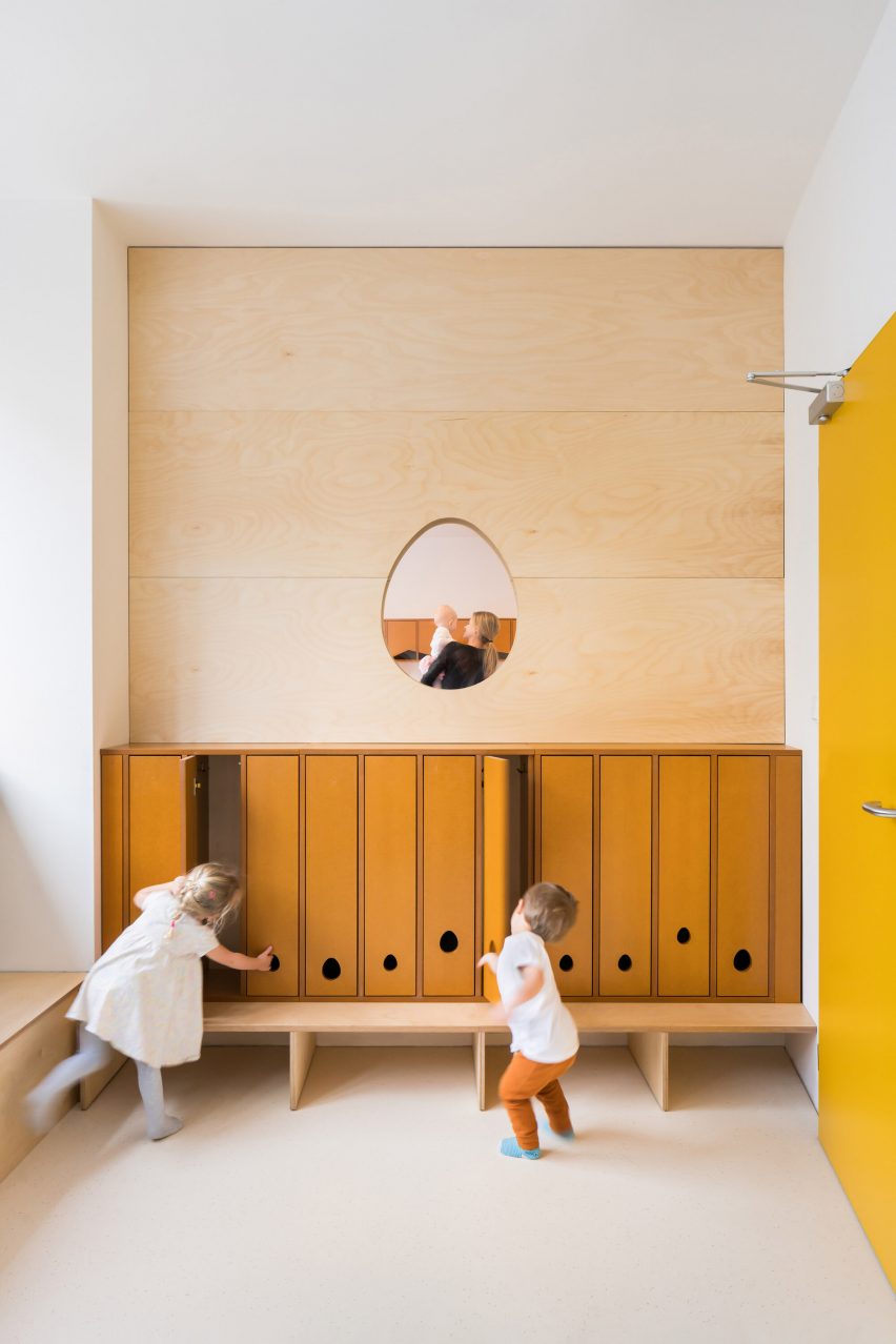
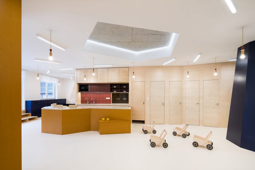
Bright blocks of colour were used to highlight important areas such as the kitchen counter, lockers and play areas.
"The space itself was quite dark – it's deep and there wasn't too much daylight," said Novák, who started No Architects together with Daniela Baráčková in 2009.
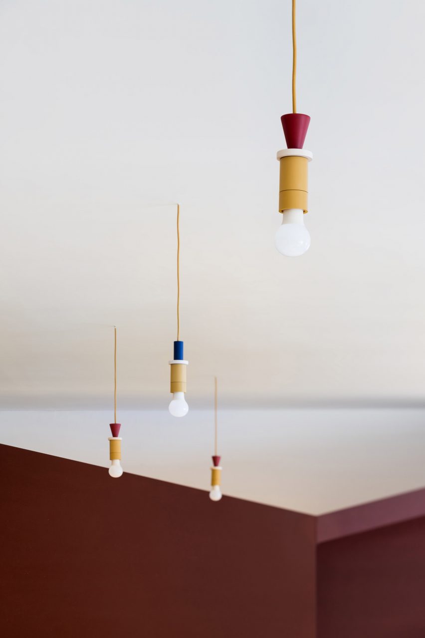
"So we chose a lot of white and light finishes, natural oiled plywood and warm colours that correspond with the nursery's branding."
Everything was designed to be easily visible and within reach, so day-to-day operations can be streamlined to allow the carers to spend more time with the children.
For kids who find it difficult to part from their parents, the studio installed windows near the exits where they can wave goodbye while being held up by their carers.

"We wanted to help the children get over separation anxiety in a positive and constructive way and help teachers to stay calm and focused," Novák explained.
"We achieved this through a clear articulation of space and by creating a sense of playfulness in the design, including quiet corners, places to hide and different levels so that the kids can feel more in control of the environment."
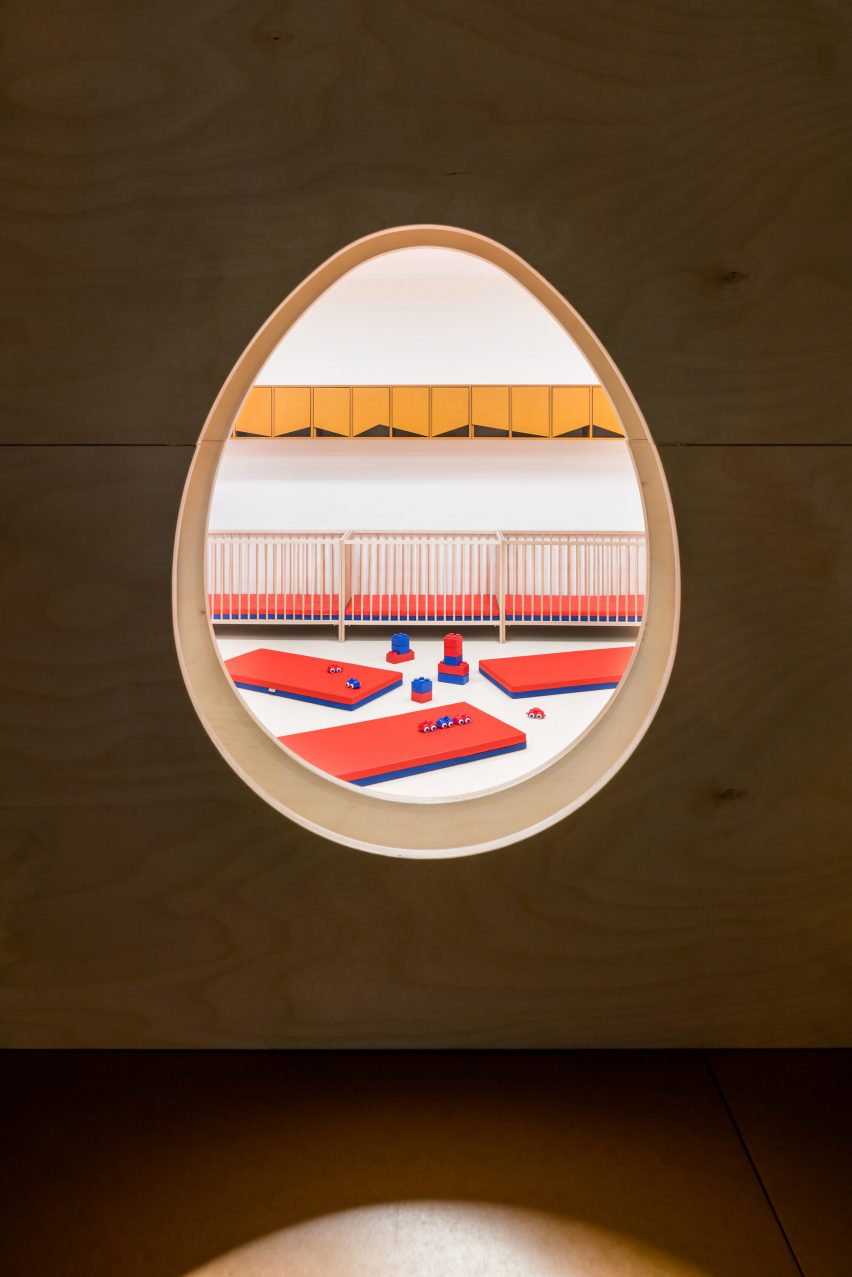
Windows were also integrated into the sleeping and playroom areas as well as the unisex toilets, to allow kids who are old enough to safely use the bathroom with carers on hand in case assistance is needed.
A series of steps were installed in the cloakroom to raise children up to an adult's height and prevent carers – particularly grandparents – from having to bend over to help them with their coats and shoes.
An open kitchen allows the children to observe the food preparation process before dining at the kitchen counter to create a more "collective experience".
The kids can also access snacks from a lower kitchen counter if they are hungry outside of allocated meal and snack times.
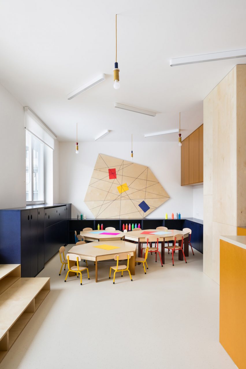
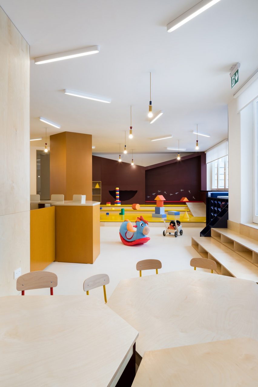
Stepped seating and platforms with mats are used throughout the rooms to create varied landscapes while keeping children easily visible to the carers.
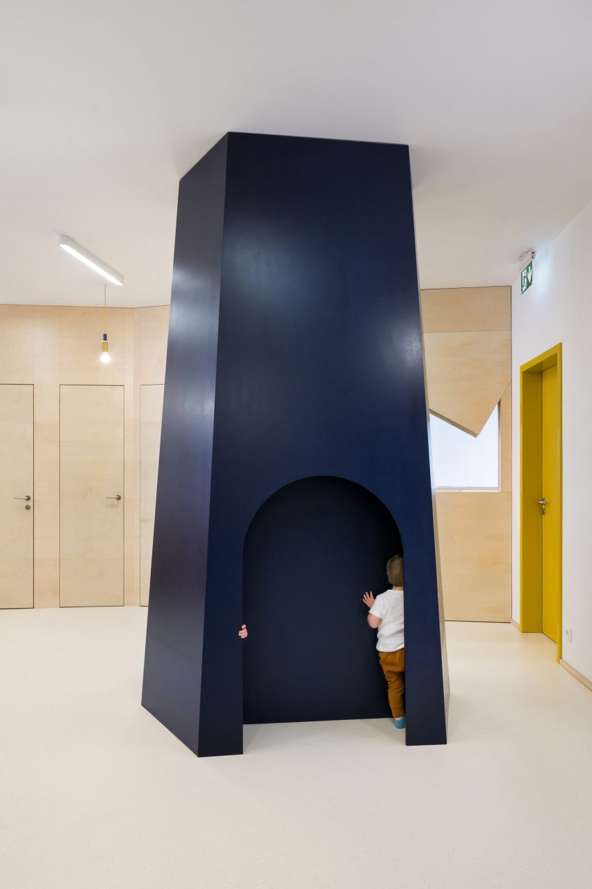
Other playful features such as slides and dens were introduced to encourage exploration.

"We made hidden corners on purpose to make it more challenging and more playful," said Nóvak. "It creates more interactions and takes longer for the children to discover the whole space."
Desks and chairs in three different sizes enable children of all ages and heights to easily play together, while small-scale toys that encourage motor skill development are hidden around the space.
A quiet sleeping area includes a row of cots for younger children and a series of mats for the older ones.
In Japan, architect Takaharu Tezuka designed this Tokyo kindergarten as a continuous space complete with an oval roof deck, allowing for unfettered learning and play rather than imposing physical boundaries on the children.
Elsewhere, architecture firm BIG installed curvaceous wooden reading dens and lily pad-like cushions in the first school of co-working company WeWork.
Photography is by Studio Flusser.