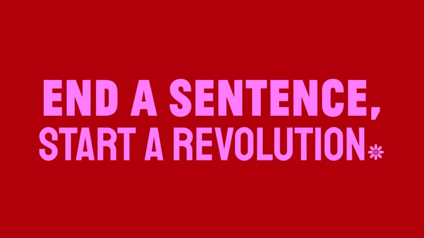
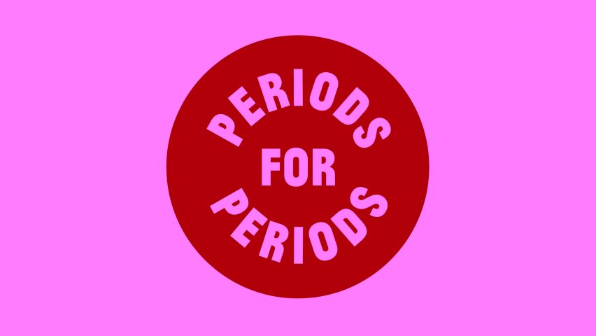
Periods for Periods is a typeface of full stops to protest period poverty
A total of 140 designers from around the world including Pentagram's Giorgia Lupi have collaborated to produce a blood-red typeface made out of punctuation to highlight period poverty in American schools.
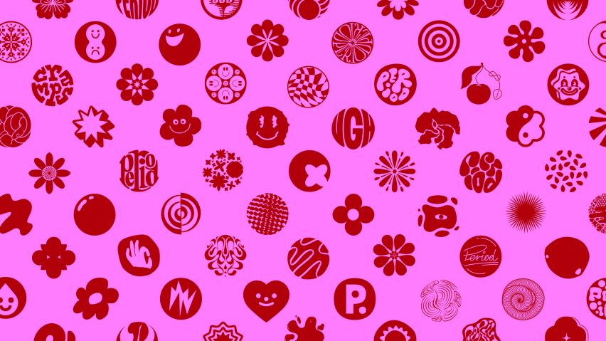
Called Periods for Periods, the typeface is a group of loosely circular, playful shapes that are "periods" – a play on the common American word for full stops.
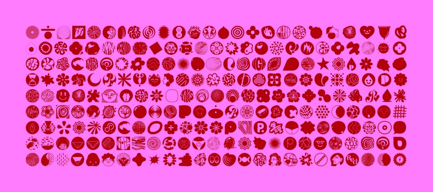
Canadian agency Rethink Communications asked designers, illustrators and typographers to create their own take on the punctuation, which is available to download as a typeface through the Periods for Periods website.
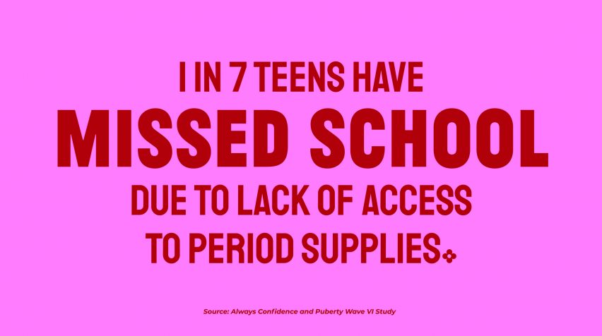
"We created this font as a protest against the current requirement for young people to pay for period products in schools," Rethink Communications told Dezeen. "One in seven teens have missed school due to a lack of period supplies."
Periods for Periods' proliferation of punctuation designs are intended to communicate the campaign's tagline, "end a sentence, start a revolution".
The project aims to raise awareness of period poverty in schools across North America, although people who menstruate experience a lack of access to sanitary products all over the world.
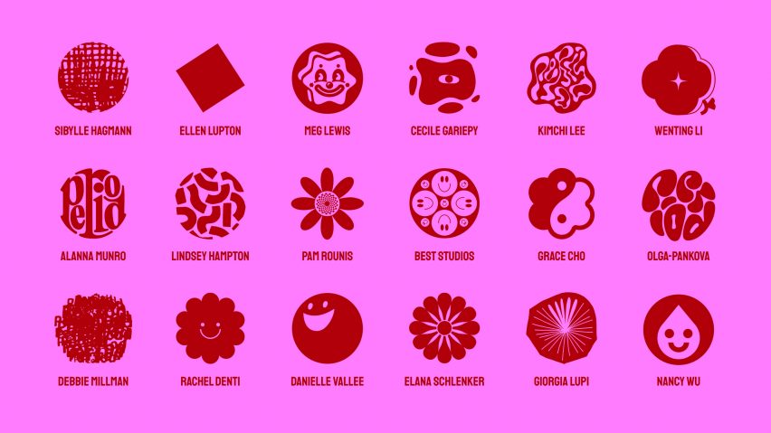
Designers created a wide range of full stops for the typeface, ranging from literal to abstract shapes.
Pentagram designer Giorgia Lupi created an asterisk-like star on a red blob, while typeface designer Alanna Munro spelt out the word "period" in a circular formation.
Graphic designer Ellen Lupton opted for a simple tilted square, and Meg Lewis and Rachel Denti were among a group of contributors who chose recognisable smiley faces for their full stops.
Designers such as Debbie Millman and Lindsey Hampton expressed themselves in ambiguous squiggles.
"The biggest aspect of our design process was colour," explained Rethink Communications.
"We wanted the colours to connect with the subject matter, but of course there was debate around whether pinks and reds were too well-trodden in the category. In the end, we decided not to shy away from it. Blood is blood, and we wanted to represent it honestly."
Everyone is invited to download the free typeface and use it in order to creatively raise awareness of period poverty, and users can also create their own "period" graphic using an online tool.
Its website also features a section where users in America can tweet their local education officials and demand free sanitary products within schools in states that do not currently offer this to students.
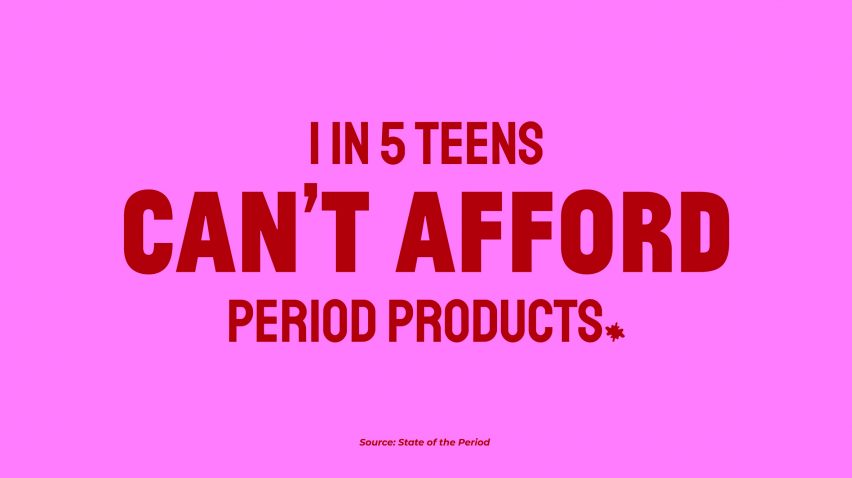
According to the campaign, product shortages caused by the coronavirus pandemic have worsened period poverty across the world, while youth and people of colour are affected by the issue at higher rates.
Rethink Communications believed that the viral nature of a typeface would provide the most effective way of spreading the message.
"Hopefully, the periods themselves will be used in designs as an act of protest, spreading our message even farther," concluded the agency.
Rethink Communications is a Toronto-based creative agency founded in 2010.
Other period-focussed designs include a reusable menstrual cup cleaner by Emanui which allows users to clean their sustainable menstrual cups while on the go, and a wearable spandex pouch called Carrie created for soldiers and police officers to carry sanitary products in at work.
Image courtesy of Rethink Communications.