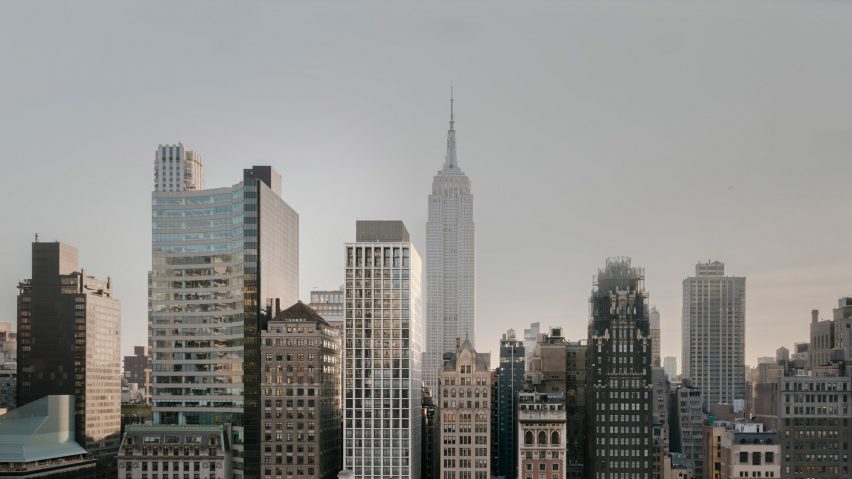
In this week's comments update, readers are discussing a skyscraper designed by David Chipperfield Architects and sharing their views on other top stories.
David Chipperfield Architects's latest New York project is The Bryant, a 32-storey mixed-use concrete skyscraper in Midtown Manhattan.
The British studio undertook the project for New York-based developers HFZ Capital Group. The building overlooks Bryant Park and the New York Public Library.
"Tough crowd here"
Readers are divided. "Boring and indistinguishable," said Jack Woodburn on one hand. "It looks like scores of buildings across America."
David disagreed: "Tough crowd here! I think this building does a great job. It's subtle, which I think is the right way to go for this location and height. It's timeless. All materials feel high-end in an understated way, which I find the ultimate luxury. Not all architecture needs to scream or be iconic."
"I think it's a very appropriately designed building," added Good Job. "It's not trying to compete with the architectural landmarks in the surrounding area."
"Two kinds of folks in the discussion," concluded Erik Boehlo. "Those who want to go to Mars and those that prefer Earth. Martians want new, excitement, gratification at all costs. Earthlings are contextual, nuanced, content. Fabulous building."
Are you a fan of The Bryant? Join the discussion ›
"A homage to the beauty of our majestic trees" says reader
Commenters are discussing a brass coffee kiosk designed by Mizzi Studio to sit alongside Buckingham Palace. The structure is part of a series of drinks stands placed throughout London's Royal Parks.
"A real homage to the beauty of our majestic trees!" said Mark. "Perfect for the parks."
Ju agreed: "Love the subtlety of the transition from the timber bent kiosks to brass! Elegant."
Alfred Hitchcock was less sure: "Commercial clutter. Unnecessary and unsightly."
Do you agree? Join the discussion ›
"This is modernism" says commenter
Readers are debating Avala House, which architecture studio Ten has created in a sloping orchard on the Avala mountain in Belgrade, Serbia. It features glass walls and a gridded steel frame.
"There's so much to like here," said Kevin, "but then that toilet situation makes me wonder if the architect should be licensed."
"This is modernism," replied JB. "This is what you wanted. This is what you get. This is modernism."
"Likely an eccentric architect for a like-minded client," concluded Arhmatic. "It was probably never intended to be a house, but an experiment. It's doing a great job at that."
What do you think of Avala House? Join the discussion ›
"This is wonderful" says reader
Commenters are impressed by a three-volume home with ceramic vaulted ceilings on the Mediterranean island of Formentera. They are less keen on its kitchen though.
"This is wonderful," said Chris Babbitt.
"Interesting," continued Sim. "I love the abstraction of the design. A holiday house done very well. I do find the kitchen less so sadly."
"Compared to the simplicity of the house, which I like, the kitchen cabinets and shelving are way too 'done'. An odd mixture of finishes."
Is Es Pou to your taste? Join the discussion ›
Read more Dezeen comments
Dezeen is the world's most commented architecture and design magazine, receiving thousands of comments each month from readers. Keep up to date on the latest discussions on our comments page.

