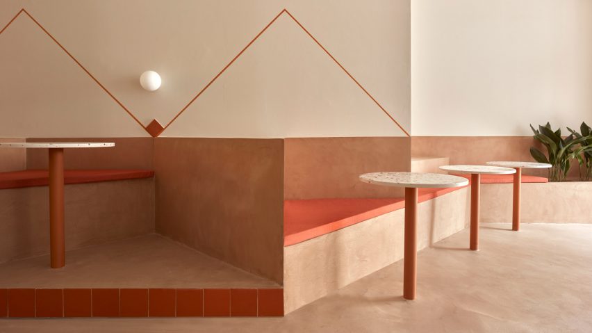
A zigzagging plinth that accommodates seating, steps and planters weaves its way through this terracotta-coloured salad bar in Valencia by local design practice Horma Studio.
Located in a protected heritage building in the city's L'Eixample district, the 140-square-metre space belongs to the BeGreen Salad Company.
For its interior, the brand wanted a non-prescriptive layout that could be used in a multitude of different ways.
"They asked us to design a comfortable and singular space," Horma Studio told Dezeen.
"It needed to be representative of BeGreen as a place that should be honest, natural and sustainable but at the same time should rethink the concept of a typical cafe and restaurant with chairs and tables. They were looking for something flexible that could be used without any rules."
Finished in micro cement, terracotta and timber, the interior is laid out over an awkward long and narrow floor plan.
To maximise the eatery's small footprint, the design team inserted a simple seating "plinth" that zigzags along one wall of the 30-metre-long space.
"We realised that the angular furniture allows us to get in more seats and contributes to creating a pleasant space, making this combination the best for our design," the studio explained.
Finished in micro-cement, the plinth is set at different levels of up to 90 centimetres in height. It divides the plan into different seating areas including booths, benches and steps for casual seating, alongside areas for planting.
The plinth is decorated with locally-produced terracotta elements such as wall tiles and integrated cylindrical table legs. Matching upholstered seat cushions were used to pad out the bench and seating.
"The project aims to be as sustainable and honest as possible, so we simplified our decisions and used as few materials as possible," said Horma Studio.
Other terracotta-hued eateries include this Mexican restaurant in Downtown Los Angeles, where Wick Architecture & Design chose materials "that could be found on a construction site", and a cafe in Melbourne in which Australian practice Ritz & Ghougassian used the worn red brick facade as a reference point.
Photography is by Mariela Apollonio.

