Studio Ben Allen casts pigmented concrete to create colourful surfaces inside House Recast
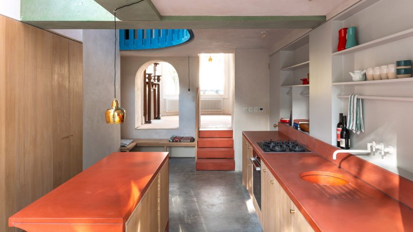
Studio Ben Allen used brightly coloured concrete to create structural walls and decorative details throughout this refurbishment of a Victorian terraced home in north London.
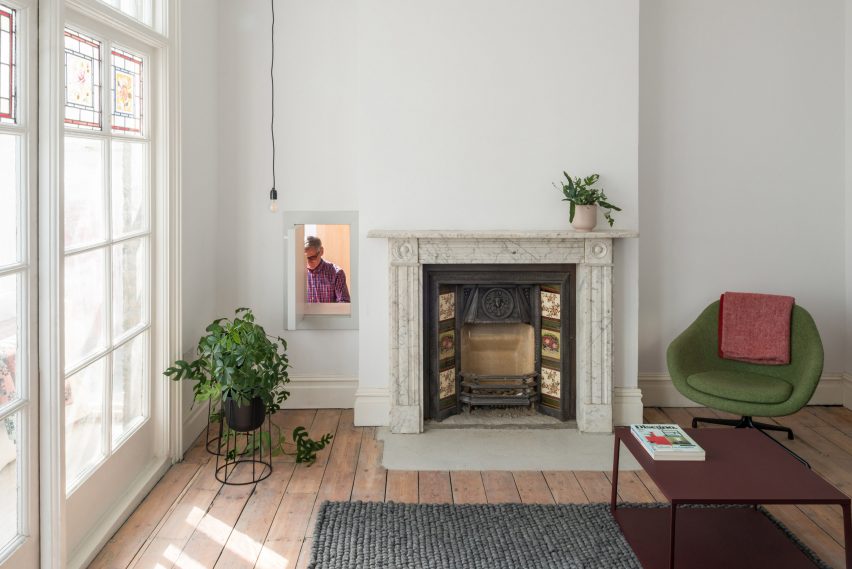
The owners of the house in Haringey asked Studio Ben Allen to reorganise the living spaces at the rear of the property, which had been adapted and added to over time.
The project brief also called for the creation of a new kitchen and two bathrooms, one of which – on the ground floor – needed to be accessible.
Studio Ben Allen used the House Recast project as a testbed for ideas, such as off-site fabrication and the use of pigmented patterned concrete as both structure and architectural finish.
"This approach was inspired by the surrounding Victorian architecture," claimed the architects, "where the brickwork is patterned and decorated, while also being a load-bearing material and having the speed and quality by being fabricated offsite."
"The colours and use of materials were also inspired by high-Victorian architecture in terms of richness," the studio added.
The house's unusual use of colours and materials led to the project being shortlisted for this year's Don't Move, Improve! awards, which celebrate the best home improvement projects across London.
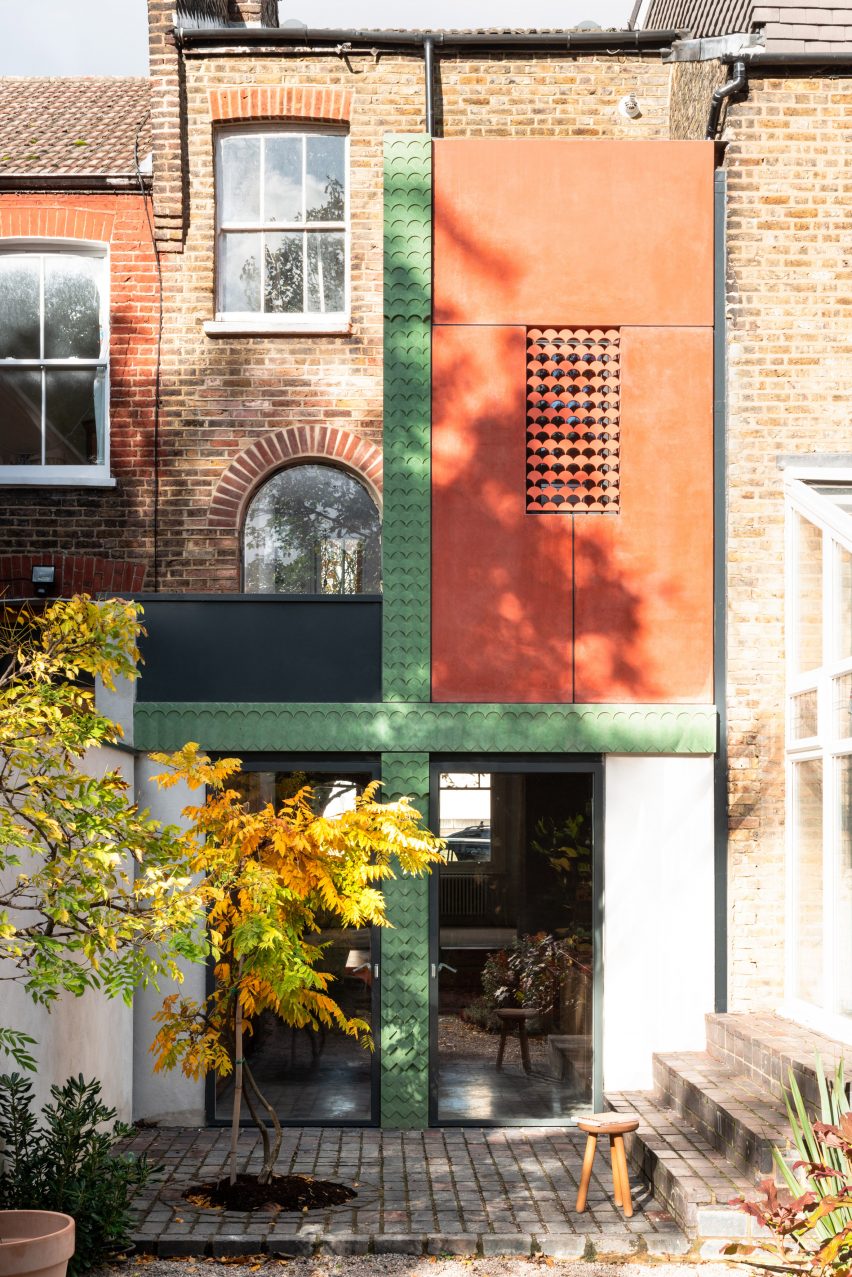
Coloured concrete is used in various ways throughout the renovated property, including for the green patterned columns and beams that support the first floor bathroom's salmon-coloured structural wall panels.
From the rear garden, the concrete framework forms a cross-shape that defines the spatial arrangement of the ground and first floors.
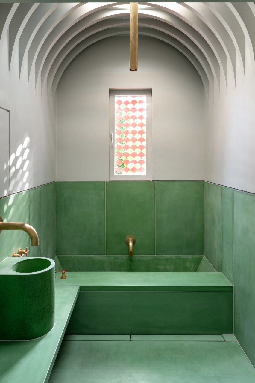
A fan-patterned relief imprinted into the concrete surfaces is mirrored in the bathroom's latticed window covering.
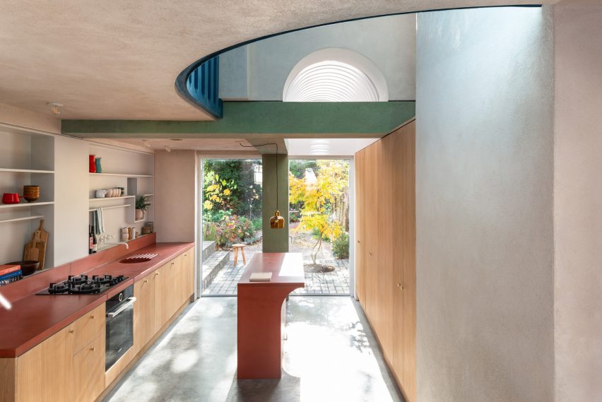
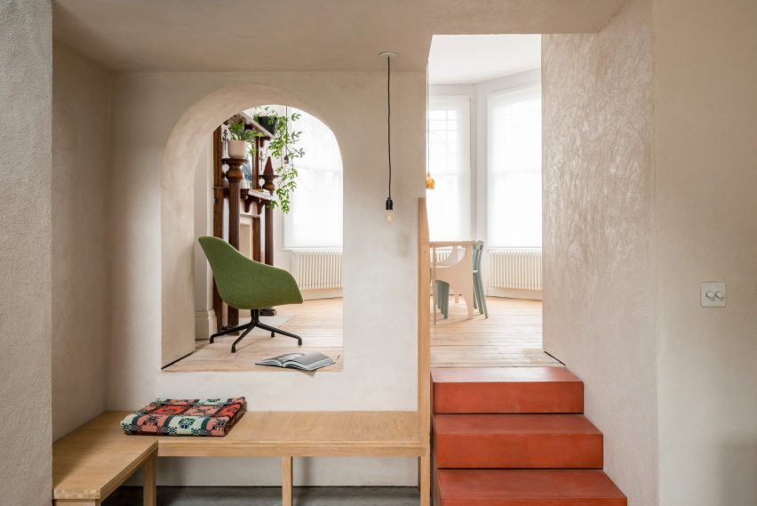
Inside the extended and refurbished kitchen, the green structure contrasts with the pinkish-red concrete stairs, counters, sink and island unit.
The bath, counters, washbasin and benches in the upstairs bathroom are all cast in green concrete – contributing to a space designed to have a hammam-like feel.
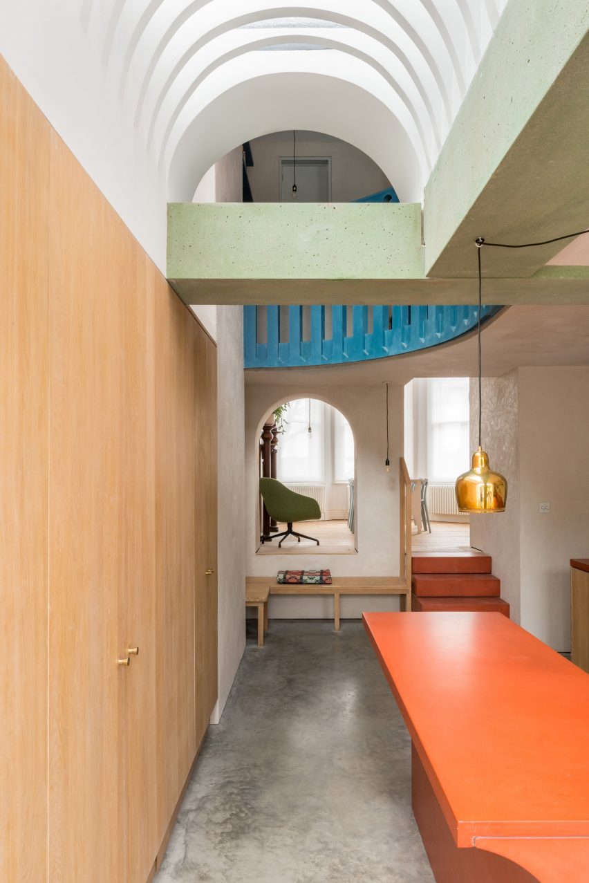
A void created above the expanded kitchen connects this space visually with a new curved mezzanine. This double-height space allows daylight to penetrate into the centre of the house.
Light also filters down into the kitchen through a skylight positioned above a louvred vaulted ceiling. The same ceiling form is used for the upstairs bathroom.
The curves of the vaulted ceilings are echoed in openings throughout the new spaces, including an archway connecting a seating area in the kitchen with the dining room at the front of the house.
In an effort to show how offsite construction can benefit smaller-scale residential projects, several elements used within House Recast were prefabricated to reduce construction time on site.
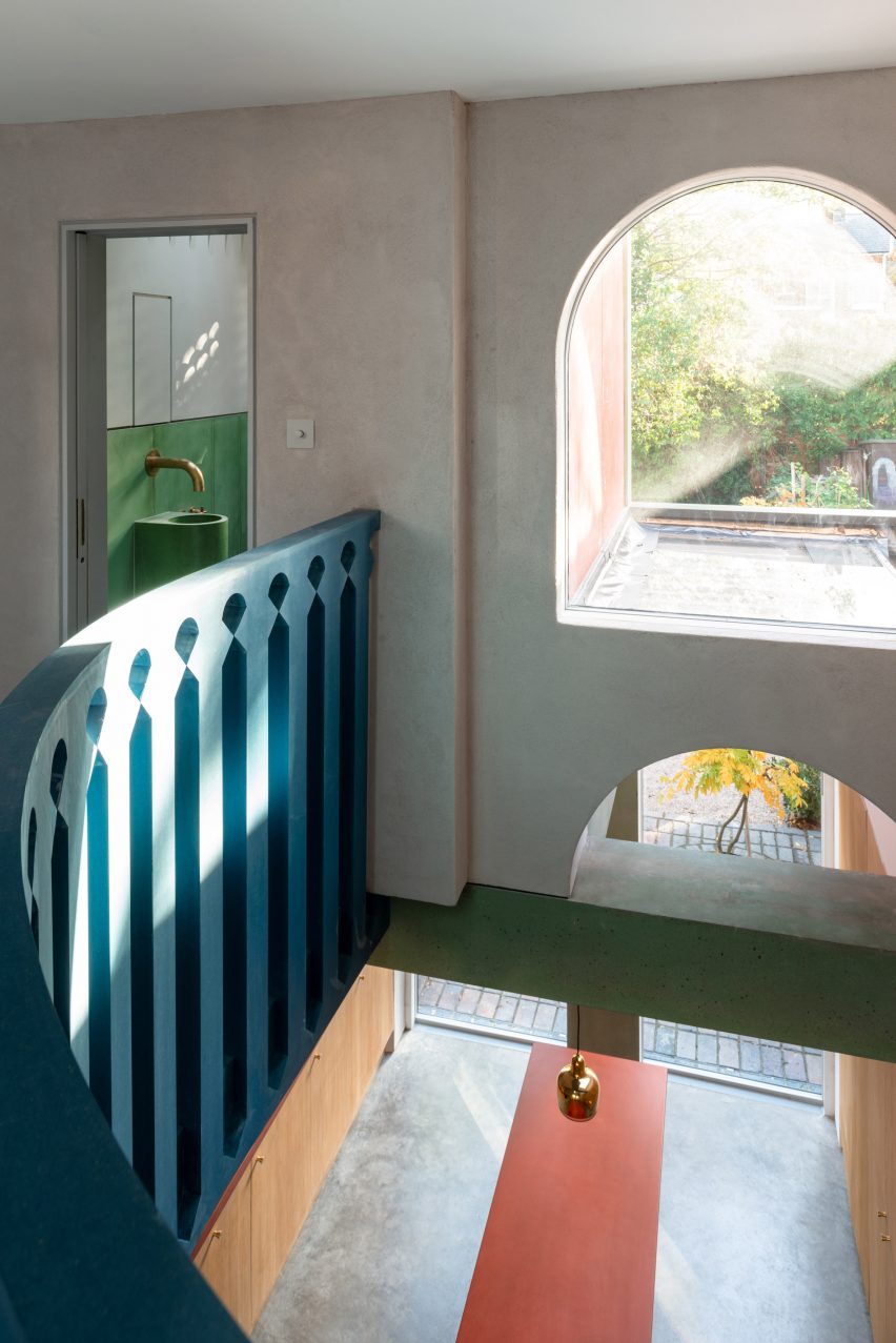
The extension's main frame and walls were erected in just three days, and the balustrade lining the mezzanine was delivered as a kit of parts.
The bespoke balustrade's design matches the pattern on the rear facade and was cut by the architect using a computer-controlled milling machine.
Other projects featured on the shortlist for the 2021 Don't Move, Improve prize included an extension to a colour consultant's house featuring an on-trend colour palette, and a pop art-inspired extension with curved and brightly coloured surfaces.
Photography is by French + Tye.
Project credits:
Architects: Studio Ben Allen
Team: Omar Ghazal (project leader) and Ben Allen
Structural Engineer: Entuitive
Landscape design: Daniel Bell Landskap
Contractor: Peridot
Structural and exterior concrete: Cornish Concrete
Interior Concrete: Concreations