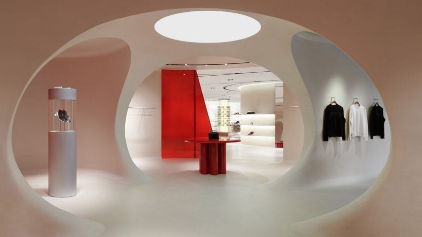
London architectural studio Sybarite has paid tribute to Ferrari's legacy in the car brand's lifestyle concept store, which features a scarlet glass wall that recalls a racetrack and a terracotta facade that nods to its Italian heritage.
Revealed here in photographs shared exclusively with Dezeen, the store is arranged across a single open-plan floor in a 1980s building in Maranello, northern Italy, where Ferrari's factory is located.
The opening of the store will coincide with the launch of Ferrari's first fashion collection on 13 June, which has been designed under the creative direction of Italian designer Rocco Iannone.
Sybarite, which won the project in a privately held competition, was asked to create a retail environment to showcase the fashion direction and serve as a place for Ferrari Formula 1 fans to immerse themselves in the brand.
For the exterior, Sybarite created a colonnaded terracotta facade – a material that has been used in Italian construction for centuries. It references the traditional colour of the roofs of Modenese houses and the historic domes in Italian architecture.
In contrast to the building's traditional exterior, the interior space features sinuous forms and glossy red and white surfaces.
A wall of glass in Ferrari's signature red sweeps through the store's interior and is intended to replicate the curves of the brand's Fiorano Circuit track.
"The ripple of the glass gives the sense of speed and movement, its ribbon-like form is a direct reference to the cars moving swiftly around the Fiorano Ferrari Circuit," Sybarite co-founder Simon Mitchell told Dezeen.
"The curve of the glass invites the customer into the space from the exterior. The signature opaque red gradient denotes velocity and is a nod to ‘race red’ (Rosso Corsa) well known to Ferrari enthusiasts."
A wall of white bricks behind the glass wall serves as a backdrop for the store's products. These clay bricks represent the clay-modelling process that is used to make Ferrari prototypes before the cars are turned to metal forms.
Elsewhere, cylindrical columns with backlit display cases in coloured acrylic showcase small objects and accessories such as sunglasses and Ferrari models, and a curving metal shelving system, which emerges out of the clay brick wall, expands to become a retail display with shelves and rails.
An installation of the brand's Cavallino logo (Italian for the Prancing Horse) sits near the entrance. Made from black metal sheets, it appears to float, separate and come together to create a suspended structure that can be observed as a whole from different angles.
Next to the entrance of the store sits a mind map-inspired installation, consisting of a red grid that recreates the map of the Fiorano circuit, lined with movable images of the creative processes behind the products.
A more intimate space within the store is dedicated to capsule collections and special collaborations.
This features three display areas furnished in acrylic, wood and leather with touches of brushed aluminium, while a monitor set into the wall showcases Ferrari projects.
To aid the design process, Sybarite worked with references from the Ferrari archives and with the Ferrari Diversification team to select materials that are synonymous with its car-making process, as well as the locality of Maranello and Italy as a whole.
"It was a serious consideration that we did not make the retail spaces too museum-like," explained Mitchell.
"The design subtly links Italy and Ferrari as synonymous with each other through architectural fixtures and material design codes. We sourced clay locally and focussed on craftsmanship from the area," he added.
Material references used throughout the interior include mahogany, which was used to make the original Enrico Nardi steering wheels of the 1950s and 1960s, and brushed aluminium, which is used in the second stage of the Ferrari car-making process.
Smoked acrylic treated with a special smoky bronze finish nods to Italian modernists that worked in lucite, such as Guzzini and Castelli, and the poured concrete floor recalls the pit lane and the Ferrari factory floor.
Yellow alcantara – a suede-like material that is used in the car interiors – is used to line the dressing room walls, and leather and stitching details pay homage to the brand's historic collaborative relationship with furniture maker and leather specialist Poltrona Frau.
"This is part of a broad strategy for Ferrari – we have created a new shopping experience and a new design concept which embodies the values of innovation, style and performance of the Ferrari," Ferrari chief brand diversification officer Nicola Boari told Dezeen.
"The space has been completely renovated and redesigned according to the company's plan to develop and expand into the lifestyle segment, becoming the first venue for the debut of the new clothing and accessories collections under the creative direction of Rocco Iannone."
The retail strategy will be rolled out to the brand's Milanese flagship store in September, followed by a dual opening overseas with locations in Los Angeles and Miami.
Other retail interiors by Sybarite include the Miami shop of fashion label Joseph, which is anchored by a black metal corkscrew staircase.
Photography is by Paola Pansini.

