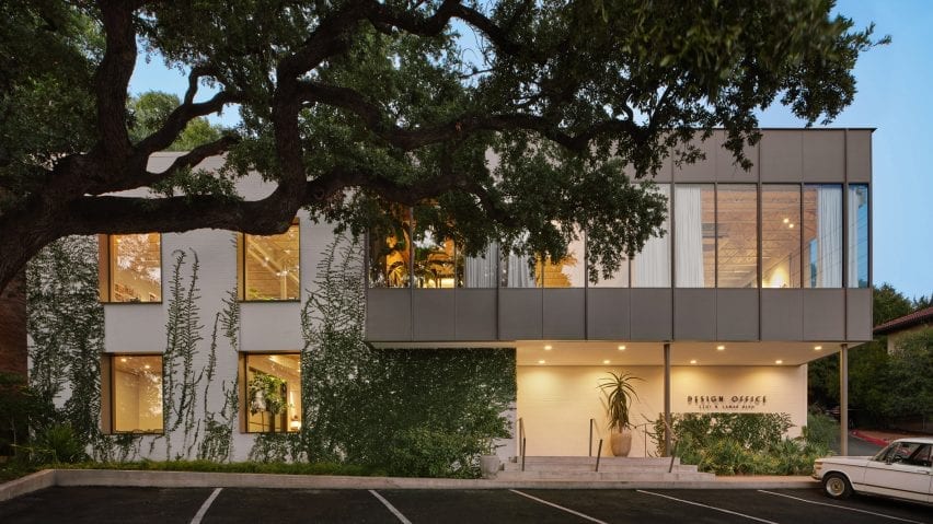
Clayton Korte overhauls mid-century office building in Austin
Enlarged windows and felt-covered walls are among the elements in a 1960s office building refurbished by Texas firm Clayton Korte, which occupies part of the structure.
The project, called Design Office, is located just north of downtown Austin, along one of the city's main thoroughfares. It houses two studios – one for Clayton Korte, formerly Clayton & Little, and the other for Word + Carr Design Group, a landscape architecture firm.
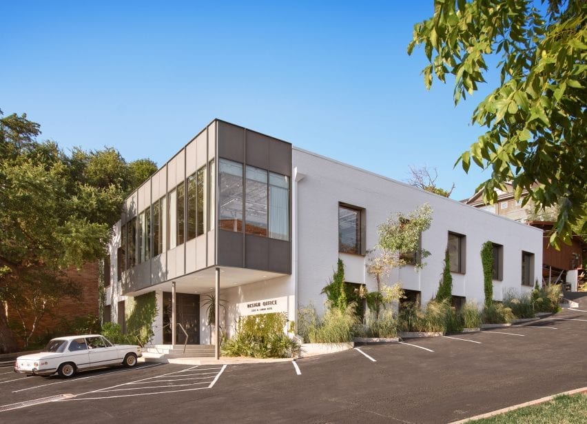
The project entailed overhauling a steel-framed, brick-infill structure that was constructed in 1963 as a speculative office building. When Clayton Korte obtained it, the building had dreary, dark offices and needed a lot of work – but the firm wasn't put off.
"We jumped at the chance to acquire it, recognizing the untapped potential of the raw spaces," said the team.
Encompassing 9,648 square feet (896 square metres), the two-storey building is set into a hillside. From front to back, the property slopes the equivalent of one floor.
Over the years, the soil had become unsteady, requiring the team to focus on stabilizing the structure first. A total of 65 structural piers were drilled to prevent the building from sliding toward a creek across the street.
After the stabilization work was complete, the team turned its attention to the building's interior.
"The interior was gutted, leaving an empty shell into which a minimal set of spaces was introduced," the architects said.
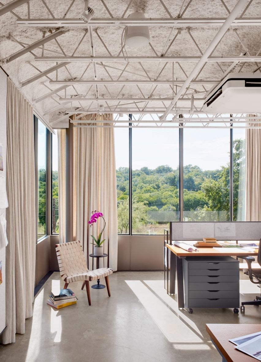
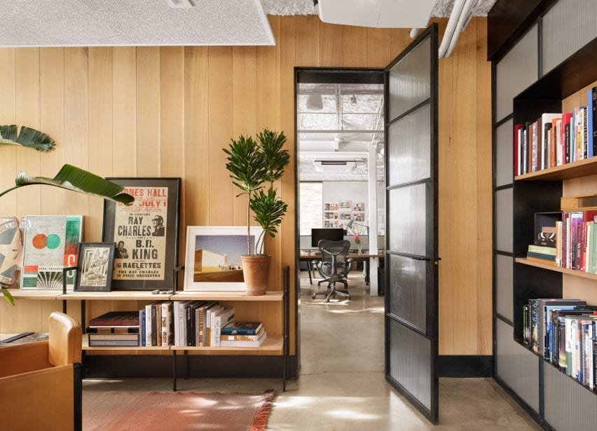
To usher in more daylight and offer better views, existing windows were replaced with larger versions that are double in size. Semi-sheer curtains modulate the bright Texas sun.
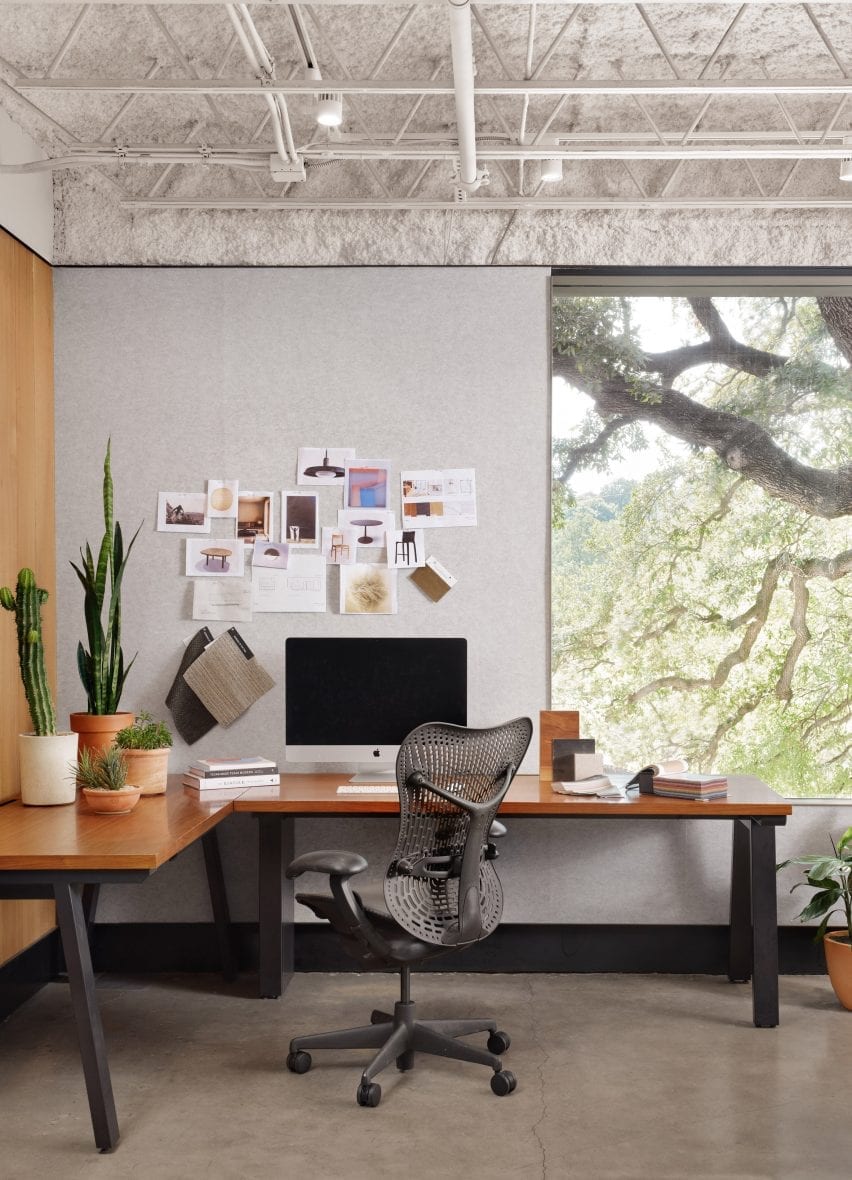
Perimeter interior walls were cleaned and clad in industrial felt, enabling them to be used as pinboards that encourage collaboration.
Private offices were placed in the corners, allowing the bulk of the office to be free-flowing. Low-scale furniture reinforces a sense of openness.
For certain finishes, the team chose a raw aesthetic. White ceiling insulation was left exposed, as was the original concrete flooring. Steel was used for baseboards, window frames and interior doors.
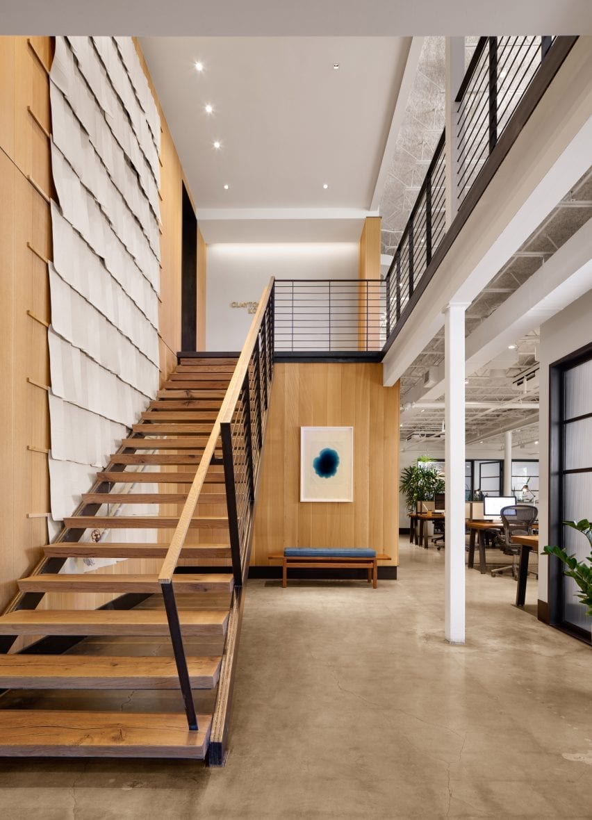
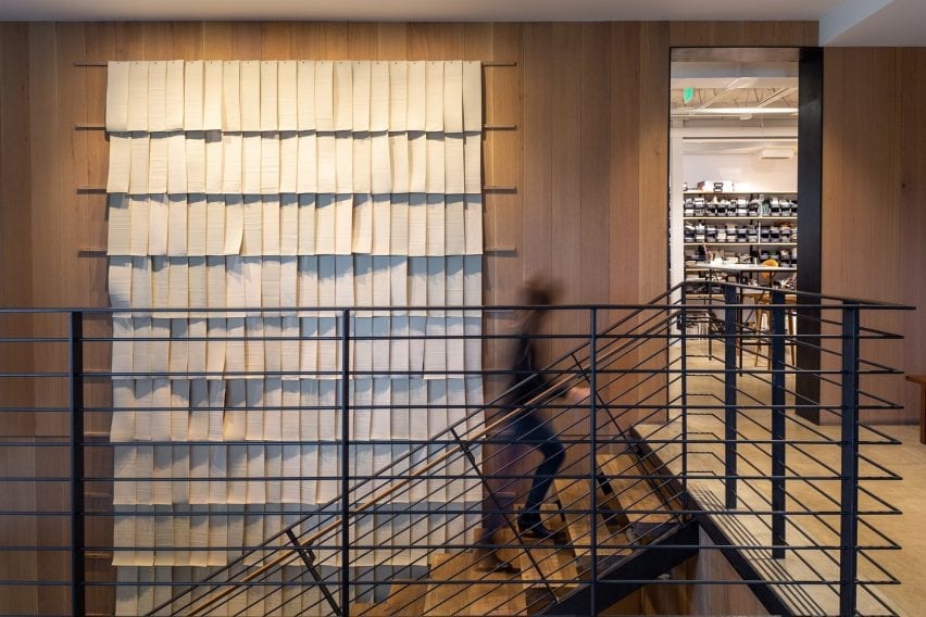
A simple stair connecting the building's two floors was removed, and the stair opening was widened. The team created a new staircase with a steel stringer, exposed weld joints and oak treads.
"The oil-finished post oak, harvested following a severe drought in 2011, also wraps the stairway," the team said. "The central open stair anchors the large, light-filled studios on both floors."
The team also made several updates to the exterior. Brick walls were coated with limewash – a durable finish made of powdered limestone that is common in the area. Above the entrance, a pop-out volume was refurbished with glass and steel.
The project also included new landscaping, including grasses and climbing ivy.
Clayton Korte has offices in both Austin and San Antonio. Other projects by the firm include a wine cellar that is tucked away in a limestone cave so it disappears into the surrounding landscape.
Photography is by Casey Dunn unless otherwise stated.
Project credits:
Architecture: Clayton Korte
Interior designer: Clayton Korte
General contractor: Burnish & Plumb
Landscape architect: Word + Carr Design Group
Structural engineer: Scott Williamson
Metal fabrication: Drophouse Design