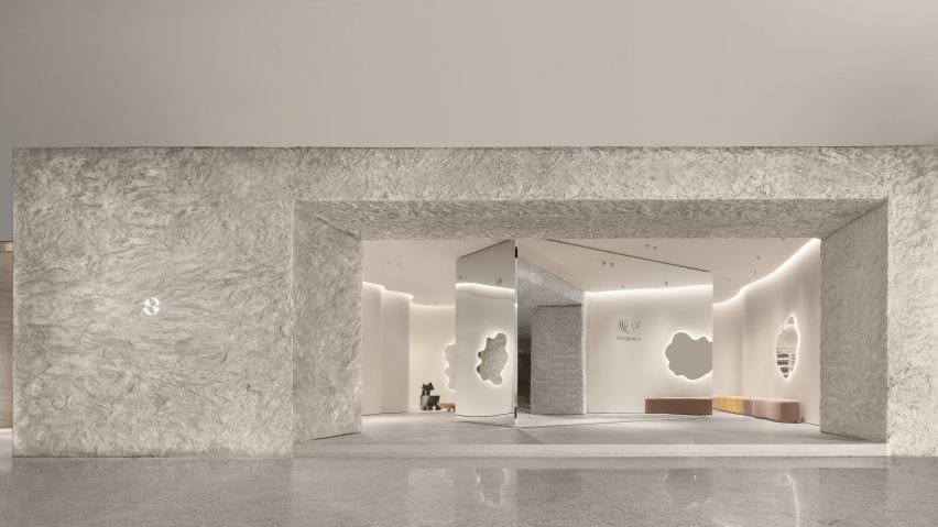
Chinese studio FOG Architecture has added curved walls, mirrored surfaces and faux stone to the interiors of aromatherapy brand ToSummer's flagship store in Beijing.
Located in Beijing's Taikoo Li Sanlitun shopping village, FOG Architecture designed the 170-square-metre ToSummer store to recall the atmosphere of a cave.
"The brand's concrete requirement for this space design was a modern cave," said FOG Architecture.
"We chose not to directly create the natural appearance of caves but, instead, presents the characteristic elements of material textures to inspire the sensory experience."
The entrance to the store is marked by a large faux-stone wall and a mirrored screen, which leads visitors into the store.
The studio explained that the large mirrored screen was designed to draw passers-by into the store while referencing screens typically used in homes and domestic spaces.
"The curiosity of what is behind attracts the beholders to walk inside," FOG Architecture co-founder Zheng Yu told Dezeen. "The surface of the screen is usually decorated with an illustration of natural scenery."
"It is a metaphor of the space hidden behind. And this is the reason we placed a scaled up, mirror polished screen as the central spatial element. It illustrates beauty in a restrained manner."
Natural-toned, undulating walls envelop the interior of the store and are illuminated by strip lighting set within the ceiling.
The interior was divided and zoned into a collection of small sections each with its own functions, housing retail space, exhibition space and installation areas.
A cream Togo by Michel Ducaroy for Ligne Roset, an off-white Playdough chair and coffee table by Karstudio as well as amorphous mirrors were placed throughout the store suggesting the idea of domestic space.
"The aim of the furniture is to convey a sense of the domestic," said Yu. "That's why we named this space a 'Living Room'. A space that gives people a place to breathe in a busy and fast-moving shopping mall."
Two "timber rotten" chairs designed by British designer Max Lamb were also placed across the store and in niches formed by its curved walls.
"In a way, Max Lamb was also our main inspiration during the project," Yu explained.
"The [chairs] lacquering was smooth, shiny and colourful while the foam is tortured, torn, scarred – combined the materiality itself gives me an illusion of heaviness similar to a piece of timber rotten through time, but it is lightweight and smooth and newly made."
An exhibition and retail space at the rear of the store has a series of shelves organised around a long reflective metal island that contrasts to the curving walls it is surrounded by.
Rectangular metal shelves were suspended along the undulating walls, drawing attention to the irregularity of the space while displaying products like artworks.
A metal cashier's table was tucked behind a curving volume and mimics the shape of its walls, forming a rounded counter space that becomes an extension of the walls.
"[The store] transforms the original cave concept into spatial language, integrating it into this realistic space full of modern oriental feeling to present a delicate balance between commercial and art, domestic and public realm, natural and artificial," said the studio.
FOG Architecture is a studio with offices in London, Shanghai and Chongqing founded by Yu and Zhan Di.
Other Beijing projects with curved walls include this avocado-green space age informed hair salon and this kindergarten with a rooftop playground by MAD Architects.
Photography is by Inspace.
Project credits:
Design principle: Zheng Yu, Zhan Di
Design team: Hou Shaokai, Zhou Chuyang, Xiong Aijie, Vince Choi and Fu Shidi
Lighting design: School of Architecture, Tsinghua University and One Lighting Associates Beijing
Furniture and installation design: DEFRONT and FOG
Construction drawing: SU PIN
Construction team: Youlong Jinsheng Decoration Ltd.

