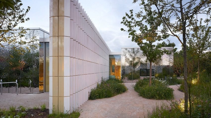
The indoors are "in permanent dialogue with the garden" at the latest Maggie's Centre for cancer care, completed by Amanda Levete's studio AL_A.
Maggie's Southampton is a low-lying pavilion hidden within Southampton General Hospital's car park by a verdant garden that covers three-quarters of the centre's plot.
It was designed by AL_A with Sarah Price Landscapes to bring greenery and "a piece of the nearby New Forest" to the otherwise grey site, according to the studio's director Maximiliano Arrocet.
"The site for Maggie's Southampton was a challenging one, a set of nondescript buildings surrounded by a sea of car park," Arrocet told Dezeen.
"We wanted the Maggie's to be easily identifiable in this expanse of grey, and bring to the hospital what it needed most, a garden," he said.
"We wanted everyone to see a garden, not another building," Arrocet continued.
"We planned the building as if there were no distinction between the inside and outside spaces, we wanted the interior to be in permanent dialogue with the garden."
Maggie's Southampton was built to support the hospital's specialist oncology unit. It is one-storey in height and has a pinwheel-shaped plan comprising four spaces that stem from a central point.
As with all Maggie's Centres, at the heart of the building is the communal kitchen and dining table. It is lit by a circular skylight, which is the only curved element in the entire building.
The four zones are defined by four "blade walls", which extend outwards from the building and also loosely divide the garden into separate areas.
Each one of these walls was built with pastel-coloured ceramic blocks, chosen for an earthy aesthetic that looks as though they have "appeared to come from the soil of the garden".
AL_A frequently use ceramics as cladding in their projects, with other examples including the MAAT in Lisbon and the V&A Exhibition Road Quarter in London.
However, in this scheme, the ceramics were designed in collaboration with Ceramica Cumella to double as load-bearing and insulating structural elements.
Running parallel to the four ceramic-clad walls are four rectilinear boxes. These contain the centre's private rooms and offer visitors to the centre both acoustic and visual privacy.
According to AL_A, these "are the only recognisable building forms" from the outside, and they have therefore been covered in reflective stainless steel surfaces to help them blend in with the gardens.
However, rather than using flat mirrors, each stainless steel element has undulations on its surface to create distorted, impressionistic reflections.
This also prevents an optical illusion of continued open space, preventing birds from becoming confused and colliding with them.
Each private room has direct access to one of the four garden areas through full-height glazed sliding doors. The gardens are uniquely landscaped but each nod to the ecology of the New Forest.
Inside, the spaces between the walls and private rooms are left open as flexible communal areas that can be adapted to the centre's needs.
The interiors have deliberately pared-back finishes to offer visitors a calming environment that retains focus on the surrounding gardens.
There are large sliding windows throughout, while a polished concrete floor has been introduced to softly reflect the colours of the planting outside.
Maggie's Centres are run by Maggie's charity, which was established by Maggie Keswick Jencks and Charles Jencks in 1995. The first centre was completed by Richard Murphy in Edinburgh in 1996.
More recently, Steven Holl completed a luminous centre next to Britain's oldest hospital and Heatherwick Studio designed a plant-filled venue in Leeds.
In 2019, Benedetta Tagliabue and Patricia Urquiola became the first designers to create a building for the charity in mainland Europe – the Maggie's Barcelona at Sant Pau Hospital.
The photography is by Hufton + Crow.

