Ten home interiors with inventive broken-plan layouts
With the pandemic leading to a move away from open-plan domestic interiors, our latest lookbook showcases 10 homes with broken plans that provide more privacy.
A broken plan is an interior that has been divided into zones to cater to different activities and privacy levels, without being split into individual rooms.
This is typically achieved using impermanent or semi-open partitions, but sometimes cleverly arranged furniture such as bookcases, different floor finishes or split levels can be used to create the effect.
In an interview with Dezeen last December, Albert Hill of design-led estate agent The Modern House told Dezeen that buyers were increasingly looking for homes with a variety of distinct spaces that allowed them to work from home without interruptions.
"People are moving away from open-plan spaces now," Hill said. "People like a little bit more variety."
This is the latest roundup in our Dezeen Lookbooks series providing visual inspiration for the home. Previous lookbooks shine a light on residential loft conversions, mezzanines, and Scandi living rooms.
Fruit Box, UK, by Nimtim Architects
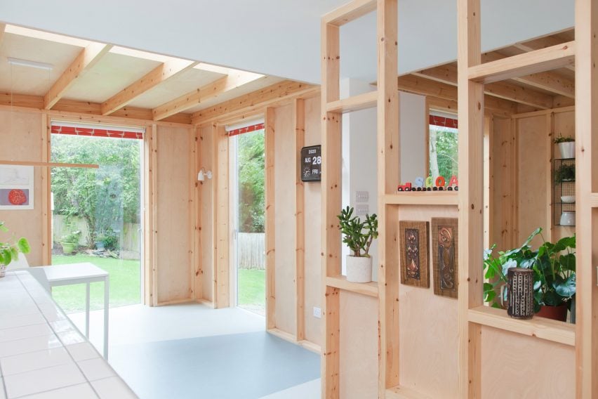
Adaptable, semi-open partitions made from plywood and planed softwood break up the ground floor of this London townhouse that was recently revamped by Nimtim Architects.
Each partition is non-structural and currently positioned to distinguish the kitchen, dining and living areas. However, they are designed to be filled in to increase privacy or easily removed to maximise open space depending on the family's future needs.
Find out more about Fruit Box ›
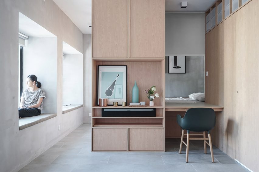
Interiors studio JAAK replaced walls with custom cabinetry when overhauling this Hong Kong apartment in an effort to create a bright and flexible living space.
The bedroom, which is accessed by two steps, is been nestled behind a built-in desk with a Normann Copenhagen armchair to offer privacy. The only fully enclosed space is the bathroom, which is hidden by a secret door.
Apartment in Sant Andreu, Spain, by Oriol Garcia
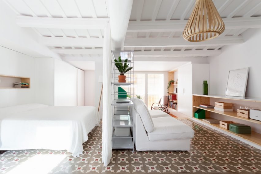
A split-level floor, bookcases and white curtains help to define the different areas in this 45-square-metre apartment, which was redesigned by architect Oriol Garcia as her own home.
The curtains and bookcases separate the zone for sleeping and bathing from the area used for cooking and lounging. At one end of the lounge, a small step and a change in floor covering have been used to create a secluded sunroom.
Find out more about Apartment in Sant Andreu ›
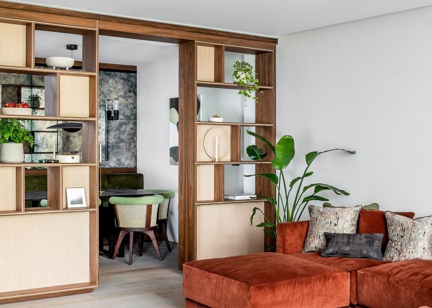
Knightsbridge Mews, UK, by Echlin
Echlin revamped this London house with a series of clever broken-plan layouts, including a basement level that features a sunken seating area to ensure the spaces are connected but visually separate.
On the ground floor, bespoke open shelving divides the study and living area from the dining room, which is fitted out with cane and banquette seating.
Find out more about Knightsbridge Mews ›
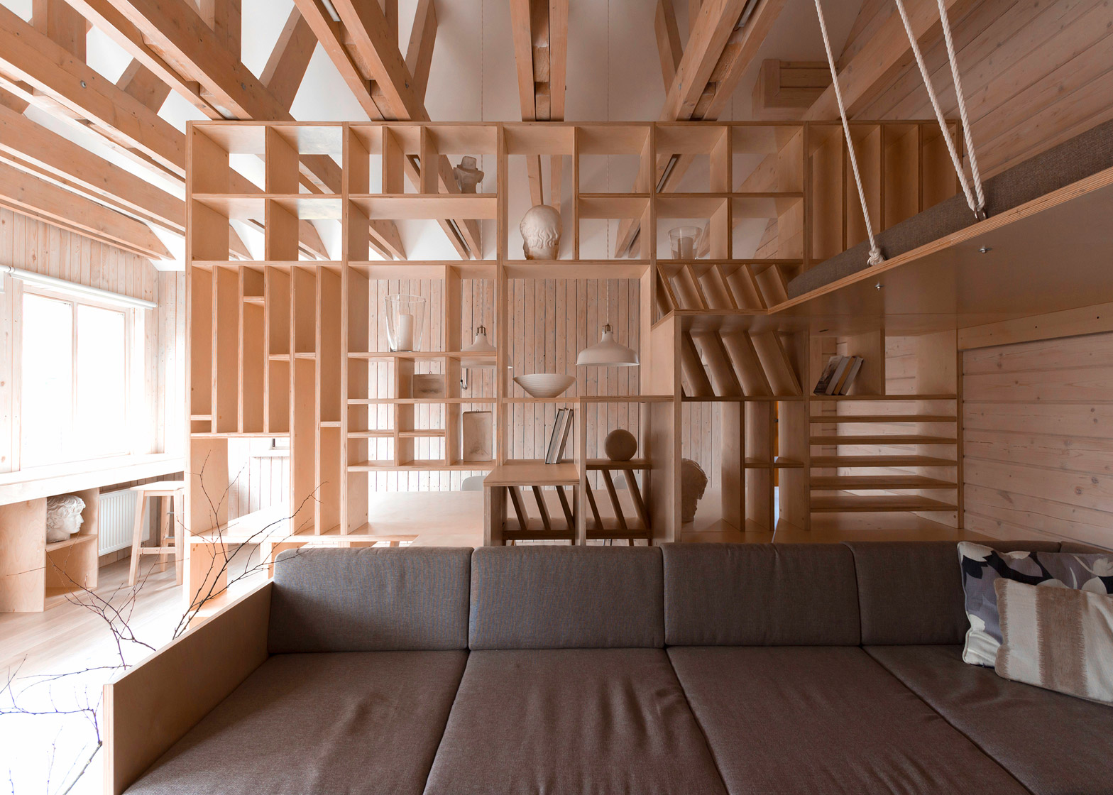
Architect Workshop, Russia, by Ruetemple
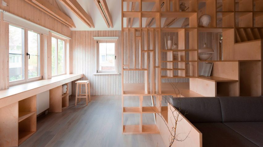
A floor-to-ceiling plywood partition with built-in shelving gives rise to distinct working and relaxation areas inside this art studio, which sits within the garage of a home in Moscow.
The wooden structure also incorporates a desk, a large L-shaped sofa with grey upholstery and a set of steps that ascend to a suspended sleeping platform with rope balustrades.
Find out more about Architect Workshop ›
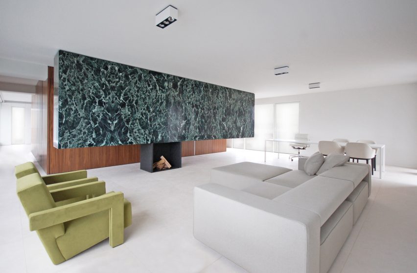
Antwerp penthouse, Belgium, by De Meester Vliegen Architecten
A two-ton slab of marble that is wedged between the ceiling and a steel fireplace helps to create the broken-plan layout of this penthouse in a 1960s building in Antwerp.
The marble works in tandem with a large volume behind it, which is clad in walnut veneer and contains functional rooms to split the dwelling's living areas into a lounge, bedroom, dining room and office.
Find out more about Antwerp penthouse ›
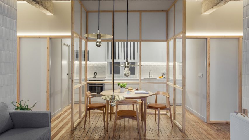
Museum Square House, Spain, by Pauzarq
The broken-plan layout of this apartment in Bilbao was guided by its original concrete girders that were uncovered by Spanish studio Pauzarq during a renovation.
In one room, a U-shaped timber-framed glass partition wraps around a dining table to set it apart from the kitchen behind it. The aim was to close the kitchen off while still allowing light to enter the space.
Find out more about Museum Square House ›
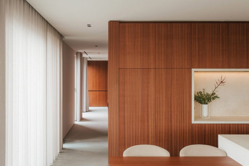
Penthouse BV, Belgium, by Adjo Studio
Large wooden elements that span from floor to ceiling were used to reorganise this open-plan penthouse in Hasselt into more practical spaces.
Crafted from cherry wood veneer, the elements take the form of kitchen cabinets, wardrobes and bookshelves. Their arrangement also helps to maximise light from the glazed walls that wrap around the apartment's exterior.
Find out more about Penthouse BV ›
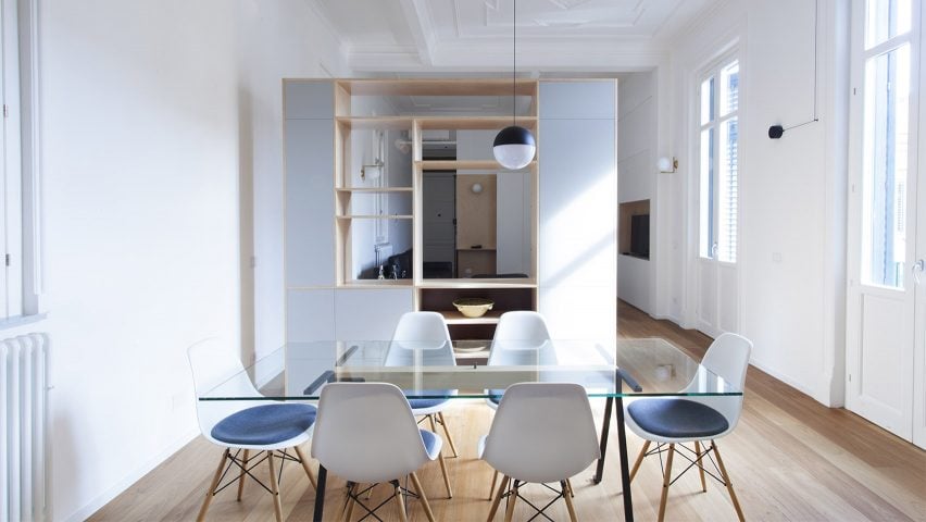
House CT, Italy, by Pietro Airoldi Studio
While renovating this apartment in Sicily, architect Pietro Airoldi Studio removed all of its partitions to maximise light. However, to define its interiors into zones, custom-made cabinetry has been introduced.
The apartment's main living space is set apart from the dining area by a plywood and MDF partition that incorporates storage and openings to maintain a visual connection.
Find out more about House CT ›
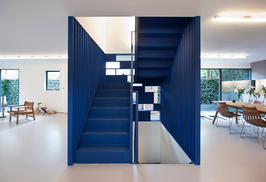
A bright blue steel staircase designed to resemble a sculpture breaks up the white-walled interiors of this London house, redesigned for fashion designer Roksanda Ilincic.
Running through the centre of the house, the stairwell is intended to create division while offering a "degree of permeability", according to architect RA Projects. On one floor, it incorporates shelving and is used to separate the kitchen from a living room on the other side.
Find out more about Fin House ›
This is the latest in our series of lookbooks providing curated visual inspiration from Dezeen's image archive. For more inspiration see previous lookbooks showcasing mezzanines, U-shaped kitchens and calm living rooms.