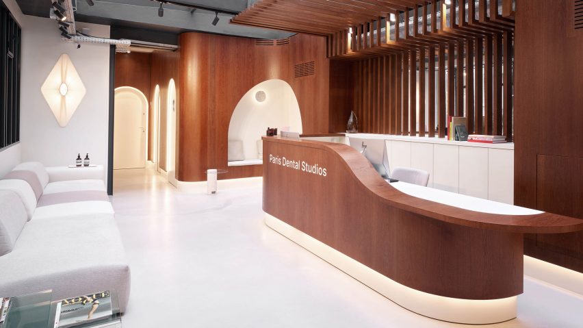
A curved wooden panel runs throughout this dental practice by Paris-based architecture studio JCPCDR Architecture.
The architecture studio was asked to create a "warm and laidback" environment as an antidote to traditional medical sites.
The dental practice, which is located on the ground floor of a courtyard in Paris, had to balance the practical medical requirements of dentists with the relaxing atmosphere that patients were after.
"The dentists wanted us to imagine a space where the patient attending a much dreaded medical appointment would turn into a guest, enjoying a moment of self-care in a warm and welcoming atmosphere," said chief architect at JCPCDR Architecture Jean-Christophe Petillault.
"Being foremost a medical facility, the dental studio required a technical, very white and bright light, as well as a lot of specific equipment," he told Dezeen.
"Part of the challenge was to seamlessly blend these operational necessities into a welcoming and glamorous atmosphere."
To achieve this, the designers inserted a single, curving oak panel clad wall along the length of the studio – from the lobby right through to the last consultation room.
"We chose to work with wood as this material immediately brings a sense of homeliness and comfort," explained Petillault.
"Contrary to what a dentist appointment usually is, this space should not be intimidating."
JCPCDR Architecture sourced the wood from eastern France where it was then assembled and dyed with a natural tone to create its deep, warm colour.
"The oak was chosen for its sustainability," said Petillault. "Compared to walnut for example, which grows very slowly, oak is easily renewable thanks to responsibly managed forests."
The designers then wrapped the walls in the lobby and adjoining corridor in the solid oak wood, a manoeuvre that proved to be challenging.
The solid wood was tricky to shape, and we had to find design solutions that would make our idea functional and affordable," recalled Petillault.
"We adjusted all partitions and built-in furniture into one single angle and curve, that acts as a design key to the whole space," he added. "These curved partitions were built, and then the wood was shaped on the partitions."
The same wood also features on the reception desk, over the arched doors and alcoves and inside the four consultation rooms. It also borders the sinks and storage cabinets in the bathrooms.
Neutral furnishings, white doors and skylights were added to the interior to help fill the studio with light and counter the dark colour of the wood.
"In order to harmonise and maximise the different ceiling heights and volumes, and to highlight the woodworks, the floors and ceilings have been left very neutral," said Petillault.
Large pipes and electrical ducts were left exposed to contrast the formal wooden cabinets and give the studio a "more contemporary and casual look".
The practice incorporates other small touches to make it feel more familiar than traditional dental studios. Lots of the dental equipment was hidden from the patient's view, contributing to the relaxed atmosphere.
A pink bathroom features towels, toothbrushes and bottles of water while soft lighting was incorporated to pare down the intense white light needed to perform dental procedures.
Other dental practices that aim to take the pain out of visits include a dental health treatment centre in Sao Paulo called SouSmile by architecture firm SuperLimão.
Photography is by David Foessel.

