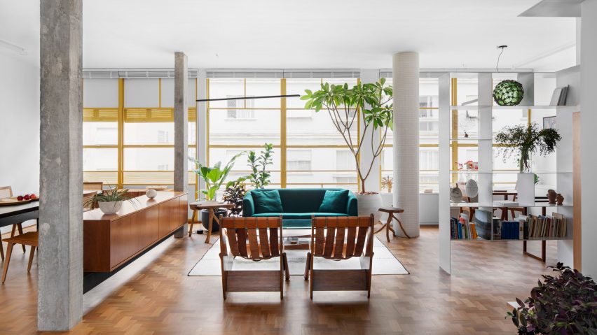
Louveira Building apartment brings together 1940s style and broken-plan living
Brazilian designer Ana Sawaia has renovated a São Paulo apartment in an iconic building, introducing a broken-plan interior filled with vintage furniture and colourful patterned surfaces.
The 140-square-metre apartment is located in the Louveira Building, built in 1946 by architects João Batista Vilanova Artigas and Carlos Cascaldi.
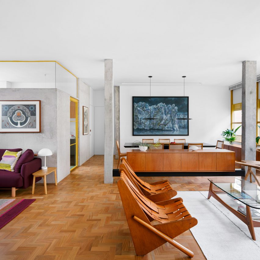
Sawaia felt it was important to celebrate the style of this era with the interior design. "My wish was that when people entered the apartment, they felt like they were at the 1940s Louveira," she told Dezeen.
However, the original layout of the Louveira Apartment was no longer suitable. Divided up strictly into small and medium-sized rooms, it didn't offer any flexibility.
For the new owners, a couple who both work as professional writers, the space needed to be able to adapt to different circumstances. At times it will be used as a workspace, other times it will host gatherings of friends. But it also had to offer the comforts of a home.
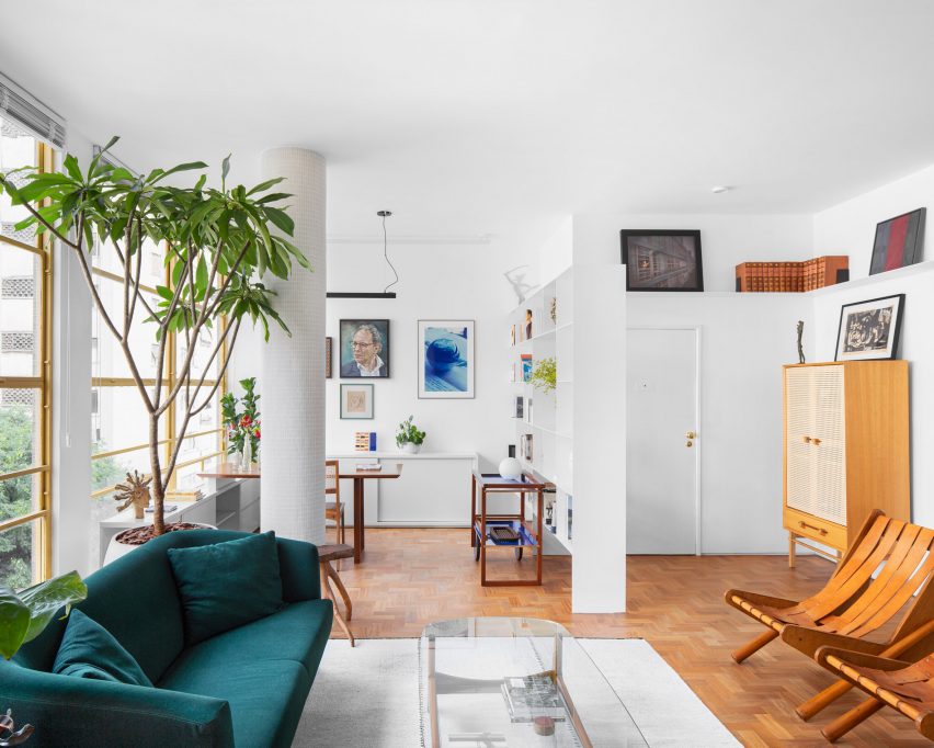
To create flexibility without interrupting the original logic of the design, Sawaia removed some of the dividing walls and replaced them with more transparent elements, such as low partitions and furniture pieces.
The idea was to create a broken-plan layout, which means finding a middle ground between a fully open-plan layout and more traditional rooms.
"The entire process was carefully dealt with in order to respect and dialogue with the original aesthetics and design of the building," said Sawaia.
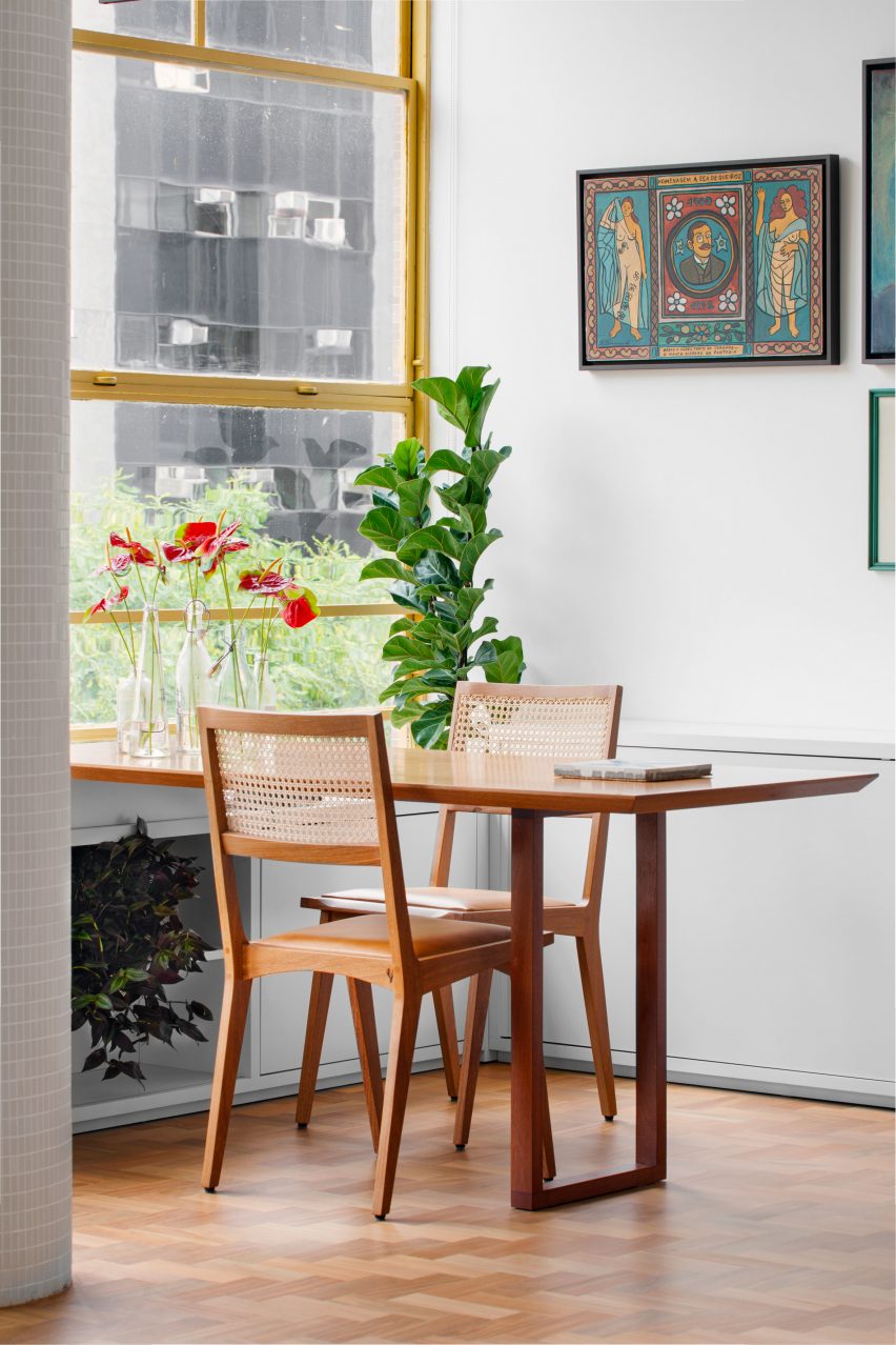
Most of the floor space is now organised across three main spaces: the living areas, the bedroom areas and the bathroom areas. But the rooms are loosely divided up into different zones, each with its own character.
The various spaces in the living room include a large dining space, a social lounge area, a snug designed for watching television or listening to music, and a cosy corner that can be used as an informal dining area or a workspace.
The space is characterised by stylised furniture pieces, including retro leather and wood armchairs designed by Vilanova Artigas and a sideboard suspended between two columns to give the impression that it's floating.
There's also a custom-made dining table, a green velvet sofa and dining chairs crafted by designer Paulo Alves.
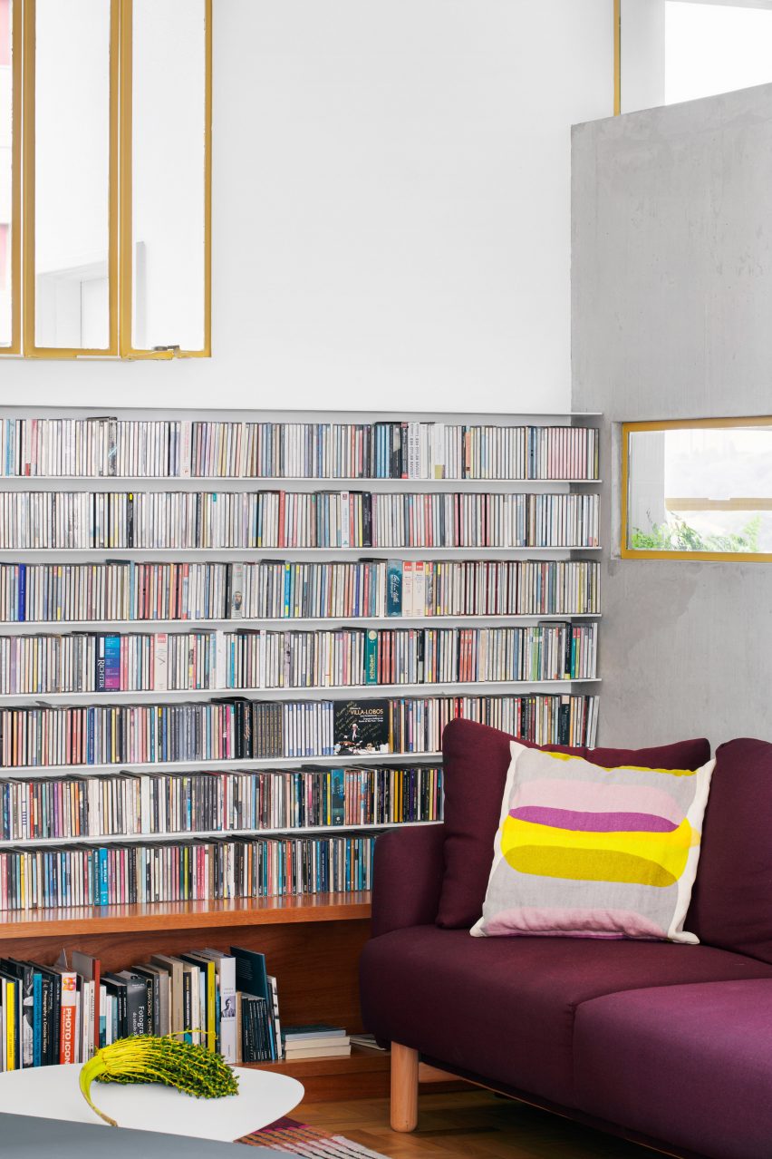
The snug has a more modern feel, thanks to a library of CDs that frames the space.
It sits alongside the kitchen but is kept separate, thanks to a new super-thin concrete partition that doesn't quite meet the ceiling, and which also integrates a panoramic window.
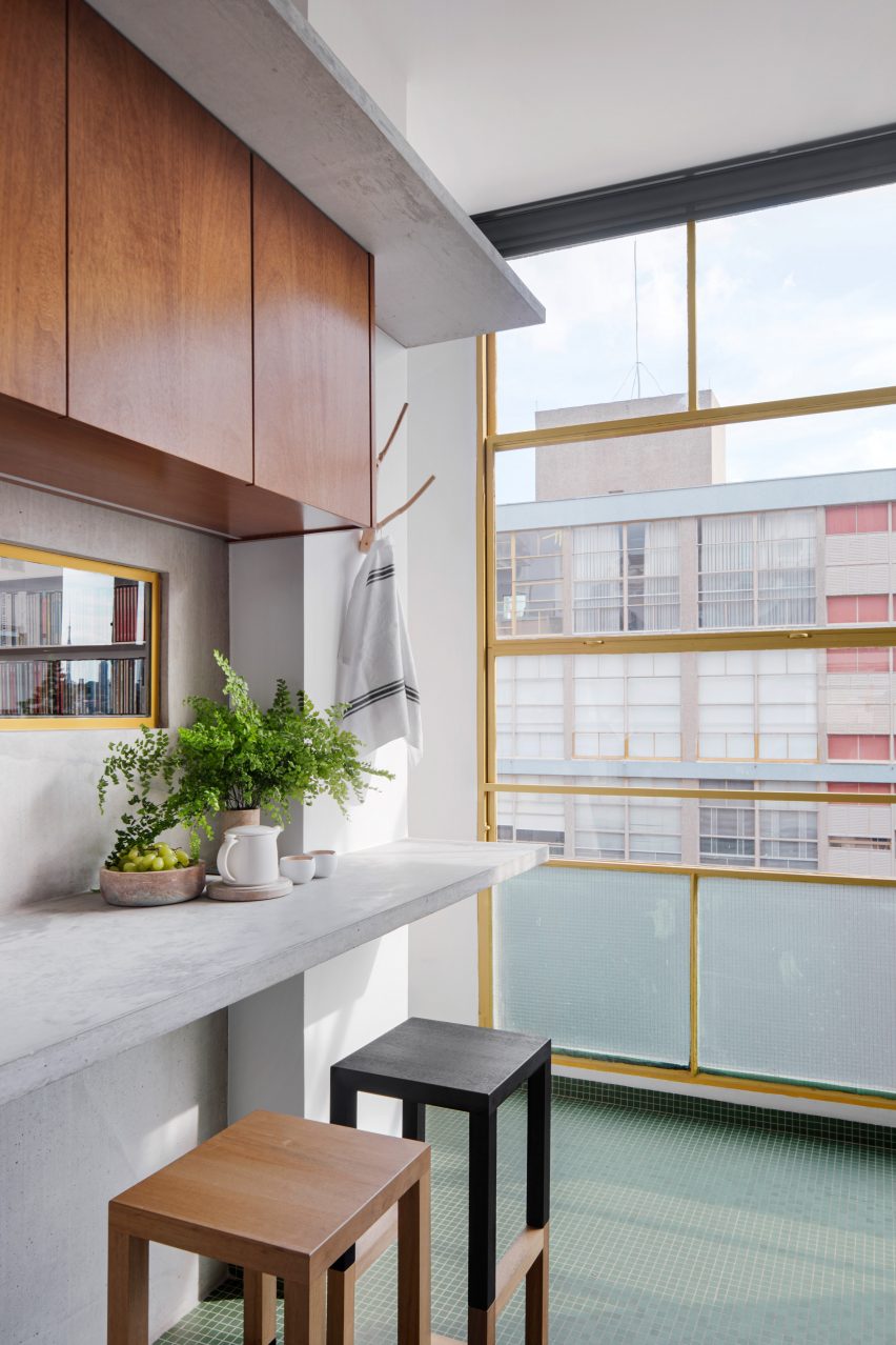
"The clients wanted the kitchen to be connected to the living room but in a subtle manner, not completely demolishing the walls between the two rooms," explained Sawaia.
"To pull this off, we had to come up with an unexpected solution: a thin wall with the upper section left open. The twist on this wall is a horizontal slit in the centre that allows a beautiful view of the Pacaembu Valley."
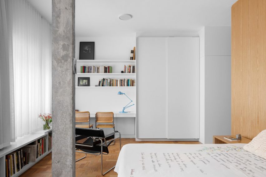
The bedroom has a more simple layout, although the additional space created made it possible to create a sizeable study desk alongside the wardrobe storage.
Splashes of colour can be found in the bathroom spaces, thanks to colourful tiles. One space features a rich shade of yellow ochre, while the other brings together royal blue and soft grey. There's also a sauna, lined with wood.
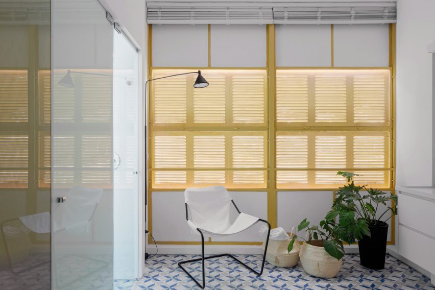
Throughout the home, Sawaia has added details that reference the architecture of the Louveira Building, from the green floor tiles in the kitchen that match those used in the buildings outdoor areas, to the yellow-painted window frames that mirror the building's facade.
Parquet flooring also helps to give the interior a distinct 1940s feel. "The building's original modernist aesthetic prevails," added Sawaia.
Other recent apartment projects in São Paulo include an art-filled "gallery apartment" wrapped in walnut and concrete and a flat decorated in earthy elements and muted hues.
Photography is by Carolina Lacaz.